
 Lessons: 22Length: 1.4 hours
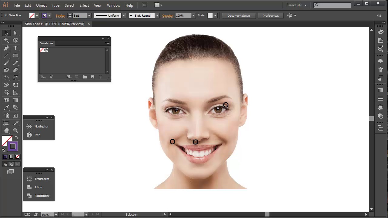
- Overview
- Transcript
2.3 Skin tones and Picking Colors
In this lesson we’ll look at selecting your own skin tone colors from a stock image, and how Adobe Illustrator comes with its own swatches to help.
1.Introduction
1.1Welcome and Course Overview02:32
2.Pre Portrait Lessons
2.1Prerequisites to the Course03:05
2.2Choosing the Right Stock03:35
2.3Skin tones and Picking Colors03:49
2.4The Three Brushes04:29
3.Create a Basic, Cartoon/Line Art Style Portrait
3.1Set Up Your Document03:29
3.2Base Shapes05:07
3.3Creating the Line Art06:34
3.4Focus on the Mouth02:43
3.5Focus on the Eyes03:24
3.6Focus on the Eyelashes and Eyebrows02:15
3.7Focus on the Hair04:12
3.8Finishing Touches03:23
4.Create a Basic, Color Portrait with Simple Shading
4.1Introduction04:46
4.2Basic Portrait Theory06:26
4.3Skin Shading: The Shadows05:27
4.4Skin Shading: The Highlights02:00
4.5Lip Shading and Eye Shading03:49
4.6Creating Shadows and Highlights for Hair04:35
4.7Make Up02:15
4.8Final Touches03:01
5.Conclusion
5.1Conclusion00:59
2.3 Skin tones and Picking Colors
Hey all, welcome back to Vector Portraits for beginners on tuts+. My name is Sharon Millin, and in this lesson we're going to be looking at skin tones. What we're specifically looking at in this lesson is how to pick your own skin tones from a stock image. I'll also show you a quick tip on how to get skin tones via Adobe Illustrator. First let's look at how we get skin tones from the stock image. This is working on the basic assumption that the stock image that you're using isn't affected by strong contrast or colored light effects. If this is the case, the colors that you'd sample would be distorted, and might not necessarily be useable. First let's look at midtones. This will be used for your base shapes. There are colors which have minimal influence from light or shadows. Typically you can get these shades from around the side of the nose, the side of the chin or the side of the forehead. For the shadows you can get these colors in the darker areas of the skin. So not specifically from the creases as this would be the darkest shadow. Assuming you have a model with no eye makeup on, you can get these colors from the top of the eye area, the lower eye lids or the cheek area and the dints from the smile. The highlight shapes can be found throughout the portrait. However, the more consistent areas will be the tip of the nose, the cheek, and the forehead. But be warned, though. You need to be sure you're not sampling color from a red tip nose or rosy cheeks. As this may result in a pink hue to your highlights. For the darker shadow, this can be found in the creases. This color's great for creating subtle line art. Look for this in the eyelid crease, the smile or cheek creases, or even the nostrils under the nose. So let's go through each of these areas with the Eyedropper tool to sample your custom palette. Move your cursor around the area and pay attention to the color fill. Keep on clicking until you find a color you are happy with. You can fill a shape, a large one at that, with this color to check it's the color that you want. Once you are happy, you can drag the field from the Color Box straight into the Swatches panel. This will add it to your panel. Then go on to do the other three colors. When you're done, you can compare all four colors side by side to see if you're happy with your selection. Alternatively, there is a much easier route. But it doesn't offer as many colors as the custom selection process does offer. Adobe Illustrator has several default libraries built in. You can access these via the Swatches panel. Go into the drill down menu. Go to Open Swatch Library and go into the Skin Tones Swatch. Here you will find several different palettes for several different ethnicities. To select the swatch that you want to use. Click on the folder located to the left of the palette and this will add the entire selection of colors to your Swatches panel and they'll be ready to use. Next time on Vector Portraits for Beginners, we're going to create the three most important brushes that you'll ever need to create. These will be used throughout your portraits, and also be great for using in other illustrations. Thanks for listening.


