
 Lessons: 32Length: 4.1 hours
- Overview
- Transcript
4.3 The Type Palette
Dive into typography with Illustrator’s advanced Type palette.
1.Introduction
1.1Introduction01:11
1.2Getting Started06:56
2.Get to Know Illustrator
2.1Illustrator Interface04:52
2.2Your First Document05:02
2.3Basic Tools11:27
2.4Creating Objects09:26
2.5The Pen Tool11:54
2.6Selection Tools06:41
2.7Settings04:43
2.8End of Week One00:26
3.Object Oriented Design
3.1Object-Oriented Design04:02
3.2Grouping11:34
3.3Layerless Thinking11:51
3.4Locking & Hiding05:21
3.5Saving Files09:02
3.6End of Week Two00:24
4.Powerful Palettes
4.1The Align Palette11:24
4.2Pathfinder Palette11:38
4.3The Type Palette11:05
4.4The Stroke Palette16:09
4.5Symbols Palette09:35
4.6The Magic Wand04:23
4.7Art Boards06:14
5.Effects and More
5.1Gradients12:53
5.2Using Masks06:05
5.3Vector Effects13:53
5.43D Tools09:38
5.5Gradient Mesh and Shading09:59
5.6Tracing and Live Paint09:24
5.7End of Week Four00:35
6.Final Project
6.1Your Final Project05:23
7.Conclusion
7.1Conclusion00:35
4.3 The Type Palette
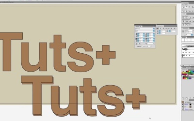
The next palette we're gonna talk about is the Type Palette. Arguably one of Illustrator's best features, is the type of typography that you can do. So let's type out something so we have a good idea of what typing is like in Illustrator. We'll say, Quick Brown Fox Jumps Over The Lazy Dog. Now, with the character pallet, and the paragraph pallet together, and I just refer to them both as type pallets, because that's what they're dealing with, right, is type inside of Illustrator. You can see you can do a lot of things. So let's first change this to Helvetica, why not? And we'll make it bold for good measure. You can see all the controls that we have here, and some of them are not visible by default. See these little arrows next to the palette. You can choose how much you wanna see. And if you're having a hard time clicking that, the menu right here can say, hide options or show options. In our Illustrator Character Palette, we can size up and down type, pretty easily, pick it from a list. But like all palettes you can type in an exact amount. We'll do 62, and hit Enter. Next is letting. Now letting is the space between lines of text. So you can see when we dial up letting, our fonts are spaced out. Now the next thing we're gonna do is modify the kerning between letters. Now it's interesting, kerning, the kerning palette right here, is actually just set at auto. It auto kerns the text, but we can use this, that Illustrator calls Tracking, to select space between letters. So you can see when we send the tracking up, our font gets really spaced out, or we do a negative, and our font gets much more dense and close together. Likewise, you can select something in Illustrator, double click to get back to type selection. Select just a piece, and edit just a piece of text. Now along with all that, Illustrator even lets you select text, and choose colors for just pieces of text. Now not all of this is too extraordinary, except for the fact when you consider that all the text that you can generate inside of Illustrator, can automatically become vector shapes. That's right, anything that you make inside of Illustrator, that is with a type tool. You can use vector shapes on. Now, once you turn something into a vector shape, you lose the ability to retype it or to kern it or to track it. But what you do get is the ability to have some really, really interesting design. So, let's take all this. Hit command A, to select all, and then let's just do. Tuts+, why not? Right? Now 100 is a little tight so we'll go 25, and we'll scale it up. If we right click on type, and go to Create Outlines, you can see all of this just became vector shapes and it puts into groups. So you're noticing a trend where Illustrator puts things into a group automatically. Well once something is a vector shape, you can imagine there's a lot that you can do with it. I don't like that color, so I'm gonna change it. And command two, to lock it, so I don't have to worry about that background. Now that we have this as a vector file or vector paths, we can put in the same properties that we could before, right? We can give things stroke. We can give it, take our Direct Selection tool and edit just pieces of it. Say we decide we want our plus sign to be a little bit shorter. And we decide we wanna move it over. Maybe up a little bit. Keep it in line with the s. We could even ungroup these, take all their separate pieces. Make it two copies, like this. Align them like that, and in each one, use the pathfinder to knock out the back. To knock out the front, rather, right? That's what this is doing. Take these, change their color. Do a darker brown. And then put our regular text in front of it. So there's all sorts of fun things that you can do now that you're seeing. Let's combine the Text tool with the Pathfinder and the Shapes, and just seeing all the different things that you can do with Illustrator. And all the different effects that you can create in a really easy, easy way. It's gonna make things really powerful. Now the paragraph is exactly what you would expect, right. The paragraph palette is center, and left aligned justification, you can even take text that you write in Illustrator, and I'm gonna. Now in my clipboard, I have some morum ipsum text. I'm gonna take the Type tool and instead of just clicking where I would get one continuous line of text unless I hit Enter, I'm going to drag a box. And that gives me a paragraph box and when I paste into that, we can see things will confine to the box. We can drag the size of the box around. So you're seeing all the versatility, that this type tool provides us. Now we're gonna take all that, and we're gonna tuck it up and over here, and group it. Finally, the last thing we can do is take our Pen tool, and draw a path. So let's start here, go down and curve it, and then go way up and pull it over so it curves again. Once we have that path drawn out, take your Type tool, and put it all the way on one, or the other side. You can start in the middle, but it's really best to start right at the end. Click. And then paste your text. So you can see, now it's following whatever line has been drawn out for it. You can imagine this is especially useful if you want text to follow a circle, or text to follow a square or a certain path. That's what this is for. And we're gonna go here and we're gonna really crank up our size, and you can see it all will just automatically fit itself. Again, we can adjust from the Character Palette. We can make the text taller, we can start the text further up from our path, we can start it so that the text follows the middle of the path. You can even make it start at the bottom, right underneath the path. And you can see the kind of weird things that's happening with the beginning letters, because they're stretched out. And over here, they're more compressed. So there is certainly repercussions and finally, you can rotate the text, which does very interesting things as you're seeing now. But it might be something that you wanna do. So Illustrator is really, really, really powerful when it comes to all the things that you can do with text, and all the things the Character Palette lets you accomplish. And you can see here very quickly. If I select this, you'll be able to check out left, right, center, justified, indent, the outdent, and the paragraph tool is, obviously, more powerful when you have the paragraph box. There's our initial indent right there. And you can see, make it break out of the box too. So the box is really just the guide for where the text should mainly be. It's not the absolute bounds when you're putting on things like indentation. So that is the Type tool. There's a lot, a lot to do when it comes to great typography. And really, typography's a whole nother art that you should, take years to study. In the meantime, what I'll do is I will save this exact file that I made. We're gonna call it, Character, or we'll call it Type, that sounds much better, we'll call it Type. And I'll just let you see what I've made here. And you can select it and look at the differences and play with it, so you feel comfortable with something already made, and then try and make your own stuff, but the type palette, both of them are really, really powerful and a must know, when you're in Illustrator.

