
 Lessons: 18Length: 1.3 hours
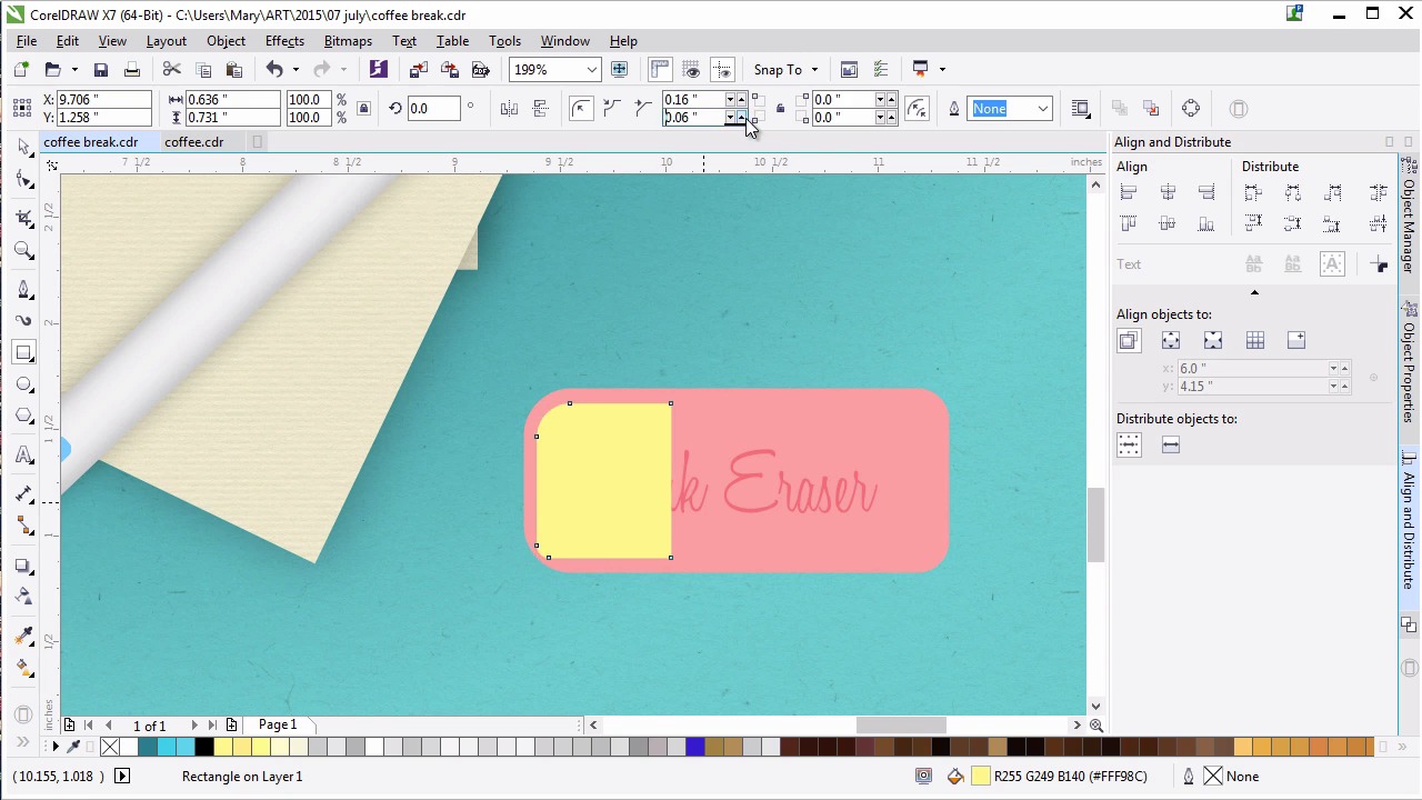
- Overview
- Transcript
5.2 The Eraser
Create a simple pink eraser with the Fillet/Chamfer/Scallop docker, fountain fills, blending modes, and text.
1.Introduction
1.1Introduction00:59
2.The Background and Napkins
2.1Creating the Background03:14
2.2Rendering the Napkins03:28
3.The Coffee Cup
3.1Rendering the Cup Saucer04:30
3.2Creating a Cup05:43
3.3Creating Additional Elements for the Cup04:43
3.4Filling the Coffee Cup04:32
3.5Finishing Up the Coffee Cup04:26
4.The Sprinkled Donut
4.1Creating a Basic Donut05:14
4.2Creating the Frosting04:47
4.3Rendering the Frosting04:20
4.4Finishing the Frosting03:58
4.5Creating the Sprinkles06:54
5.The Office Supplies
5.1The Pen06:59
5.2The Eraser04:57
5.3The Thumbtacks04:55
6.Conclusion
6.1Finishing Touches04:11
6.2Conclusion01:27
5.2 The Eraser
Welcome back to Advanced Techniques in CorelDRAW. I'm Mary Winkler for Tuts+. In this lesson, we'll continue working on our assortment of office supplies with a pink rubber eraser, and some custom text. I've zoomed into my illustration in order to work on the eraser. It will hang out near the pen within our composition. Use the rectangle tool to draw a rectangle, mine is about half the length or a bit less than the pen. You can make your eraser whatever size you want, but the rectangle should be pretty close to the final size you've intended for your eraser to be. In object properties, choose your erasers shade of pink. Go for something reddish or a bit pinker to match the donut. Really this is up to you. Grab the pick tool and select your eraser. Filet the left corners together and then the right corners. My left corner radii will be 0.24 inches. Since my rectangle is two inches in width, this rounds them out a bit. My right corner radii will be 0.16 inches. You can play around with the radius of each corner as you see fit. Grab the text tools in the tool box and either click an area within the eraser shape or draw a small box with it to define your text boundaries. Write a couple words for your eraser brand or style. I'm making mine very, very simple. Pink Eraser. This is a good place to write down your own name, brand or some little message to viewers of your work. Or you can write down the brand of an eraser that you use often. Change the size of the text and other object properties or the property bar. I don't want you to take up all of the space with the eraser. But I do want it to be legible within my illustration. Change the font to some sort of refined script. I like Honey Script for this design. Make sure the size of your text didn't change too much. Enlarge it if you have to. A lot of this is simple trial and error. I've settled on Honey Script at 26 points in size. With the text tool selected, change the uniform fill in the object properties docker to hot pink. Convert your text object to curves. Under transparency, set the blending mode to multiply and the transparency to 56 or so. Scale your text shapes up and in the align and distribute docker align your text group to the center of your eraser. Draw a small rectangle on the left side of the eraser. Fillet the left corner so the mimic the erasers own corners. Scale the rectangle like so, so that it's closer to the edges of the left half of the eraser. Set the fill color to dark pink, I sampled the text color with the eye dropper. Use the transparency tool to create a foutain fill transparency going from left to right. Adjust your fountain fill, so that the black box on the right doesn't extend past the shape's boundaries. Like we did while rendering the coffee and the coffee cup, we do this with a transparency gradient effect fades into the shape it's overlapping. Versus showing the actual boundaries of the object that has the attribute applied to it. Duplicate the pink shadow shape and rotate it 180 degrees, so it can easily be placed on the right side of the eraser. Change the radii of the corners to match the erasers right corners. Set the fill color to a lighter pink, and under transparency, set the blending mode to screen. This forms a simple bright highlight on our eraser. Since rubber is a pretty simple construct, it doesn't have a lot to render. I've found this to be a nice compromise between rendering too little or too much. Group together your eraser components and use the drop shadow tool to add a drop shadow to the group. Set feathering to 6. The shadow color to a deep, dark pink and the transparency to the mid 30s. Zoom out with the zoom tool and rotate and move your eraser with the pick tool to situate it within the composition. When we have multiple objects lined up horizontally, vertically or with the same angle, it can create a static awkward image. As such, I want it to look as though it wasn't planned for the eraser to be where it is. By rotating it to the right a bit, scaling it down and placing it to the lower right of the pen I think it balances out the right side of our composition nicely, without crowding the design, and drawing too much attention away from the coffee and donut, which are definitely the focal points. As we near the end of this course, every item we add needs to balance out the items before it, as well as their own flair to the piece. At least that's how I feel about this placement of this eraser within this particular design. Once satisfied with the placement of your eraser, you can move on to the next lesson. Thank you so much for watching this lesson on creating a pink rubber eraser. In our next lesson, we'll put those shape building skills to the test to create some brightly colored thumb tacks for the left side of our piece.


