
 Lessons: 18Length: 1.3 hours
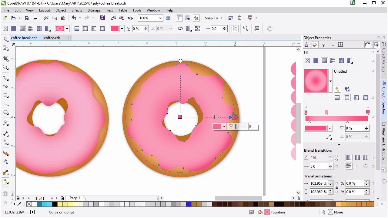
- Overview
- Transcript
4.3 Rendering the Frosting
Now we’ll render the base frosting shape.
1.Introduction
1.1Introduction00:59
2.The Background and Napkins
2.1Creating the Background03:14
2.2Rendering the Napkins03:28
3.The Coffee Cup
3.1Rendering the Cup Saucer04:30
3.2Creating a Cup05:43
3.3Creating Additional Elements for the Cup04:43
3.4Filling the Coffee Cup04:32
3.5Finishing Up the Coffee Cup04:26
4.The Sprinkled Donut
4.1Creating a Basic Donut05:14
4.2Creating the Frosting04:47
4.3Rendering the Frosting04:20
4.4Finishing the Frosting03:58
4.5Creating the Sprinkles06:54
5.The Office Supplies
5.1The Pen06:59
5.2The Eraser04:57
5.3The Thumbtacks04:55
6.Conclusion
6.1Finishing Touches04:11
6.2Conclusion01:27
4.3 Rendering the Frosting
Welcome back to advanced techniques in Coral Draw. I'm Mary Winkler for Tuts+. In this lesson, we'll work on rendering the frosting, exploring some quick techniques for working with and choosing colors. Working where we left off, change your icing object's fill code to a bright pink, and outline to none, of course. Let's explore a technique for planning and choosing colors. I like to do this for a variety of reasons, choosing a color palette, picking out a range of tones for an object, or planning out shades from highlight to shadow. Using the ellipse tool, draw two circles. Set one to the darkest tone for your color, and the other to the lightest tone. Using the blend tool create a blend from one object to the next. Reduce the amount of blend steps in the property bar to 3-5. Now you can select each shade within that blend range for the purpose of rendering the object with one of the eye dropper tools when you need it. Try this technique when planning out color palates in the future. You've got an easy answer for what colors blend easy between two hues, tones, or shades. Set your frosting shape to an elliptical fountain fill in the attribute properties docker. The process for this lesson is pretty similar to what we did for the doughnut previously. The main difference is this shape is more uneven, and we'll need to play around with the gradient a bit to get it just right. Set both outer colors to the darker hue of your object blend. Starting with the center, whose color is currently on the right of the fill slider. I want to make sure it sticks close to the inner edge of the shape. Drag that slider to the right. You can also push your colors further than what I did with my blend. Doing so will increase the contrast and speed up your process for choosing colors. If I set both colors to a hot pink, I can set a middle color within the fountain fill to the lighter pink hues in the blend. We then select the tab circle in the blend and change its color to get a new color range. Use the interactive fill tool, shortcut g, to adjust the radius and placement of the fountain fill. While you can adjust the fill in the docker it will remain confined to your objects boundaries. Whereas the interactive fill will be able to extend beyond those bounds at a whim. I want the darkest pinks within the gradients to be on the outer and center edges of the frosting shape, and to blend evenly between them. I also want the frosting itself to much lighter than this in the middle. I want the darkest pinks within the gradients to be on the outer and center edges of the frosting shape and to blend evenly between them. I also want the frosting itself to be much lighter than this in the middle, or similar to what you can see on the left side. Lighten up the central color, and make sure it's closer to the left side of the fountain fill. Adjust the shades and placement of your fountain fill as you see fit. How bright, colorful, and shiny do you want your doughnut frosting to be? The sky's the limit when you're rendering pastries. And this illustration is quite colorful. So feel free to explore colors and have fun with that. Next, we're gonna add a drop shadow to that icing shape, just to give it a small bit of dimension against the rest of the doughnut. Use the drop shadow tool to drag out a shadow to the right. Reduce the feathering to single digits, seven or lower, and the transparency to the low 20s. Adjust the shadow and its properties as you see fit. Follow along with the changes I've made to my own. I think it's important to get a feel for what you like aesthetically. So while learning techniques for illustration and graphic creation, you're still making your work fit with what you enjoy, versus what someone else tells you to enjoy. At least in the case of something like this, where you're not trying to please a client, you can create what you wanna see. Finalize your frosting contour with help from the smooth or smear tools and make sure the frosting is scaled to the extent you want your doughnut covered. I think it's important to get a feel for what you like aesthetically. So, while learning techniques for illustration and graphic creation, you're still making your work fit with what you enjoy, versus what someone else tells you to enjoy. At least in the case of something like this, you're not trying to please a client. You can create what you wanna see. Finalize your frosting contour with help from the smooth or smear tools and make sure the frosting is scaled to the extent you want your doughnut covered. I felt mine was a bit too small and wanted it to match the doughnut on the left a bit more closely. Now that we get our frosting layer, let's move on to the next lesson. Where we'll use shapes to help define and render the full scarves, shadows and highlights. Within our doughnut's frosting. Thank you so much for joining me in this lesson on rendering an organic style shape. In our next lesson, we'll continue rendering your frosting.


