
 Lessons: 18Length: 1.3 hours
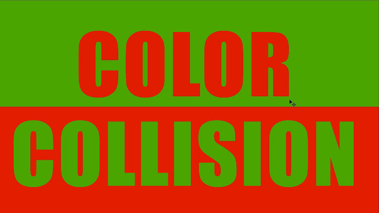
- Overview
- Transcript
2.5 When Colors Collide
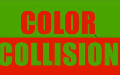
It’s inevitable that eventually you will happen across a color combination that absolutely does not work! Here’s some guidance on what to do when colors refuse to play nice with each other.
1.Introduction
1.1Introduction01:22
2.Basic Color Theory
2.1The Color Wheel02:27
2.2Warm vs. Cool04:52
2.3Color Schemes04:45
2.4Hue, Saturation, and Lightness03:46
2.5When Colors Collide03:23
3.Color Modes
3.1RGB06:10
3.2CMYK05:36
3.3LAB06:06
4.Working With Color
4.1Scene Planning06:26
4.2Controlling Color With the Hue/Saturation Adjustment Layer06:00
4.3Controlling Color With Blending Modes07:35
4.4Controlling Color With Gradient Maps05:35
4.5Controlling Color With the Painting Tools04:24
5.Tips and Tricks
5.1GUI Color Wheel03:31
5.2Adobe Color Themes03:55
5.3Color Look-Up Tables (CLUT)02:56
6.Conclusion
6.1Conclusion00:53
2.5 When Colors Collide
Hello everybody. Welcome back to working with color in Photoshop. This is lesson 2.5 where we talk about when colors collide. We've spent a good deal of this course talking about how to make colors that work well together. We've talked about different color themes, where they sit on the color wheel and how to make colors that complement each other. But all of that has a hidden implication behind it. That means that the other side of that is that there is color combinations that simply don't work well together. And that's what we're gonna talk briefly about in this lesson, and then what to do about it if you find yourself having to work with those. Now, as a warning, there will be some very bright and garish color combinations in this lesson. If you happen to have a medical condition that's affected by bright colors, you might wanna skip this lesson. When I use a term like color collision, I'm referring to a combination of colors that when you put them together in large quantities, they become almost painful to look at. Right now I've got a black and white filter engaged, so you can't really see the colors of this yet. But when I turn this off, we can see how these colors just do not really work well together. Now, they're two very basic colors. There's red and there's blue. In fact, a lot of superheroes use this very color combination. How can this be wrong? Well if you look at the borders of these two colors together, this really does not work well. It really has a lot to do with the intensity or saturation of these two colors and how much of each color is bordering the other. Because when these two colors border each other, they tend to almost bounce off each other. I like to think of it as two magnets of the same polarity, trying to push them together and they just won't go together. Now your first instinct might be, well, that's because you're using two primary colors. What if you use a color scheme that's complementary, like red and green? Well, red and green are complementary colors, but to my eye this looks even worse than the red and blue. This is very difficult to work with and often seen as an absolute mistake when it comes to design. The question becomes, if you are not doing this intentionally, but you're assigned two colors that simply do not work together. And you have to work with them together, how do you manage that? Maybe you're commissioned to create a team logo and the team colors are two colors that just won't work and they were chosen unwisely. How do you work around this? There's a couple different strategies that we could employ. First of all, if we can't actually change the color, which is really the best strategy, you can change the saturation or the brightness of them. In this solution I've desaturated the green quite a bit and I've increased the brightness of the red. Now, this still doesn't look great, but it certainly looks a lot better than that. A more common strategy is to actually separate the colors with a third color or a neutral element. For instance here I've added a line in-between this border and a stroke around the letters. While this still doesn't look great it is certainly not nearly as jarring or painful to look at. And the more reasonable elements that you can employ to separate the two colors, the better. I'm not usually a huge fan of drop shadows, but in this case I think it's justified. Also consider changing the amount of color and the position of it too. Instead of having two lines of different color and alternating backgrounds, we change it up like this and we've already made things a lot better. So then with the addition of some subtle gradients, we've changed the saturation levels of these colors, so they don't bounce off each other quite so much. And then the combined efforts of all these techniques together, we've created a design that we can take these two colors that were at odds with each other and we've made them play nice. So that brings chapter number two to a completion, where we've gone over some basic color theory. Next chapter, chapter three, we'll start talking about the color modes, particularly the ones that Photoshop uses.


