
 Lessons: 18Length: 1.3 hours
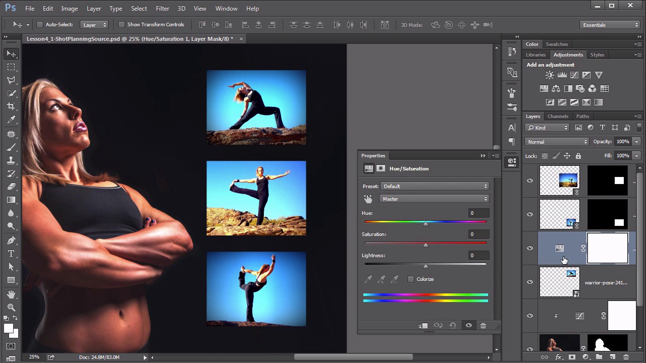
- Overview
- Transcript
4.2 Controlling Color With the Hue/Saturation Adjustment Layer
In this lesson we delve into how to use the most versatile color control in the entire program: the Hue/Saturation adjustment layer.
1.Introduction
1.1Introduction01:22
2.Basic Color Theory
2.1The Color Wheel02:27
2.2Warm vs. Cool04:52
2.3Color Schemes04:45
2.4Hue, Saturation, and Lightness03:46
2.5When Colors Collide03:23
3.Color Modes
3.1RGB06:10
3.2CMYK05:36
3.3LAB06:06
4.Working With Color
4.1Scene Planning06:26
4.2Controlling Color With the Hue/Saturation Adjustment Layer06:00
4.3Controlling Color With Blending Modes07:35
4.4Controlling Color With Gradient Maps05:35
4.5Controlling Color With the Painting Tools04:24
5.Tips and Tricks
5.1GUI Color Wheel03:31
5.2Adobe Color Themes03:55
5.3Color Look-Up Tables (CLUT)02:56
6.Conclusion
6.1Conclusion00:53
4.2 Controlling Color With the Hue/Saturation Adjustment Layer
Hello everybody, welcome back to working with color in Photoshop. This is lesson 4.2, where we take a look at using the hue saturation adjustment layer to control color. Last lesson, we arranged the elements of our scene. In this lesson, we're gonna begin using the hue saturation adjustment layer to control some of the color. First of all, I want to talk a little bit about the Hue/Saturation, and how it works. If we added it as an adjustment layer, it's this little icon here that looks like it has a set of gradients attached to it. I'm gonna hold down the alter the option key while I click on that, so I can clip it directly to the curves adjustment layer that we added previously. Then the Properties window comes up with the Hue/Saturation controls. Now last chapter when we were talking about how Photoshop works with color, we discussed what the Hue/Saturation and lightness actually mean. And that the Hue is the actual color or tone of the color. The Saturation controls the vibrancy of it. And lightness is pretty straightforward as to what that means. So first of all let's just play around with this a little bit. We'll take this top slider and we'll move it back and forth and we can see how it changes the color of her skin but it doesn't seem to correspond to where we are on this slider. So if we move that slider to this magenta view, it makes her look green. That doesn't seem to make a lot of sense. What's happening is it's actually adding these hue values to the current values that's in her skin. It's taking the hue values that were there and it's adding these to it, and we result in a totally different color. This is a very unintuitive control when you're using it this way. Something that's a little bit more intuitive, is if you check the colorize box. Now all of a sudden, this Hue slider, corresponds to the color that it's adding, because now it's essentially creating an absolute Hue value instead of a relative Hue value, which is what it was doing before. So if we wanna make her green skin, we can do that by putting it in the green tones, increasing the saturation and pulling down on the lightness. Notice that it is adding this colorized effect to the entire layer, including the dark tones of her outfit and the white tones of her eyes. The colorize box is a very heavy adjustment, that it forces this tone onto that layer. If you can find the right tone without using it, it's usually preferred. It tends to create a much more natural and less forced appearance. Also notice that these adjustments are done on the master, or really the composite color channel. If we open up this pull down box, we can see how it separates out several of these other colors. Now even though this is a RGB file. We can still isolate more than just the RGB colors. That's all built into the hue saturation adjustment layer. Now I'm going to throw this away because I want to make color adjustments to her, as much as I really want to colorize these individual boxes. I want these to represent the red, green, and blue. So the blue doesn't need adjustments, it's already there. But I'd like the sky and the top one to be red. So let's find that top layer, that's this warrior pose one here, and add the Hue/Saturation adjustment layer to that one, clip it in, then notice I didn't hold down the alt key this time. Because I can clip it later on by holding down the alt key at this point and clicking in between those layers. And I really only want to change the color of the sky, and this is a great feature that we don't even have to create a selection of that sky, because it's predominantly one color. It's that bluish tone, and if we use this little icon here, this is the on-screen adjustment tool. We grab that. We get the eyedropper and we click right here on the sky and we begin to adjust the Saturation there. Notice as I'm clicking and dragging, it's that Saturation control that's moving. If I control or Command click, then it's the Hue control that moves. And in this case, I'm gonna move it all the way over to the 180, cuz I wanna colorize this. Also notice that it automatically selected the Cyans. So it detected that as the proper color to adjust. Now we get this weird banding in here because things are being kind of forced. We don't really like that. The thing to do to correct that is to start pulling open these brackets within these color bars to expand how much of the color is being impacted. As I pull this one more to the right, that banding goes away. We get a much better gradient. It's because this adjustment is allowing more colors to be impacted by that Hue/Saturation adjustment. And because we're adding this effect as an adjustment layer, we don't even have to click an OK button. The effect is always sitting there, and it's completely live, it's not baked in, so we can always come back and readjust these values when we need to. Be aware that when you come back into this adjustment layer, you might not see the controls immediately. It's because it defaults to showing you the master controls. To get back into the controls we were previously adjusting, you need to select the Cyans from the drop-down menu. And now we can see them. So let's use that same process for creating a green background from this second image. Here's that second photograph here. Once again, let's add the Hue/Saturation adjustment layer. We'll clip it in there to it. Use the on-screen adjustment tool. To control, click on that sky and begin adjusting the hues for that one. Once again notice it's selected the Cyans, and once it's selected there, we can adjust this Hue's value to try to dial in that greenish tone that we like. Let's increase this Saturation there a little bit for it too, and pull the Lightness down some. There is some blues over here that didn't get caught up in the adjustment. We can adjust the bracket sound here as we did before. But in this case let's use this eye dropper tool here with the little plus sign to it. That way we can drag that along those areas that are not being included. And it automatically adds those tones into the adjustment. We've got our red, green, and blue boxes all assigned. And we've got a great start on a very colorful scene. The hue saturation adjustment will handle probably 90% of the color work that you need to do in Photoshop. There's several other options for you to use, but Hue/Saturation should almost always be your first go-to when working with different colored elements. Next up in lesson 4.3 we begin looking at some of those other options outside of the hue saturation adjustment layer. We'll start with the blending modes and see what they can do for us with controlling color.


