- Overview
- Transcript
2.3 Color Schemes
Some colors work well together, and some don’t. There’s a measurable reason behind this, and in this lesson we explore the science behind developing appealing color schemes.
1.Introduction1 lesson, 01:22
1.1Introduction01:22
2.Basic Color Theory5 lessons, 19:13
2.1The Color Wheel02:27
2.2Warm vs. Cool04:52
2.3Color Schemes04:45
2.4Hue, Saturation, and Lightness03:46
2.5When Colors Collide03:23
3.Color Modes3 lessons, 17:52
3.1RGB06:10
3.2CMYK05:36
3.3LAB06:06
4.Working With Color5 lessons, 30:00
4.1Scene Planning06:26
4.2Controlling Color With the Hue/Saturation Adjustment Layer06:00
4.3Controlling Color With Blending Modes07:35
4.4Controlling Color With Gradient Maps05:35
4.5Controlling Color With the Painting Tools04:24
5.Tips and Tricks3 lessons, 10:22
5.1GUI Color Wheel03:31
5.2Adobe Color Themes03:55
5.3Color Look-Up Tables (CLUT)02:56
6.Conclusion1 lesson, 00:53
6.1Conclusion00:53
2.3 Color Schemes
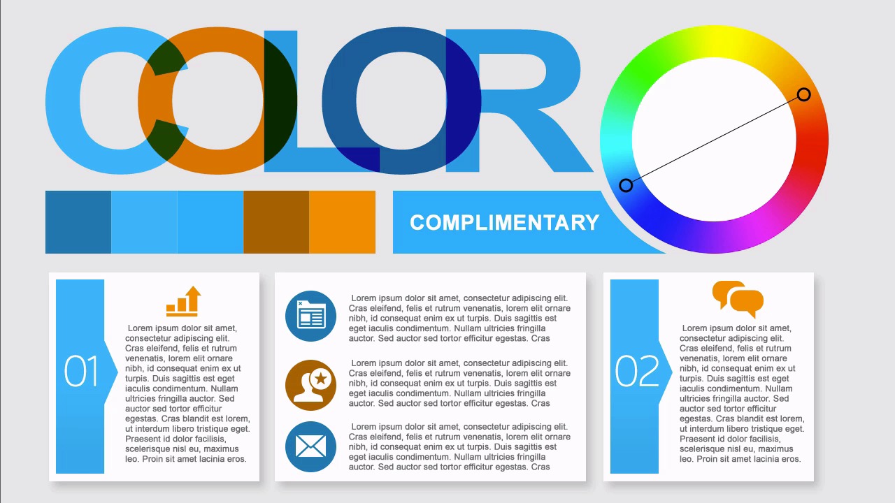
Hello, everybody. Welcome back to working with color in Photoshop. This is lesson 2.3, where we take a look at some very common color schemes. When we discuss color schemes, you might think that's referring to individual sets of colors and they are sets of colors but the naming for them isn't based on what the colors are but rather, their relationship to one another. For example, if we start with the blue and orange complementary colors, and we isolate one of them, and we use that as the base color for our color scheme and we then take colors that are next to it, or near it, within the color wheel, this would be known as an analogous color scheme. Designs that use an analogous color scheme are fairly simple to work with and they're very pleasant to look at and very comfortable over all. Analogous color schemes work really well for things like corporate art or other designs that don't wanna show a lot of risk. While they're still simple, they are rather attractive and come off as very clean. When working with an analogous color scheme, you wanna pick one of the colors to be the dominant one. Another one of the colors to play a supporting role and then the rest of them or possibly even just one more to play the accents and the use of black and white with an analogous color scheme are vitally important. One way to draw a lot of attention to a design that's laid out with analogous colors, is to pick one single element and fill it with the complementary color and that really draws the attention. There's a lot of nice contrast there. It makes that one element pop. Which in turn leads us to discuss the complementary color scheme. The complementary color scheme starts with one pair of complementary colors. As you remember, those are colors that are directly opposite each other on the color wheel. Now two colors don't make up a color scheme even if you add in grey and black and white to it as well. Instead we need to fill that out with a couple other different values and hues that are very close around the two base complimentary colors, which essentially creates two analogous sets of complimentary colors. Designs that use a complimentary color scheme feel more vibrant and full than the analogous color schemes. Design has more of a complete look to it and also draws attention. While this may seem like a simple type of color scheme to work with, a lot of times, it has too much contrast and the two colors can kind of bounce off from each other but is used carefully, it can create a color scheme that's very pleasant to look at and draws attention to itself. It's very eye catching. Be warned, using complimentary color schemes for large pieces of text is generally not advised, because it could lead to combinations that are somewhat visually jarring. In fact, you probably don't want to put the two complimentary colors directly next to each other without something in between it, or some other type of blending mode or something, to help offset the stark contrast of the two colors together. A variation of the complementary color scheme. It's much easier to work with but still produces some nice results is what's called the split complementary scheme. It's where we take a pair of complementary colors, but on one end we split that and point it to the two adjacent colors. This helps to avoid a lot of that jarring contrast that you can sometimes get with the strict complementary color scheme. Designs that use a split complimentary color scheme have a lot of vibrancy to them and a lot of contrast, but not nearly the amount of tension that the strict complimentary color schemes do. It's best to select one of the colors to use as the primary color of the design, a secondary one to be the supporting color and then that third color can sever as an accent. I would recommend trying to split complimentary color schemes before you try to use the complimentary color schemes because even while it seems more complicated, it is actually easier to use. The last color scheme that I wanna go over is known as the tetratic color scheme which is essentially two pairs of complimentary colors which are adjacent to each other on the color wheel. This is also sometimes known as the rectangular color scheme, because the four points can easily form a rectangle. Designs that use the tetradic color scheme can be very rich in their variations. There's a lot of different possibilities to go with on this type of scheme. It is recommended that you select one of the colors and let that be the dominant color. Then the rest can play supporting colors with the one that has the most saturation simply being the accent. This is one of the most common color schemes used by professional designers and others who are well experienced in working with different colors. It's well balanced, it has a lot of contrast to it, and it's very attractive. So now that we've talked about how colors can work together with a variety of different types of color schemes. Let's take the next lesson to talk about variations within a single color. That's the hue versus saturation versus lightness.


