
 Lessons: 18Length: 1.3 hours
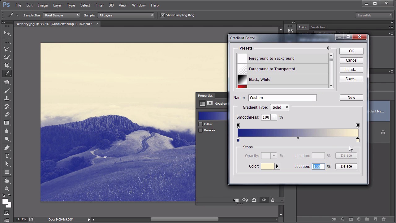
- Overview
- Transcript
4.4 Controlling Color With Gradient Maps
Gradient Maps are an effective way of crafting intricate color tones by mapping a color gradient to luminous values in a layer. This lesson will show exactly how that’s accomplished.
Related Links
1.Introduction
1.1Introduction01:22
2.Basic Color Theory
2.1The Color Wheel02:27
2.2Warm vs. Cool04:52
2.3Color Schemes04:45
2.4Hue, Saturation, and Lightness03:46
2.5When Colors Collide03:23
3.Color Modes
3.1RGB06:10
3.2CMYK05:36
3.3LAB06:06
4.Working With Color
4.1Scene Planning06:26
4.2Controlling Color With the Hue/Saturation Adjustment Layer06:00
4.3Controlling Color With Blending Modes07:35
4.4Controlling Color With Gradient Maps05:35
4.5Controlling Color With the Painting Tools04:24
5.Tips and Tricks
5.1GUI Color Wheel03:31
5.2Adobe Color Themes03:55
5.3Color Look-Up Tables (CLUT)02:56
6.Conclusion
6.1Conclusion00:53
4.4 Controlling Color With Gradient Maps
Hello everybody. Welcome back to working with color in Photoshop. This is lesson 4.4 where we take a look at the gradient maps. The gradient maps in Photoshop are not to be confused with the gradient tool or the gradient fill. Those are completely different tools within the program, although they do use the same gradient editor. The gradient tool is found over here in the tool bar and works as a way of drawing gradients. That's not what we want to do. Neither do we want to use the gradient fill which is a way of simply filling a layer with a gradient using the gradient fill options. Again, that's not what we're after. What we want is the gradient map. That's this option down here way at the bottom. It can also be found through, layer, new adjustment layer, gradient map. The idea of the gradient map is that it is taking the luminous values of the image and mapping it to the gradient. Right now, the gradient that I have up, it looks like it's just all white. So if I click that gradient there, and open up the gradient editor, we'll start with a black and white gradient, and talk about what's going on with this. If I hide that, and we begin to evaluate what this image looks like, we can clearly see the white areas of the image. Are these bright clouds in here, followed by the very light luminous values found up here in the sky going down to the darkest areas of the image are the shadows underneath the trees. So what the gradient mad does, is it essentially maps this black to white gradient to the dark to light luminous values within the image, so it's a really good and controlled way of creating some nice gray scale values. That is if you're using the black to white gradient. You could add some other stops in here to change it to some separate gray colors and have a little more control over that black and white adjustment. And as useful as that is, I find what's even more useful, is being able to use a color gradient on these. So if you think about what this does, let's select the violet green to orange gradient. It is starting over here on the left and taking the darkest values of the image and making them purple. Then over here on the right it's taking the lightest values of the image and making them orange. In the mid tones, it's mapping to green. Now, this does not look good. It looks rather psychedelic. But, with some careful work within the gradient editor, you can actually create some very beautiful duel tone images. One of my favorite combinations is to select a deep, rich blue for the dark areas, going over to a very pale orangish-yellow. Sort of a complimentary yellow for that blue up in the light areas. And I like to add another one in just this side of the white parts. To add a little bit more saturation into that too. And then maybe do something similar on the other side, where the total black areas is a very de-saturated, dark blue. And it's a great way to get some very interesting duel tone effects. Let's talk about how that's useful within our own work in controlling color in a composition such as the one we're working on. In the source file for this lesson, I've got within the red group, several smoke images. These are smoke stalks that I created myself. It's white smoke against a black background and I've positioned them in here much the same way I did those splash effects. And if you set these to screen, the black behind it disappears and we just see the white smoke area. I also used a layer mask to control which parts of that smoke that we're seeing. And I added several of these, and some at the bottom actually, that's been inverted and set to multiply, so we get some black smoke in there. And the idea is that I want to use that gradient map feature to colorize the smoke. So first, let's add a gradient map, directly over this first smoke layer here. And we're gonna clip it to it so it's only affecting that smoke layer. And then in the gradient editor itself, I've already prepared a red smoke gradient that I wanted to work with. It's going from black on the far left dark areas, to a very deep burnt red about a third of the way through, to a very bright red closer to the outside edge to eventually end up with a sort of hot pink on those highlights. Take a look at how well that does in colorizing that smoke. Also notice, we don't need use a blending mode at all. Because the blending mode is being sort of inherited from the screen process of the smoke layer. If we change that black to normal, we can see it's still colorizing those dark areas in there. But because this is set to screen, the gradient map is going to inherit those properties. And I've gone ahead and added in that same gradient map, clipped to that other smoke layer too. And this serves to be a very helpful, very handy and very fast way of colorizing elements that would otherwise be a little bit difficult to colorize. Can you imagine trying to select the highlight areas of this smoke to make sure that it get's that hot pink color in there? That would be really difficult to do. But by using the gradient map, it's actually quite easy. So we've gone through all these lessons on using color in Photoshop and we've yet to even touch one of the biggest ways of working with color. And that's with the paintbrush. Well, that's next stop. In lesson 4.5, we talk about the painting tools.


