- Overview
- Transcript
2.4 Hue, Saturation, and Lightness
Photoshop approaches the expression of color by using Hue, Saturation, and lightness. In this lesson we take a look at what those terms mean and how they work.
1.Introduction1 lesson, 01:22
1.1Introduction01:22
2.Basic Color Theory5 lessons, 19:13
2.1The Color Wheel02:27
2.2Warm vs. Cool04:52
2.3Color Schemes04:45
2.4Hue, Saturation, and Lightness03:46
2.5When Colors Collide03:23
3.Color Modes3 lessons, 17:52
3.1RGB06:10
3.2CMYK05:36
3.3LAB06:06
4.Working With Color5 lessons, 30:00
4.1Scene Planning06:26
4.2Controlling Color With the Hue/Saturation Adjustment Layer06:00
4.3Controlling Color With Blending Modes07:35
4.4Controlling Color With Gradient Maps05:35
4.5Controlling Color With the Painting Tools04:24
5.Tips and Tricks3 lessons, 10:22
5.1GUI Color Wheel03:31
5.2Adobe Color Themes03:55
5.3Color Look-Up Tables (CLUT)02:56
6.Conclusion1 lesson, 00:53
6.1Conclusion00:53
2.4 Hue, Saturation, and Lightness
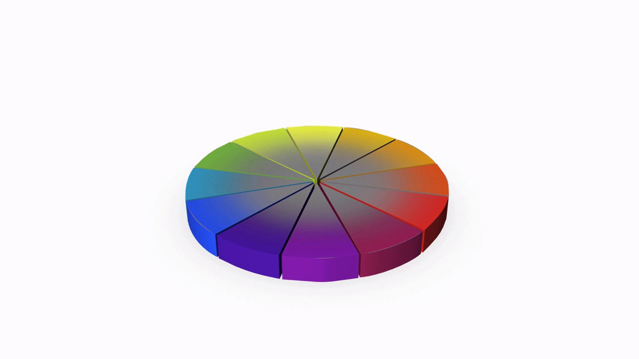
Hello everybody. Welcome back to working with color in Photoshop. This is lesson 2.4 where we take a look at how color is described through hue, saturation and lightness. Here's the color wheel that we've been using. This should be rather familiar to you by now. Now you may have wondered why we made it as a ring and didn't include it as a solid circle. Why is there empty space in the middle of it? That's primarily to avoid some confusion regarding the saturation and lightness and those are things we're going to discuss in this lesson. Let's start off the discussion by removing that center circle so we have a bunch of pie wedges of different colors. Now we've discussed previously how the three primary colors are used to form all the rest of the colors going around this color wheel. These difference in colors are also referred to as hues. So when you see the word hue referenced in Photoshop, that's really what it's referring to is the various different colors that can be used. And as we continue around this color wheel, it's the hue that changes. Then the term saturation refers to how much of that color is present in whatever specific tone that we're looking at. If we decrease the saturation of the middle of this circle, so as all these colors approach the center of the circle, they all turn into this midtone gray, cuz midtone gray has 0% of saturation whereas the outside rim of this would have 100% saturation. So the more saturation that's present, the more vibrant or deep or colorful that color tends to be. This is also what's know as the chroma. Fully saturated colors appear brighter and more vibrant, where colors with low saturation tend to appear more muddy and dull until they all approach this center point which is fully desaturated, and is just a mid tone grey. To get a better understanding of how this entire color model works, we need to break out of this 2D diagram that we've been using so far. So imagine this color wheel rendered out as a little 3D pie plate, say like that. And then just so that we can get a better visualization of how the colors are changing, let's make it as a cross-section. So we will remove a few pieces of this colored pie. Now, it's a little bit easier to see how these colors change when we talk about saturation. As the color moves away from the middle part of this pie, the saturation increases. And this 3D diagram is also a better model for envisioning how lightness impacts our colors. So if we take our basic pie chart here, and we duplicate it several times and stack them one on top of each other until we have several versions of them all stacked up here. In this way, we'll start envisioning how lightness impacts our color wheel. We'll take the bottom most ring and make it have the least amount of lightness, which will make it completely black. Take the topmost ring and make it the opposite, so it will end up being completely white. And then we'll adjust the lightness setting going from the black all the way up to the white amidst the remainder of these color wheels. So they gradually change from dark to light and this is a good way to depict the lightness setting of the hue saturation lightness values. Now it should be noted that the way Photoshop handles the lightness is that our original color ring is the 0 point and then as you add lightness to it, those colors get closer and closer to a solid white. And as you add negative values, it gets closer and closer to a solid black. Also notice that the lightness setting will override the other two settings. That's why this top ring is completely white and the bottom ring is completely black because it doesn't really matter what the hue or saturation settings are. If it's setup to 100% lightness it will always be white. If it's set to 0% lightness or -100 as Photoshop measures it, it will be completely black. I would encourage you to keep this model in mind while you're working with hue, saturation, and lightness values in Photoshop. If you can understand this diagram, it will make things a lot easier for you when you're trying to figure out exactly what settings you want to achieve the color that you're looking for. Next lesson, lesson 2.5, we'll talk about what to do when colors just refuse to get along with each other.


