- Overview
- Transcript
5.2 Adobe Color Themes
Another rarely used feature for working with color in Photoshop is the Adobe Color Themes panel. This amazing tool makes easy work out of finding attractive color schemes.
1.Introduction1 lesson, 01:22
1.1Introduction01:22
2.Basic Color Theory5 lessons, 19:13
2.1The Color Wheel02:27
2.2Warm vs. Cool04:52
2.3Color Schemes04:45
2.4Hue, Saturation, and Lightness03:46
2.5When Colors Collide03:23
3.Color Modes3 lessons, 17:52
3.1RGB06:10
3.2CMYK05:36
3.3LAB06:06
4.Working With Color5 lessons, 30:00
4.1Scene Planning06:26
4.2Controlling Color With the Hue/Saturation Adjustment Layer06:00
4.3Controlling Color With Blending Modes07:35
4.4Controlling Color With Gradient Maps05:35
4.5Controlling Color With the Painting Tools04:24
5.Tips and Tricks3 lessons, 10:22
5.1GUI Color Wheel03:31
5.2Adobe Color Themes03:55
5.3Color Look-Up Tables (CLUT)02:56
6.Conclusion1 lesson, 00:53
6.1Conclusion00:53
5.2 Adobe Color Themes
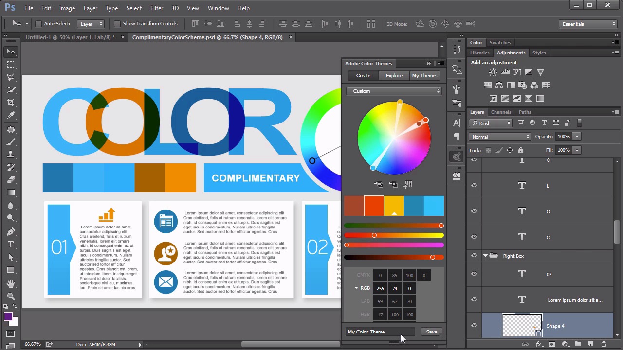
Hello everybody, welcome back to working with color and Photoshop. this is lesson 5.2, where we explore the Adobe color themes feature. You might remember earlier on in the course we explored different color schemes, different ways of pairing colors together, to create a cohesive scheme. There's a feature in Photoshop that works really well to help with this, and it's called Adobe color themes. In previous versions It was known as color, and it's found through the Window -> Extensions -> Adobe Color Themes. The first time you open this window, you may find it takes a minute for it to load. But once it's open, this is a beautifully, well-designed feature that is wonderfully helpful when it comes to creating color schemes. First and foremost, you might see that there's a drop down menu right here, with several very common methods of creating color schemes. We'll start for instance with a complimentary. And now the good thing about this, is these little stops right here on the color wheel. You grabbed the one that's highlighted, and you start pulling it around. And you can see the rest of the stops adjust automatically according to it. This is the primary color of the scheme, it's the one that's in the center position of these five color swatches. And you can easily select any color, and get a complementary color scheme from this. And it doesn't stop there. You can even get the compounds, the monochromatic, the triads, all sorts of different color schemes are easily accessible right here through this drop down menu. What's even more helpful, is to be able to create your own custom color schemes from some of the default ones. We'll start with this complimentary scheme, which is a pretty standard color scheme. And we saw before where you can grab these stops and move it around, and the entire scheme responds accordingly. But, if we change this now to custom, each of these little color stops, they behave independently. So we can pull them off to the side to create our split color scheme. When we get a set that we really like, let's go ahead and save this. So we'll call this one SplitTheme1, we'll hit the Save button. We will save it to a library, I've got one already for color and Photoshop, which also is available in the Libraries panel over here. But when we go to my themes in the color themes panel, it's right here. Split Theme 1. It's available for me right there to easily choose. And because this is saved to my library, it's available through all my devices, whenever I'm logged in to my Creative Cloud account. There's also an explore button. Which means that you can look at themes created by other people. These are themes that they have chosen to share. Feel free to go through these and draw inspiration from the way that other people have decided to put together a series in their own color themes. There's some really good ones in here. Feel free to use those in your own work. So you might be wondering, this is all well and good for working within this little panel here. But how do I actually use these colors over here on the canvas of Photoshop? My advice, is to create swatches from your color themes. that's this little icon here. This is add this swatches. You could come at and when you go this swatches panel. It's right here listed out. Swatches theme one, we get zero, one, two, three and four. And can simply click on those individual colors, and you'll notice the that the program color changes to match those. And one of the biggest benefits to using these as swatches, is that they are very easy to select. And you can make sure that you are getting a purity of color, so to speak. A common practice in a lot of designers, is to use a color on something and then maybe add a little bit of a gradient to it. Or make it blend with something, or just the opacity. Forget that that was done. And then when you use the color picker on that actual element, you're not getting that pure color. You're getting sort of the treated color that's being used in the design. You want to avoid doing that. And one of the best ways to avoiding that, is just to get used to using your swatches. So next lesson, lesson 5.3, we talk about something called color lookup tables.


