- Overview
- Transcript
2.2 Warm vs. Cool
Even though there’s no actual heat generated from colors, some tones are seen as “warm” while others are seen as “cool”. In this lesson we will explore why that is, and how it can be useful.
Related Links
1.Introduction1 lesson, 01:22
1.1Introduction01:22
2.Basic Color Theory5 lessons, 19:13
2.1The Color Wheel02:27
2.2Warm vs. Cool04:52
2.3Color Schemes04:45
2.4Hue, Saturation, and Lightness03:46
2.5When Colors Collide03:23
3.Color Modes3 lessons, 17:52
3.1RGB06:10
3.2CMYK05:36
3.3LAB06:06
4.Working With Color5 lessons, 30:00
4.1Scene Planning06:26
4.2Controlling Color With the Hue/Saturation Adjustment Layer06:00
4.3Controlling Color With Blending Modes07:35
4.4Controlling Color With Gradient Maps05:35
4.5Controlling Color With the Painting Tools04:24
5.Tips and Tricks3 lessons, 10:22
5.1GUI Color Wheel03:31
5.2Adobe Color Themes03:55
5.3Color Look-Up Tables (CLUT)02:56
6.Conclusion1 lesson, 00:53
6.1Conclusion00:53
2.2 Warm vs. Cool
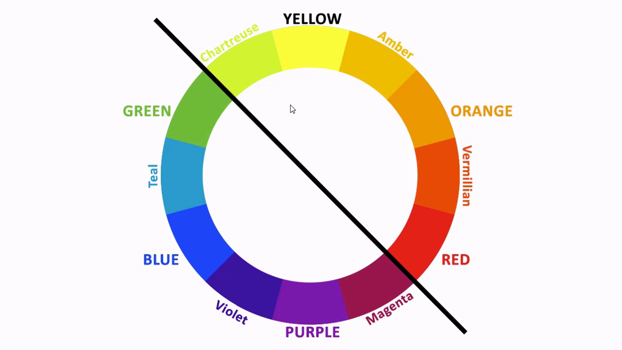
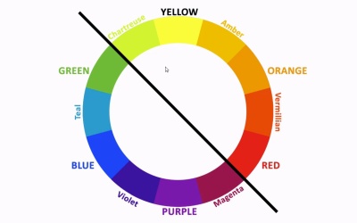
Hello, everybody, welcome back to Working with Color in Photoshop. This is lesson 2.2 where we take a look at the difference in between cool and warm colors. Last lesson, we dealt with how to create the basic color wheel, starting with the primary colors to then form the secondary and the tertiary colors. In this lesson, we're gonna talk about how that wheel then gets divided into warmer and cooler tones. Now when I use the terms warmer and cooler, I don't mean the physical temperature of them. Colors can not carry physical heat with it, but we can perceive and associate them with physical realities that do carry temperatures with them. For example, when we think of ice we would think of something very bluish and when we think of fire, or other things that are hot, we would envision those to be red or orange. In using that as a guideline, let's talk about how the color wheel is traditionally separated into warmer and cooler tones. First of all, there is not full consensus between everybody as to which colors fall necessarily where. There are some that are very well accepted, but then where you draw those divisions otherwise, is somewhat a topic of debate. Let me show you how it's traditionally laid out. First of all, let's take two complementary colors that there's no real argument about. If we start with the blues and violets, those absolutely feel like they're cool colors, whereas the ambers and orange absolutely feels like they're warm. In fact, some would argue that this would represent the coolest end of the spectrum, and the warmest end of the spectrum. And so the reasoning goes, if we then draw a separation that's at a right angle to that, we end up with the separation between warm and cool tones, whereas the chartreuse, the yellows, all the way over to reds, would be the warm tones and then the cool tones would go from the magenta through the violets and blues over to the greens. And as I mentioned, not everybody agrees on this. This just happens to be the most traditional way of breaking it down and the reasoning behind it. But in all honesty, when you talk about cool tones, very rarely does anybody imagine magenta and green to be included with the very cool color palette. The teals through the purples tends to be the cooler color palette, where the yellows through the reds tends to be the warm palette. The magentas and some tones of purple into the greens and chartreuse's, tend to almost fall somewhere in between, they're kind of a transitional area. We're not gonna call them neutral, cuz that's reserved for the grays. Gray is considered neutral in the color tones. But this is all well and good. How do we make this work for us? There's a certain phenomen that our perception has when it comes to the perception of warm and cool colors. Warmer colors tend to be more energetic and almost feel like they're advancing upon the viewer where cooler colors tend to be more calming and seem to recede. You can see that in just looking at these color bands here. The red colors feel like they're standing closer to us than the blue or even the greys do. And this phenomenon is really the foundational principle that comes behind anything we do working with warm and cool color tones. Admittedly, this is a very extreme example, but you can see how the warm red tones of that barn create a very stark contrast with the cool blue tones of its landscape and it really does jump out in a stark contrast from it, it draws your eye to it and it does tend to be standing clearly out in front of all those other cooler colors. But let's look at an example where we can use this to our advantage. In this shot here, that bright yellow cab does draw your attention. It already stands out from its background which is predominantly grey which is a neutral tone. But if we add a cool overlay to that background, it makes that yellow cab stand out even more. It almost appears to be closer to us than it did before. This is the premise behind using warm and cool colors to manipulate the viewers eye in an image. Interestingly, it doesn't really work the other way around. Using a very bright and vibrant warm tones for the background, as this images does here with these brilliant fall colors, those don't tend to blend well into a distant background. All though this is a beautiful image but if we try to add a cool tone to this bench, it doesn't pop out the same way that warm taxi cab did against those cool toned streets. That's because of the perception of warm and cool tones to our eye. We mentally want to bring warmer colors closer to us and visually we push cooler tones to the back. So having a cool color in the foreground like this against a warm background, tends to be almost confusing and visually unsettling. Learning to use warm and cool color tones to your advantage, will help you to build depth and visual complexity, into your images. Next up, is lesson 2.3, where we take a look at some common color schemes.


