
 Lessons: 18Length: 1.3 hours
- Overview
- Transcript
3.1 RGB
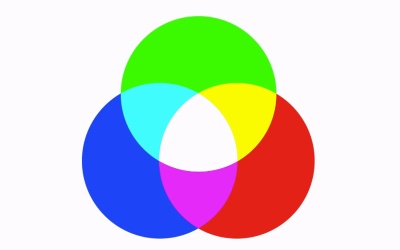
The classic color wheel uses Red, Blue, and Yellow. Yet most digital images are RGB for Red, Green, and Blue. Why the difference? In this lesson we discuss why digital displays use a different set of primary colors.
1.Introduction
1.1Introduction01:22
2.Basic Color Theory
2.1The Color Wheel02:27
2.2Warm vs. Cool04:52
2.3Color Schemes04:45
2.4Hue, Saturation, and Lightness03:46
2.5When Colors Collide03:23
3.Color Modes
3.1RGB06:10
3.2CMYK05:36
3.3LAB06:06
4.Working With Color
4.1Scene Planning06:26
4.2Controlling Color With the Hue/Saturation Adjustment Layer06:00
4.3Controlling Color With Blending Modes07:35
4.4Controlling Color With Gradient Maps05:35
4.5Controlling Color With the Painting Tools04:24
5.Tips and Tricks
5.1GUI Color Wheel03:31
5.2Adobe Color Themes03:55
5.3Color Look-Up Tables (CLUT)02:56
6.Conclusion
6.1Conclusion00:53
3.1 RGB
Hello, everybody. Welcome back to Working with Color and Photoshop. This is lesson 3.1, where we explore the RGB in color mode. Before I begin, I want to point out that our human vision can see so many millions of colors that we actually don't even have a color model that encompasses all of the different types of colors that we can see. We have several that get very close, but those are usually more adapted to the particular medium that uses that model than it is the actual vision of our eye. The first one I wanna talk about is the RGB color model, because that's the color model that tends to encompass the largest amount of different colors that match up with our vision. You may remember that we started out building our color wheel with three primary colors, being yellow, blue and red. Another way to express these colors is if we blended them within a single Venn diagram. And then you can clearly see where the colors are combining. The yellow and the blue make green. The red and the blue make purple. There's the orange, and so on. And in the center of it is this all colors combined to form black. But you may notice that the first color model we're talking about is RGB, not RYB. Because the letters R, G, and B would stand for red, green, and blue. These three primary colors are red, yellow and blue, so that seems a little bit strange to us. Well, there's a very good reason for this. And that has to do with the way screens deal with color, and the fact that they have to emit light. You see, the standard color model here that we're used to looking at and have been studying for generations was developed many years ago by painters, who had no real way of developing methods of broadcasting light. So they had to deal with paint. And combining them this way made a lot of sense to them, but in today's world, we have digital displays. And we have almost the opposite problem, in that how do we emit light, or display, black? How would you do that? That seems kind of odd, because according to conventional thinking, you would turn on all of the colors within a single pixel and expect it to be black. But that doesn't really work because if you turn off all the colors in a single pixel, it's essentially turned off, and therefore it would be black. So turning them all on to expect that to become black is kind of counter-intuitive to the way we approach digital displays. We also now understand that light itself, pure white light, contains the entire spectrum of colors. So adding them all together should really create white, not black. So that has to shift our thinking just a little bit. People who developed digital displays originally found out that if we separate the colors down into red, green and blue as our primary colors, then we can get a lot better result when it comes to combining them together to form white. This also does some shifting around in here to create all the different hues that we need to use for digital displays. Now, it does create some rather unintuitive combinations, like the idea of combining red and green to get yellow, but ultimately it all tends to work out pretty well. So let's take a look at how Photoshop deals with the RGB color model. The RGB color mode is actually the default in standard color mode for working in Photoshop. It's the color mode that Photoshop expects your image to be in for most of its features. So, all of the filters and adjustment layers and everything is gonna be happy with working with RGB color, because RGB color is designed for digital displays, which tends to be primarily the medium Photoshop work is presented it. Something you need to understand about how Photoshop even deals with colors is actually through the use of greyscale files. And while that seems rather unintuitive, it does make a lot of sense once you start digging into it. So this image is an RGB file. We can see that right here. Another way to check is to go to Image > Mode. There will be a check mark next to the color mode the open image is currently in. This, by the way, is also how you would change to a different color mode. But we'll get into that in a little bit. Next to the Layers panel, there's a Channels panel, and this panel shows the composite color at the top. That's the RGB total composite image. But then it also has separation of the Red, Green, and Blue channels. And each of these channels are presented in a greyscale image. And the way this works is that Photoshop takes this greyscale image, which is divided into 256 various levels of grey and interprets that for each color channel. And as you look at the image, I want you to see this as whites and blacks. So wherever you see deep, dark black, it means the color of this channel is not being represented or it's not really present at all. So right in this area here, there is very little to almost no green values. And if you remember in the composite channel that would be true because that looks like it's totally red. And if we look at the Red channel for this area, we can see it's very bright, which means that there's a lot of red values in here. Likewise for the Blue channel, you can see representation of that as well. Now, understanding the way color works in Photoshop this way is particularly helpful, especially when you're dealing with the actual RGB values of a color. So if you pick the Color Picker or just click on the color chip here to get the Color Picker and you start clicking around in these different areas. Let's take that red color that we originally were talking about. Now look at the RGB values for that. The red is almost fully saturated with 224, the G is at o and the blue is at o, and that matches with what we saw back in the color channels. The red is almost fully white, the green and the blue are completely black. Just as a mental exercise, if you click on the white areas, what would you expect to see the RGB values being? If you said a full 255 for each, you were correct. That means that those white pixels have full representation of all three color channels, and that fits with what we were talking about with the RGB model. Combining all three of the colors together to form white is what we refer to as an additive color model. So, next lesson, lesson 3.2, we'll dig into the other most common color model, that's the CMYK.


