
 Lessons: 18Length: 1.3 hours
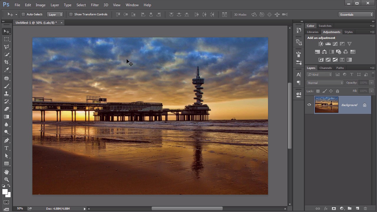
- Overview
- Transcript
3.3 LAB
The last color mode we will explore is more conceptual and medium-independent. It’s also the least utilized. It’s the LAB color mode. Learn what it is and why it’s useful.
Related Links
1.Introduction
1.1Introduction01:22
2.Basic Color Theory
2.1The Color Wheel02:27
2.2Warm vs. Cool04:52
2.3Color Schemes04:45
2.4Hue, Saturation, and Lightness03:46
2.5When Colors Collide03:23
3.Color Modes
3.1RGB06:10
3.2CMYK05:36
3.3LAB06:06
4.Working With Color
4.1Scene Planning06:26
4.2Controlling Color With the Hue/Saturation Adjustment Layer06:00
4.3Controlling Color With Blending Modes07:35
4.4Controlling Color With Gradient Maps05:35
4.5Controlling Color With the Painting Tools04:24
5.Tips and Tricks
5.1GUI Color Wheel03:31
5.2Adobe Color Themes03:55
5.3Color Look-Up Tables (CLUT)02:56
6.Conclusion
6.1Conclusion00:53
3.3 LAB
Hello everybody. Welcome back to working with Color in Photoshop. This is Lesson 3.3 where we take a look at the L-a-b color mode. First of all, I wanna point out that this color model is described as the L-a-b Color Model. It is not called the Lab color model. That's a common misconception. Just because these letters are arranged so that they form a pronounceable word doesn't mean we need to pronounce that word because these letters each mean something specifically different. Just as the RGB color model isn't called the RGB color model each of those letters stand for red, green, and blue. Likewise with the LAB color model. Each of these letters means something very specific. Now the LAB color model does contain a much larger gamut than the previous two color models, even combined. Some say the LAB color gamut contains all perceivable color, and the way it approaches measuring that color is completely different than the way the previous two approach it. While both the RGB and the CMYK describe color according to the different components that are used to create that color, the LAB color model instead describes the actual appearance of that color as opposed to its creation components. That sounds a little bit confusing, I understand. Let's try to break it down a little bit. The best way to think about this color model is with a 3D axis. We'll start with the vertical one, that's the L for Lightness. That one's pretty easy to understand. The higher it goes, the lighter it is. The lower it goes, the darker it is. After that the colors are described by two horizontal axes. The first is the A axis, and that is the axis that runs from green to red. So positive numbers in the A axis would indicate more green, and negative numbers in the A axis would indicate more red. Notice that these two are complimentary colors, so they are actually on opposite sides of the color wheel, that's why that works. Then there's the B axis. Which works the same way except it goes from blue to yellow, now what's nice about this color model is it is device independent. Because it's talking about the actual perception of the color or how the color appears and not how it's created. Just for the sake of clarity I also wanna point out the very midpoint of these two axes and along this lightness value, is 50% gray, so even though we know that blue and yellow form green the middle point or what would be the zero point on the B axis is not green instead it's gray. Likewise, with a red and a green. That way we can easily look at the numbers for an LAB color model and understand which colors are being added where. So let's talk a little bit about how Photoshop deals with LAB color mode. First of all, too hue turn image into LAB color It's done the same way as the previous color modes. It's through the image mode. I've already turned this one into LAB color. It was RJB. Notice that we don't see any color shift at all from RJB to LAB. That is only because LAB already contains all of the different colors that's available in the RJB mode as well. Now, it's theoretically possible there could be some color shifts going from LAB to RJB, but here's the thing, you would never actually see that. Because the screen can only display RGB colors. So if you're seeing any color, it's already in RGB display. So if it does shift colors, you won't see that happen. So we've got this image in LAB color mode, let's take a look at the channels. This can be a little less intuitive than what we saw the RGB or CMYK color channels. First the light in this one makes a lot of sense. That's the actual lightness, or the luminous values of the image. That's all fine and good, but actually looking at the A In the B values, it's very difficult for us to look at this and mentally think about what this means. Because as we imagine that chart that we had before, when we're on the B channel, that is the axis going from blue to yellow. So tones that we see that are over 50% gray and under 50% gray means more blue. But as we're looking at this, that's a little difficult for us to perceive. So we know that there's a lot of blue in the sky, we see some darker images in there, okay, we got that. But looking at the A channel, well that looks almost like a muddy mess. But in thinking about what is on the A axis, Negative As or darker pixels on that channel are gonna be more red. Lighter pixels are gonna be more green. While they're all about a midtone gray except for there are some dark areas over here, that would indicate some reds which is about what we would expect to see with a sunset type of image. But let's see how this is even more useful. If we add a curves adjustment layer. And we can see the breakdown here of the different channels, starting with lightness, the A and the B. Well lightness, we can get some nice contrast in the brightness of the image. This is a pretty standard technique in Photoshop, even with the other color modes. But here's where this can become particularly useful. If you look at a histogram for the a mode, remember? The A is from red to green. We're seeing very little representation in there. So we can actually stretch these colors out by moving in on the curves a little bit. Likewise with the B channel. Like in that histogram seems to be focused mostly on those center areas. So by moving these points inward just a little bit we can do some stretching off those colors. You get more of a full gamut of colors in there. So look at the difference that that made. With just a curves adjustment layer on the individual LAB color channels. We can get some very rich and vibrant colors very easily. Now if you're thinking that's a little esoteric and kind of difficult to follow, here's an easier trick. Change your image to the LAB color mode, make a copy of this background layer, change the blending mode to soft light, and reduce the opacity maybe to about 50% or so. Somewhere around there. Look how that really just made those colors pop. Now it's true working in the LAB color mode means that some of your filters and some of the image adjustments are not available because once again Photoshop prefers to work in RGB. But sometimes photographers would like to work outside of that RGB color gamut. The LAB mode is a good way to do it. It's also an easy way to get some very rich, vibrant hues to your colors. All right, now that we've gone through what the individual color modes mean in Photoshop, it's time to move on to an actual project. We'll start with chapter four next time in creating a very colorful and vibrant scene.


