
 Lessons: 18Length: 1.3 hours
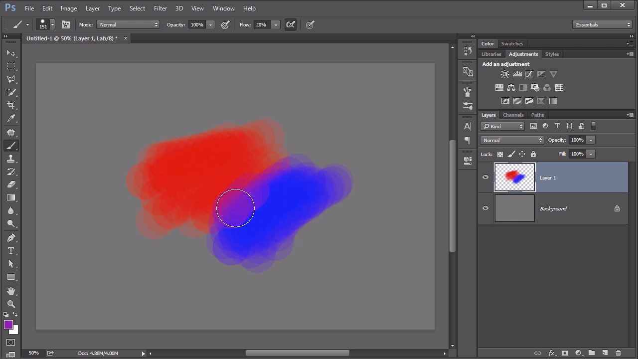
- Overview
- Transcript
4.5 Controlling Color With the Painting Tools
Any study on color in Photoshop would be remiss to leave out the powerful painting engine within Photoshop. No other technique gives as much control over the application of color.
1.Introduction
1.1Introduction01:22
2.Basic Color Theory
2.1The Color Wheel02:27
2.2Warm vs. Cool04:52
2.3Color Schemes04:45
2.4Hue, Saturation, and Lightness03:46
2.5When Colors Collide03:23
3.Color Modes
3.1RGB06:10
3.2CMYK05:36
3.3LAB06:06
4.Working With Color
4.1Scene Planning06:26
4.2Controlling Color With the Hue/Saturation Adjustment Layer06:00
4.3Controlling Color With Blending Modes07:35
4.4Controlling Color With Gradient Maps05:35
4.5Controlling Color With the Painting Tools04:24
5.Tips and Tricks
5.1GUI Color Wheel03:31
5.2Adobe Color Themes03:55
5.3Color Look-Up Tables (CLUT)02:56
6.Conclusion
6.1Conclusion00:53
4.5 Controlling Color With the Painting Tools
Hello everybody. Welcome back to working with color in Photoshop. This is lesson 4.5 where we take a look at working with color by using the painting tools. Now you might be wondering why I waited so long in a course about color in Photoshop to even deal with the painting tools. Well that's because I didn't want this course to turn into a course that revolved around painting in Photoshop, which it quite easily could. I wanted this course to be focused on photo compositing and illustration, and I think it's done that, but I would be remiss if I did not deal with the painting tool in Photoshop when dealing with color. Now I will say that it's not the most intuitive way of dealing with color when using the painting tools. For example, let's say we picked the brush tool and we select a nice soft edged brush, and we select a nice brilliant blue color. Then we paint a little bit with the blue. Nice. So now let's paint a little bit with yellow to fill in this other side over here. What do you think should happen when I overlap the two? Well, you might think, well they should blend together to make green. That's not the case at all. Photoshop just doesn't deal with color quite that way. Even if we now add the red down here at the bottom, still not quite getting exactly what we want, so what gives? Well, that's because Photoshop isn't actually blending these colors together in an additive way that we would expect actual paint to do. It just doesn't work that way. So how do we make that work? There's a couple of good solutions for this. Mostly it has to do with the brush settings and then how to use it. My personal preference would be to actually turn off that softness. I think that makes things really kinda muddy. So increase the hardness of the brush. So we got a solid, round brush here. But pull down on the flow. Set that at maybe about 20% or so. So it's just going to start building up that color. With each stroke it's just gonna add a little bit more of it. That way, when we change the colors, you will start to see a little bit of blending effect in there. You can kind of force it to do that. You see a little bit of that purple coming out? And here's the nasty little cheat that we all do that nobody talks about. When you start to see a little bit of that blended color hold down that Alt or the Option key and go ahead and sample it. So we sort of force that to happen in there, and sample the blending between those, and over here too. So if you want colors to blend in Photoshop, this is really the best way to do it. Keep sampling and kind of force that blending to happen. It doesn't happen naturally on its own. Now there are some tools. Like that mixer brush tool that can do a better job of trying to mix colors together, but it's still not quite like you would expect when it comes to blending paints. You're really better off, just specifying the color you want and using the color picker. To blend those areas together by hand. But please, don't let that limitation fool you into thinking that the painting tools are completely useless when it comes to controlling color and working with color in Photoshop. In fact, the opposite is true, they are monumentally useful. No other tool quite gives you the amount of control over the application of color onto a layer. For example, I've got the wind elements, working in here, but I want them to be blue. So let's make this first element layer, which I've layered in the same way I've done those other layered elements, by using the screen blending mode to remove the black background from it. So I'm adding a blank layer directly above that first wind layer. I'm going to clip it to it, and call it the blue layer. Then with my brush tool active, and I am actually going to use a soft edged one, at this point. But I want to use the same blue color that's in the background behind her, so I'm gonna hold down the alt key to get my eye dropper tool and just sample from that blue back there, and then begin painting over just certain portions of this wind element. So right now it's obscuring it pretty well. We don't want it to be obscured, we want it to be colorized. So let's use the blending mode on that. We'll start with the overlay. I actually really like the way the overlay is working there. I can very intentionally decide which portions of this wind energy I want to be blue and which portions I want it to remain white. Until I end up with a very vibrant blue wind effect, that's completely non-uniform and colorized entirely by hand. So that's it with all the different ways of applying and working with color in Photoshop as far as the different tools to use. Next chapter, chapter 5, we dig into some of my favorite tips and tricks for working with color.


