- Overview
- Transcript
2.1 The Color Wheel
The color wheel is an age-old method of working with color combinations. But where did it come from? In this lesson we take a look at the development of the classic color wheel and discuss its usefulness.
1.Introduction1 lesson, 01:22
1.1Introduction01:22
2.Basic Color Theory5 lessons, 19:13
2.1The Color Wheel02:27
2.2Warm vs. Cool04:52
2.3Color Schemes04:45
2.4Hue, Saturation, and Lightness03:46
2.5When Colors Collide03:23
3.Color Modes3 lessons, 17:52
3.1RGB06:10
3.2CMYK05:36
3.3LAB06:06
4.Working With Color5 lessons, 30:00
4.1Scene Planning06:26
4.2Controlling Color With the Hue/Saturation Adjustment Layer06:00
4.3Controlling Color With Blending Modes07:35
4.4Controlling Color With Gradient Maps05:35
4.5Controlling Color With the Painting Tools04:24
5.Tips and Tricks3 lessons, 10:22
5.1GUI Color Wheel03:31
5.2Adobe Color Themes03:55
5.3Color Look-Up Tables (CLUT)02:56
6.Conclusion1 lesson, 00:53
6.1Conclusion00:53
2.1 The Color Wheel
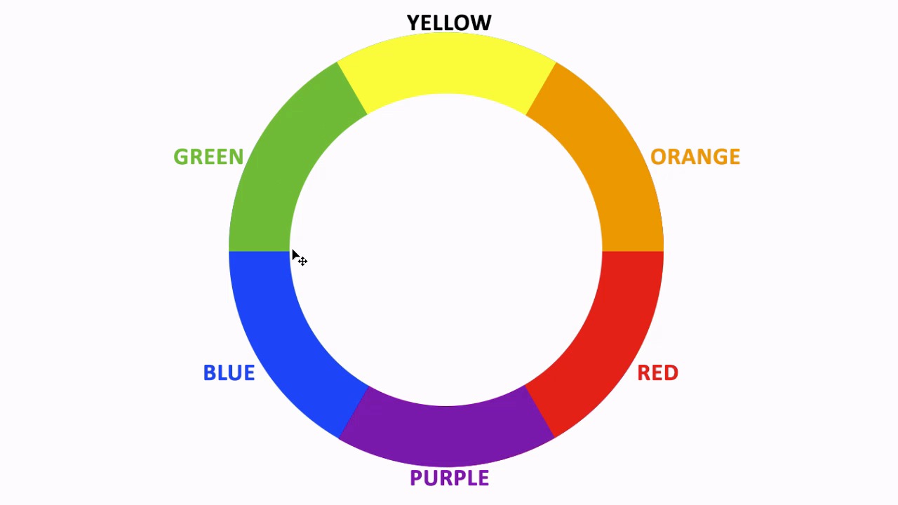
Hello everybody, welcome back to Working with Color in Photoshop. This is chapter number two where we take a look at the basics of color theory. This is lesson 2.1 where we talk about the color wheel. Traditionally, understanding color always starts at the same place, and that's understanding how colors work together. The traditional model is using the primary colors of blue, yellow, and red. Now imagine if we take these three primary colors then put them together into a single circle where each color is one-third of that ring. This will serve as the foundation for what will ultimately be known as the color wheel. The concept being, if you take the areas where the colors overlap or where they boarder each other and you combine the neighboring colors together, you end up with the secondary colors. Not coincidentally, this method of blending colors together to get additional colors creates the same sequence of colors that we commonly associate with the rainbow. And that's why those rainbow colors are often in that very order. Because that's the way the colors tend to work out. In these six major groupings of color, traditionally known as the primary colors and the secondary colors, is pretty basic knowledge of the way the colors work together. But the way we created these secondary colors by combining the neighboring primary colors, is a concept that can continue on. If we isolate the areas where these colors border and start blending those, we end up with the tertiary colors. Now, these tertiary colors are combinations of one primary In one secondary and you can continue subdividing this color wheel into smaller and smaller increments until you end up with a gradient that goes all the way around. Now you may be wondering why we even bother putting the colors in this arrangement? As in why do we put them in a circle? Why not just use the strip like the rainbow that we saw previously? What advantage is there to putting it into a ring like this? Well, the entire point of that is so that we can easily isolate complimentary colors. That is, if you take colors that are exactly opposite each other on the color wheel, those would be known as complimentary. And so then it becomes very easy to figure out complimentary color schemes just by finding opposite colors on a color wheel. So the whole point of putting it into a ring arrangement, is that it just makes it functionally easier to develop different color schemes. And that's really the basics behind the color wheel and how it's used. Next lesson, lesson 2.2, we talk about warm versus cool colors and why that's important.


