
 Lessons: 16Length: 2.3 hours
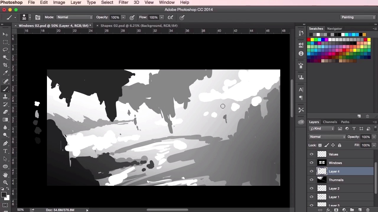
- Overview
- Transcript
2.4 Value Studies
In this lesson, I will show you how you can incorporate dynamic design into your work. You will use the shapes you designed in the previous videos and learn how to arrange those shapes into the composition of your value studies. You’ll learn how to create a sense of depth and structure in your paintings whilst making use of some of the basic tools in Photoshop. The aim of the lesson is to complete a number of quick thumbnail paintings to use as a potential starting point for your final concept environment painting.
1.Introduction
1.1Introduction01:31
1.2Adobe Photoshop Setup05:28
2.Shapes and Thumbnail Design
2.1Experiment With Shapes08:20
2.2Designing Shapes10:20
2.3Thumbnail Setup05:46
2.4Value Studies12:39
3.Painting
3.1Translating the Thumbnail08:19
3.2Initial Painting09:22
3.3Adding Texture08:31
3.4Design Development10:28
3.5Lighting and Colour10:19
3.6Clouds10:18
3.7Composition Adjustment10:56
3.8Adding Detail11:14
3.9Final Touches11:52
4.Conclusion
4.1Conclusion01:44
2.4 Value Studies
Hey guys, and welcome back to the concept art tutorial. In this video we're gonna go through creating our value studies, and also bring into practice what we've learned in the previous lessons to create three or four thumbnails based on the reference. Now, what's important here in this setup are the swatches on the left hand side. Basically what I've done is to create five different shades of gray, ranging from white, and then progressively getting darker to black, or very dark gray. And now, what they're gonna help with is our values. To start out, we'll use these swatches to color pick off and then just basically create a sense of depth to our thumbnails. So I'm gonna use the gradient tool, here, just to add a bit of background to paint off, and then once we've done that, lower the opacity down so it's not too dark. We'll just use our brush tool on another layer, set the hardness to 100% and start painting. So to color pick the swatches, just hold down the Alt key whilst you have the brush source selected, and then click on the color you want. Now, as a general rule, light values recede, and dark values come forward. So basically, the closer something is, the darker it should appear, and the further something away is, the lighter it should appear. So for this painting I've been looking at grassy mountain range references. So I've been thinking of creating a somewhat fancy piece that reflects something along those lines. And just to start off with, I'm using the midrange grey color here just to place down some of the ground work, and just roughly place some shapes. I'm thinking about the elements of the landscape. So I've got some rocky elements on the left and the right here, just creating some sort of cliffs or mountains. I'm thinking really early on about the composition and how and what will make it interesting. So just using the color picker here to add some more darker values to the foreground. Increasing the brush size. Just again, feeling some shapes, and thinking about what makes the painting look interesting. You can also use the eraser tool, setting the same brush setting as your brush tool, and use it to sculpt out, and just sort of chip away at your shapes and see if you can come up with any happy accidents or anything that looks cool. Just chipping away at them here, switching both between the brush tool and the eraser tool, and just feeling out what the composition looks like. You can also use the lasso tool to make shapes or as I've done here just sort of separate the layers so you can move them around and Just experiment with placement of the composition. So, yeah, just picking up a lighter value, here, just to add some more details. Again, just feeling the painting out, sculpting it with your razor. So, now I'm just gonna change the shape dynamics of the brush, so that it allows my brush tool to act with my work on pen, so that the pen pressure adds sort of variety to the strokes that I'm making. So now I can sort of add a little bit more details, and smaller brush strokes. So these small details, as I mentioned before, will add a sense of scale to the painting. And I really want to try and get a really fantasy, kind of epic, feel to this. Just by doing this and adding some extra little small marks and structures, we can begin to do that. So with these thumbnails, again, I'm using the hard round brush which was introduced at the beginning of the course. No extra settings, apart from the pen pressure, as you saw before. No textures are needed or anything like that. We just want to keep these thumbnails as simple and as easy to read as possible in these early stages, which really forces us to focus and slap down just flat color and focus on making these interesting shapes. So over here now, I'm sort of playing about with what could potentially be my focal point. Sort of a floating island. I'm thinking about what sort of structures we can create using this floating island idea, and what sort of structures would be underneath the island. Perhaps we could have a almost upside down land structures to represent how the earth is sort of been ripped out from underneath it So what I'm doing now is just adding some more darker foreground shapes. I want this to really pop forward, which will help sell the sense of scale to the structures in the background. And you can see here, now that we've got different values, the sense of depth is really starting to pop through. So just using the white color here, just to represent, perhaps, a river flowing in the background there, a couple of waterfalls, perhaps. It doesn't have to be too detailed at this point. I just want to, it's just information that I can understand and that I can read and then as we move on to the painting we can develop these ideas and really add some detail to it. So, again, just using the brush tool, a smaller brush size to add that sense of scale. You can see I'm using quite a few layers here as well. So now I'm just moving on to the air brush tool, so this soft round brush, and what this does is it adds a bit of lighting to this scene and a sense of atmosphere. So just blocking out the structures with the lasso tool and using the soft round brush, I can add some atmosphere, and also, it adds an extra sense of depth as well. Remember, structures behind you, behind, in the background should appear lighter than the structures in the foreground, so that contrast really helps to sell that. Right now I'm thinking about how the lighting should work in the piece, and perhaps we should, using the soft round brush, just painting in some light rays from the top left over there. Again, just information that I can use when I take it onto the main painting. Okay, so now we are moving on to the shapes that we created before. You can see how I've got a few more shapes that I've created, and just dragging and dropping them into the painting using the Transform tool, which is Ctrl+T or Command+T to just move it around, duplicating it, copying and pasting. Just playing around with the composition to see what works. Just moving it around, experimenting with it, turning it around, rotating it, and changing the values to see how it works. So yeah, you can see that adding these shapes and those smaller elements in the background here, those visual notes that gives the painting an even greater sense of scale. Prior to putting those in you may not have even known how big those mountains were, or those cliffs were. But now you can really get a sense of scale by comparing these elements amongst each other. So just dragging in some more shapes. At this stage it's just about playing and seeing what works. So, just adding these shapes here, making the the composition a little bit more interesting. These shapes also give the painting that little bit of added detail in there as well. Just doing the same with these ones. You can continue to go on with these shapes and just painting over, continuing switching between all the techniques that we've shown you so far and create more thumbnails. So, I think we'll leave it at that. Sometimes it takes a couple of thumbnails before you've really warmed up and get into the flow of things. So it's always a good idea to create a few thumbnails to help generate those ideas and to help give you the best possible selection to move on with and to develop for your main painting. So that's chapter 2 finished. In the next chapter we'll go through all the steps of the actual painting process, from taking your chosen thumbnail and translating it all the way to completion. See you guys there.


