
 Lessons: 16Length: 2.3 hours
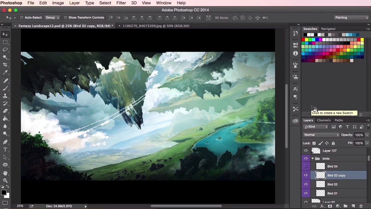
- Overview
- Transcript
3.9 Final Touches
In this final lesson you will learn how to add some finishing touches to your painting to really tie all the elements together. I’ll show you how to create a sense of scale in the piece by adding some smaller details such as birds and floating rocks.
1.Introduction
1.1Introduction01:31
1.2Adobe Photoshop Setup05:28
2.Shapes and Thumbnail Design
2.1Experiment With Shapes08:20
2.2Designing Shapes10:20
2.3Thumbnail Setup05:46
2.4Value Studies12:39
3.Painting
3.1Translating the Thumbnail08:19
3.2Initial Painting09:22
3.3Adding Texture08:31
3.4Design Development10:28
3.5Lighting and Colour10:19
3.6Clouds10:18
3.7Composition Adjustment10:56
3.8Adding Detail11:14
3.9Final Touches11:52
4.Conclusion
4.1Conclusion01:44
3.9 Final Touches
Hey guys, and welcome back to the final video tutorial for the Concept Art Environment course for games. So, in this video, we're going to go through the final touches of the painting. The small details, which will really help sell the idea of these floating landscapes, and the sense of scale and the epic-ness of it all. So to begin with, I'm just going to mark out and include some more cloud textures to the back of the painting, just to give it that extra sense of being really high up in the sky. So just putting it in the back layer, making sure that it doesn't overlap any of the foreground elements. So, these clouds don't necessarily have to be that painted or detailed. We just want to give a general sense of it and just let the foreground dictate the rest of the information. So just moving it around and try to see where it best fits within the composition. And then once I'm happy with that, just again, using the soft eraser, just blending it in. And a cool little trick here I used to increase the contrast, or level of detail, to an element is to duplicate the layer and then set the layer properties to multiply. And then you can use the brightness or contrast tool to fix up to the level that you like. You can experiment with different layer properties and to see what sort of gives you the best effects. So when I duplicate a layer, I usually go for multiply or for overlay or for screen. Just depending on what type of lighting I'd like to go for. So from here, just again, just duplicating it just to see what sort of effects it gives me. I'm going through the other layer effects. And just playing about with its colors here now. Just to see if I can make the sky blend in with what I've already got. And then it's just a matter of tidying the rest of the painting up. Making sure that the values are all correct. And that the distance and the sense of depth can be read correctly. Just send some elements back using the white brush tool, the soft brush tool. Or sending them forwards using the black soft round brush. So just analyzing it again, going through all my lighting layers, making sure everything is correct. Okay, now here we're going to use the bird shapes which I've designed a while ago. They're not as detailed at all because we'll be seeing them from a distance. So for these shapes I just reference some birds in flight from Google and then just simplify the shapes drastically using the lasso tool to draw them out. If you want, you can even use the hard round brush tool on a very small brush setting and just paint them on using a separate layer. But with these ones, we're gonna use these birds here that I've created just to show you how I personally like to position my birds within the composition of the painting. So I've dragged one in now and I've set the the bird on angle as usual, just using the transform tool to do this, and also just giving this the bird, as smaller size. The smaller the bird, the bigger everything else in the painting will seem because there will be a direct comparison. It just helps that sense of scale to compare different elements together within the painting, which is why you should always include smaller structures like rocks, rivers, trees and birds like these. And other general sorts of things that people can instantly recognize and understand the size of. So, I always like to position my birds in groups of threes. Or, a close group of threes, and another bird just sort of scatter spotted here and there. I find that the birds always read better when they're done in groups, as opposed to spreading your birds out all over the place. Like you would if you were to just have a spray can and just sprayed the bird shapes on. So just positioning them in a way which I find looks interesting. I'm varying the sizes of the birds here as well. So it looks like that particular bird to the left is a lot further away than the birds to its right. So yeah, once again, checking the lighting, checking the values, zooming in and out to see if everything is working correctly. And, just painting in some extra atmosphere, some extra clouds, maybe some extra elements here and there. Changing the lighting, checking my values, and seeing that everything works nicely. Okay, so here I'm going to start taking some little bits of this other reference photo of a mountain and to create some floating rocks around the focal point in the middle here. I'm just using the Lasso tool to chip away a bit at the texture in the reference photo, making a shape which seems interesting, and then translating it back into the composition. So using my transform tool here to stretch it or to warp it into a shape that I want. And then just moving around to see what sort of layer I want for these floating rocks to work at. So when I'm selecting the shapes from the mountain, when I'm using the lasso tool to mark out the specific shape, I'm just keeping in mind the lighting of the painting, of the original painting as well. So when I select this shape, I select something which has one half darker than the other. So in this case I want to keep the darkest side of the rocks on the right hand side, so that the light appears to be coming from the left of the painting. And it's consistent with everything else that's been painted on. So a good tip a lot of people use at this stage, and certainly the stages during the painting, is to flip the canvas horizontally. What this does is it gives your eyes a fresh view on what you've created, and it enables you to see things like inconsistencies, and paint things in which you may have missed. However, because of the sheer size of this painting at this point, it would have taken my computer a long time to just flip everything over. So, we'll just leave it for now. It's definitely good to keep in mind with your own paintings when you find yourself struggling with the composition, as I did a few videos back. So what I'm doing here is just selecting what's inside the layer by hitting Cmd or Ctrl and then right-clicking the layer. And then just using the Brush tool to emphasize the shadows and the lighting of the rocks. With this particular rock I want to show that it's a bit closer than the rest that I've placed. Again, giving the sense of depth that the floating rocks are not all on the same plane or axis. I just wanna darken it a little, and give it a hint of lighting here using the Brush tool. Here, I've merged the rest of the rocks, and then I've just given them the exact same treatment, painting over them, giving them a bit more shadow and lighting. It's a good idea to increase or decrease the level of brightness or darkness to some extent on the rocks, just to add a bit more variety and sense of depth as I said before. So just going through my layers and seeing if everything works correctly. Again, lighting some up and making sure the values are correct. So what I'm going to do next now is I'm gonna use the lasso tool and I'm just going to, whilst holding the Shift key on the keyboard, I'm just going to create some multiple smaller rock shapes just scattered around, just to give it even more variety again. And like I said, again an even greater sense of scale, having smaller elements around that will make the other elements seem a lot larger. So once you've done that, giving it the same treatment again, just painting in the lighting and the shadow, using the Brush tool. Exactly the same technique as the other rocks, except obviously without the photographic reference texture in there. So, there you have it. You can continue to tweak and to paint some detail into your painting, just to take it to completion using the same techniques you learned in this course. In the next video, we'll just go through a quick overview of all the lessons learned. See you there.


