
 Lessons: 16Length: 2.3 hours
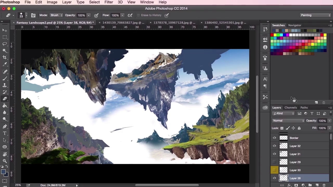
- Overview
- Transcript
3.4 Design Development
In this lesson we’ll start to develop the composition of the environment further. You will hear my thoughts and reasons behind this development as I demonstrate how you can continually change your painting so that it becomes a stronger piece of art.
1.Introduction
1.1Introduction01:31
1.2Adobe Photoshop Setup05:28
2.Shapes and Thumbnail Design
2.1Experiment With Shapes08:20
2.2Designing Shapes10:20
2.3Thumbnail Setup05:46
2.4Value Studies12:39
3.Painting
3.1Translating the Thumbnail08:19
3.2Initial Painting09:22
3.3Adding Texture08:31
3.4Design Development10:28
3.5Lighting and Colour10:19
3.6Clouds10:18
3.7Composition Adjustment10:56
3.8Adding Detail11:14
3.9Final Touches11:52
4.Conclusion
4.1Conclusion01:44
3.4 Design Development
Hey guys, and welcome back to the concept art environment course for games. In this particular video, we're just going to see some major changes made to our initial thumbnail design as we continue to evolve and develop the composition and ideas of the overall painting. So the whole thing has been a pretty lengthy process and we've already gone through the majority of the techniques needed for this stage of the painting, so I'm just gonna go ahead and speed through, fast forward this video, so you can get a general idea, a general gist of what went on when making this concept painting. What I'll do, whilst we're going through the video, I’ll go through my thoughts and processes when I was developing it. So as you can see here, I'm just starting to lay the shapes and starting to really pinpoint how they should look in the painting, just getting those edges correct and removing parts which I don't need anymore. And just getting a better feel for what the painting is about and what it should look like. This video is all about putting down the details, as you've seen before, the textures and the painting, down very, very quickly. So we've gone through most of the techniques that you should be familiar with now. In order to work through this particular process so, you'll notice that when it comes to the details, I'm not too worried about making sure that every leaf is correct, or every rock is correct, or every blade of grass is correct. Like I said if this isn't a map painting, this is something which you can show your art director who can then pin it to the wall or just pass it round in the studio, and something to show the game designers and the creative directors so they can get a real, a general sense of what this particular level will look like, or what the location will feel like, and potentially what the game play will be. Just stuff like that. So here I'm just trying to increase the level of the sense of depth here by adding more structure to the floating islands and giving it a sort of halo ring effect on the top left corner here. Just experimenting with the brush tool and seeing where it goes, exactly like how we were using the thumbnails. So just, again, just always switching between the sew tool and painting and using the textures from our photographs. At the moment just concentrating on the composition here and seeing how the painting goes. I'm going to add a little bit more detail to the top mountains on the right here. Again, just using these textures to really aid us in how these mountains are going to work and how these shapes are going to work. Different sources and just experimenting again. And now these top mountains here, they're gonna be very, very close to our light source so I want to make them as light as possible, just to give it that epic feeling. Just trying to experiment with some shapes using the brush. Again just remembering to use the eraser tool as well. Just like the brushes, just set it to the setting that you're using at the time, and just use it to sculpt whatever you're painting. I'm just trying to create an interesting shape to these floating islands here. Sometimes reusing the same textures to try and get something that works. It's quite often that once you get lost in this process you forget about checking your values as well. So just keep an eye on that as well as keeping an eye on creating your structures and your details. So, just adding the values here and keeping those mountains light, just creating a sense of contrast between the top half and the bottom half of the structure here of the floating island. Just keep adding more and more depth to that bit. And you can see now how the painting has progressed since we added the thumbnail in. It might not be 100% the same as our thumbnail but the idea is still the same. It was a good starting point for us, so that's all that matters. Just going through my layers and checking if everything's correct, revisiting that structure on the left there. You'll see that sometimes I take the already painted textures and just see if I can try and use them elsewhere. Just using the transform tool to stretch and to make it into something new. Using the warp tool to manipulate the shapes into something that I want it to be. Just borrowing textures again. Switching back and forth. Still looking at the composition, still experimenting. Always keeping values in mind. It's good to use the values check layer when you can as well, just to make sure you're using the right values. Sometimes I group certain elements together, so you'll see that I'll have grouped these floating islands and color coded them, so I know what they are. And then you can sort of transform the whole group and move the whole group around. Maybe even merge the whole group together and do it that way as well. See that I'm starting to think about the composition, now just moving slightly here and there, these land masses, and seeing how they all work. So I'm not quite happy about how the top right structure is at the moment, so I'm just going to change it around and move it about. Just adding more to the bottom there, just to make it a little bit more epic. Just using the transform tool again, using the lasso tool, just painting it out, eraser tool, molding it in. Just always checking and just experimenting. At some point, you'll have to organize all your layers, like I said, as well, then. Just make sure. You'll come up with your own way of working but the way I work is I'll just assign one group to a specific path to the painting. So I'll have one group in the background for sky. I'll have another group in the foreground for the lighting, and then I'll have separate groups for different parts of the painting. Perhaps I'll have one for trees, one for leaves, one for the ground. In this case I'll have a few for the top floating islands there, and then a couple for the islands that are towards the bottom of the painting. Okay, so that's it for this video. In the next video, we'll be going through some lighting and color. See you there.


