
 Lessons: 16Length: 2.3 hours
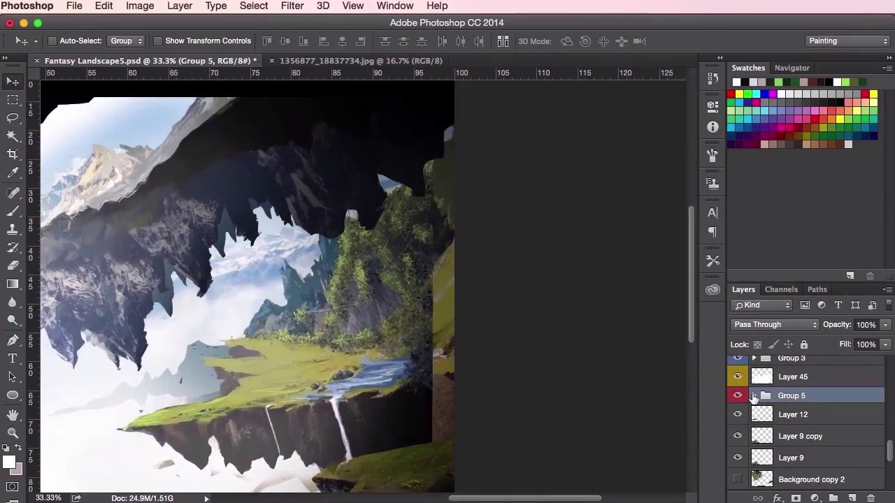
- Overview
- Transcript
3.5 Lighting and Colour
In this lesson you will learn some simple tips and tricks on how to use lighting, contrast and saturation to push the viewer’s eye around the composition. Adding lighting will really help start to add that ‘polished’ look to your painting, as it ties all the different elements together. You will also learn how to implement certain lighting and shadow techniques to the leaves and trees within the painting.
1.Introduction
1.1Introduction01:31
1.2Adobe Photoshop Setup05:28
2.Shapes and Thumbnail Design
2.1Experiment With Shapes08:20
2.2Designing Shapes10:20
2.3Thumbnail Setup05:46
2.4Value Studies12:39
3.Painting
3.1Translating the Thumbnail08:19
3.2Initial Painting09:22
3.3Adding Texture08:31
3.4Design Development10:28
3.5Lighting and Colour10:19
3.6Clouds10:18
3.7Composition Adjustment10:56
3.8Adding Detail11:14
3.9Final Touches11:52
4.Conclusion
4.1Conclusion01:44
3.5 Lighting and Colour
Hey guys, and welcome back to the concept art environment course for games. In this video, we're gonna go through some simple tips and tricks on how to incorporate lighting and color into your piece. So you'll see in this first instance here I used lasso tool quite a lot to help aid me to find the shapes of the rocky structures or mountains here on the left. I want to try and emphasize the lighting here. So I just used the lasso tool, fill it in using either white or black, and just using the opacity setting to find out the right value that I want. Same goes for the bottom part of the structures here, you can see I've made it darker. So using a black paint bucket instead of the white and then just playing about with the opacity. So well I begin to just block out some ideas for the river and some waterfalls just to help give this painting a sense of scale as well. At this stage of the painting, the lasso tool kinda of replaces the brush tool quite a bit now. As I'm starting to define the structures a bit more and just wanna go for a more sharper, more defined edges and shapes. So just continuing to paint along using lasso tool as well as the brush tool. And now here I'm just gonna start using a leaf brush. Again you can find plenty of leaf brushes online and on Google. Now just detailing the leaves and the trees here, are helping blend everything together using different colors that you can color pick from the photographic reference here. You can start up just by defining off the darker leaves just getting some sense of light and structure using this leaves brush. With light leaves helping to paint and define where the light is coming from and darker leaves to indicate some more shadowy areas. So you can see here just gently varying the shades of the leaves. Just dabbing in some brighter leaves there and just defining the structure of these mountains a little bit more. So just continuing with the varied lights and dark colors of the valleys of the leaves. And you also, again, just use the eraser tool to sculpt everything out as well. So, I'm just continuing to define those bushy areas, using different colors of the leaves, dark and to light, to dark. Just experimenting with the form. And now over to the left of the painting, exactly the same thing, just color picking the shades of the leaves that you want. Starting from dark and then moving on to light, and then going back to dark again. Like I said, you can also use the eraser tool. Set the brush settings of the eraser tool to exactly the same as the brush that you're using. In this case it would be the leaves. And then just use that to help sculpt the shape of your leaves out. So yeah, again just using the soft round brush tool. You should always be constantly checking and rechecking your values, remembering how the farther away something is, the lighter it should appear. And then using the lasso tool and paint bucket trick to send things back or just simply adjusting the brightness and contrast of a layer to achieve a similar effect. So here I'm doing the same with the foreground, just marking it out and using the paint bucket tool to make it darker instead of lighter, just to add that sense of contrast to the structures here. So you can see I'm always adding bits of photographic reference just to play about with composition to see where things will work and where things wont work. And just experiment really, cause like I said again you could always come across some really cool happy accidents. And that's the sort of thing that we're going for. Just enjoying the process. So yeah, using the brush tool to paint some elements in, some flowers in. Perhaps some grass using another brush that I found on Google, a grass brush. Again, you'll find plenty of those. Just always zooming in, and zooming out to check the overall structure and composition of the painting just to make that everything's working right. So a nice little trick on how we unify the colors here. So just create a new layer, fill it in with any color that you think would fit the overall mood of the painting and then just make sure the layer sits on top of everything. And just go to the layer adjustments and just above the Lock button, select Overlay. Set the opacity down till you're happy with the result, and then as you can see here just using the hue and saturation tool, just playing about with seeing what sort of colors go well with the image. Just adjusting it and and experimenting with the options here. Let's see what sort of results you can achieve. So you can do that quite a few times. If you're not happy with the color there you can choose another color and once your happy with that just star select the round brush tool. And we are just going to start painting in some light rays. So from there, just making sure you've got the soft round brush tool and make sure you set it to white, the color to white. And just using the brush tool, just lightly brush across the painting where you want your light rays to be. So, yeah, the idea here is just to visualize the light source coming out from the top left just a little bit more. So now as we brush these light rays in, they may appear a little bit harsh at first. So it's a good idea after you've laid them down to just play about with the opacity settings on the bottom right of the screen there, just on top of Fit. You can also go into Shape Dynamics to modify the strokes of your pen just so that they can react to your pen pressure if you got whack-on tablet. So again, just playing about with brushing these light rays in, then going back to your opacity settings as before just to soften them up a little bit and making them just a little bit more subtle. We can also use the Transform tool here to help us position these light rays which may work better for us. Stretching it and rotating it until we're happy with the positioning. Also, remember you can also use the soft round eraser tool to help you with blending these light rays in. Making sure that you set the opacity and the flow settings at the top there to something which is quite low. So you'll see I've set mine here to 39% and 54%, but it really doesn't matter what setting you make it, as long as it's not 100. Just experiment, and see what works. And then lastly here, we can check the values once again, increasing the contrast between the two structures on the bottom right here, as well as just adding a bit more lighting and atmosphere using the soft round brush tool again on the layer behind the foreground elements. Just dabbing it on, and playing about with the opacity settings as usual. So that's it for this video. In the next video we're going to go through a personal favorite of mine, which is how to paint clouds in your painting. See you there!


