
 Lessons: 16Length: 2.3 hours
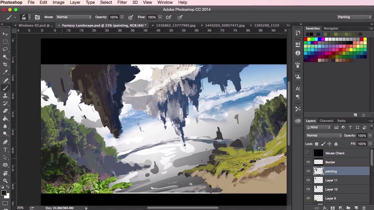
- Overview
- Transcript
3.3 Adding Texture
In this lesson you will learn how to add and blend in texture from photographs into your painting, helping your environment achieve a sense of believability. You will learn different rendering techniques that will help you incorporate the textures efficiently and realistically.
1.Introduction
1.1Introduction01:31
1.2Adobe Photoshop Setup05:28
2.Shapes and Thumbnail Design
2.1Experiment With Shapes08:20
2.2Designing Shapes10:20
2.3Thumbnail Setup05:46
2.4Value Studies12:39
3.Painting
3.1Translating the Thumbnail08:19
3.2Initial Painting09:22
3.3Adding Texture08:31
3.4Design Development10:28
3.5Lighting and Colour10:19
3.6Clouds10:18
3.7Composition Adjustment10:56
3.8Adding Detail11:14
3.9Final Touches11:52
4.Conclusion
4.1Conclusion01:44
3.3 Adding Texture
Hey guys, and welcome back to the Concept Art Environment Course for Games. In this particular video, we're just going to continue on from the painting techniques shown from the previous video. This time however, we're gonna want to start thinking about our values, and giving some sense of depth into the painting. So just starting off from where we left off from the previous video. What we want to do here is just go back to the library of photographic references again. And just using the Lasso Tool, just mark out the areas roughly of what you want to use. Again, there's no need to be 100% accurate. You can see that I'm being really, really rough here. Just because we're more interested in the form, the shapes, and the textures really, and the colors, to the accuracy of having to really place a structure into the painting. So with this particular photograph, I want to try and make use of the sense of depth it already has. And where there are some very close natural elements, that you can see on the bottom left here. As well as some really quite far-away-looking rocks and cliffs in the background. So sometimes key bits of photographic reference can really aid you and help you in your painting, helping you bring forth some ideas. And sometime even some happy accidents can occur, and be potential nice key focal points. So yeah, that's what I'm trying to think of in the left here. I want to try and emulate that sort of sense of depth. And that the key, grand, the scale of the epicness, like I said before. So just using the Transform Tool, Cmd or Ctrl+T. And just play about with your references and shapes. And to see what sort of placement works best. And then switching back and forth, from placing your references and playing about with the composition, to painting. And just using your Brush Tool to kind of blend everything together. To form new shapes of your own, while still keeping things fairly loose. So we're just gonna speed up the video here. Because this process can take quite a bit of time. And we've already gone through quite a lot of the techniques from this video and the previous video. Yeah, just going through the whole thing. Switching back and forth from your photo references, like I said before, to painting. And when you feel you need some extra texture, just go back to your photographic references again. Making use of the photo's natural light to help aid you in your own painting. So this is something, after a while, you just kind of pick up. You kinda want to work out what kinda textures will work where. And so using different textures to form your own structures may take a bit of practice. And you have to get a little bit of an eye for it. So here, I'm just going to create a values check layer to check if my values are correct. What you want to do here is just simply create a new layer. Fill it using the Paint Bucket Tool in black. And then just set the Blending Mode here to Saturation. Make sure that this layer is on top of all your layers. And it should make everything appear in grayscale. Which makes checking your values a hell of a lot easier. So yeah, just remember that the closer elements and objects must appear darker than the elements behind it. So elements and objects in the foreground are darker. Background elements and things like that will appear lighter. Okay, so I'm just gonna grab a bit more photo reference. And just putting it in some background mountains here. A lot of texture placement is just about adding noise to the painting, really. So when you paint a texture in, or when you paint over your photo reference, it's not meant to tell you too much about those shapes and about those rocks here. Just indicating a tiny bit of information, which is all you need, really. That tiny bit of information to just sell the fact, and to communicate to the viewer just about what they're really looking at. If you look at a lot of concept paintings and even a lot of master paintings, they're detailed in the focal areas. But in the areas that aren't the focus, the places that you don't necessarily want the viewer to look at, you can leave them fairly loose. And what you'll find is that, once the image is viewed as a whole, the human brain will fill in those details and overall shapes, etc. And are detailed out. So you'll see here that I'm using the same photo reference again in different places. Using the same tricks as before, transforming, rotating, shrinking. And just moving it around in places to find out what works. The good thing about reusing the same elements is that it helps sort of bring everything together. And the overall painting is one piece, as though everything belongs together. So just painting away, using the soft, round Brush Tool to blend the elements and the photographs together. Switching back and forth with the Lasso Tool again. Just using the Lasso Tool to really sort of define the shapes in the backgrounds, and the mountains. And using the soft, round Brush Tool to create a sense of atmosphere, a mist in the background. And then switching back to a painting brush to create the forms. Just a lot like how we used the Brush Tool when we were creating the thumbnail paintings. Just letting it move and dictate the shape of the mountains here. And just coming up with interesting shape. So what you'll find sometimes is certain elements, when you're working on the thumbnail that works quite well, may not translate as well onto the actual painting itself. So things like the bridge in the background there, which was a cool idea at the time, has become a little bit distracting on the eye as we're working on the painting here. So I've had to get rid of that. Not to say that we may not bring it back in a little bit later on. But we just wanna concentrate on just coming up with an interesting composition. And really using these textures to bring the painting to life. So yeah, that's it for this video. In the next video, we'll go through some basic design development with the painting and go on from there. See you there.


