
 Lessons: 15Length: 1.5 hours
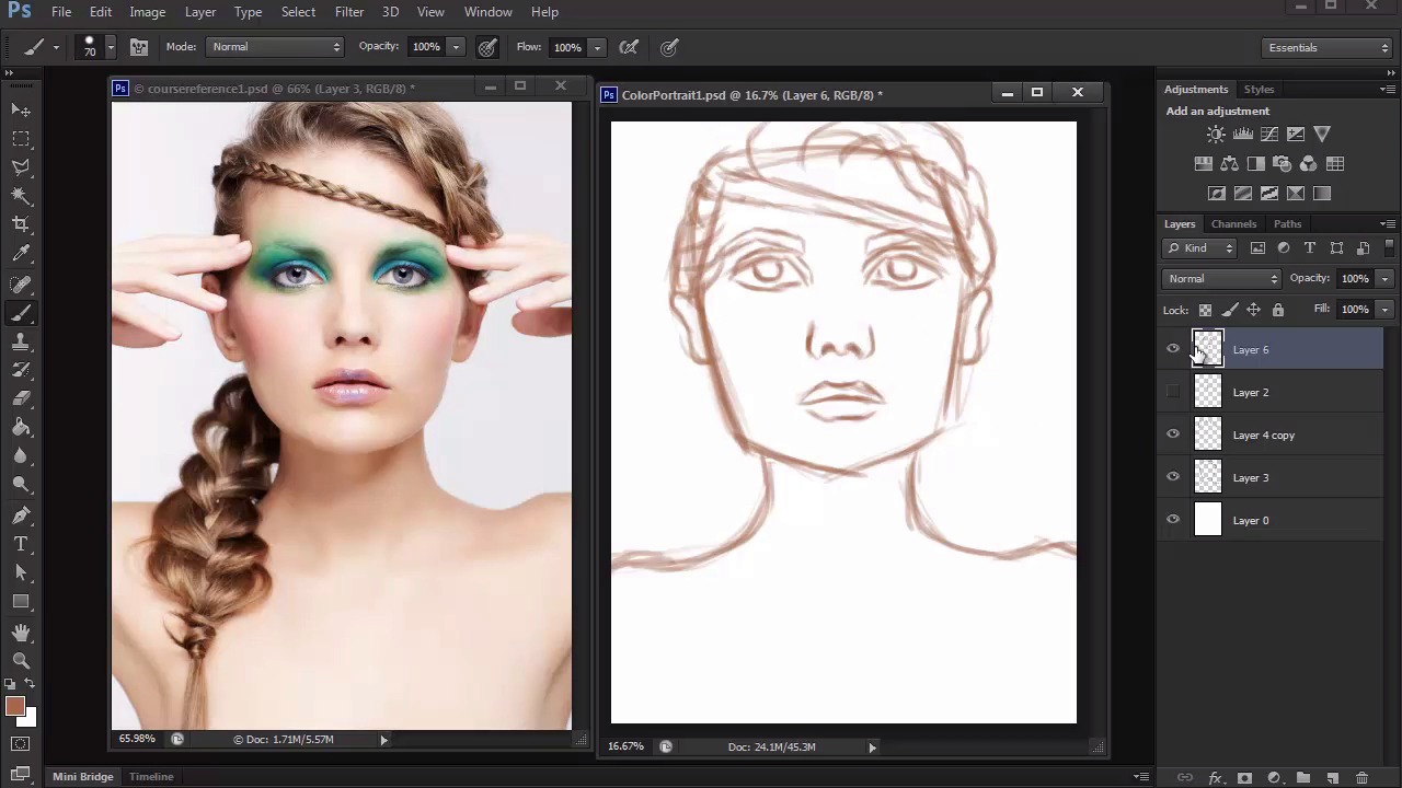
- Overview
- Transcript
3.1 Sketch
In this lesson we'll take a rough sketch that was created for the placement of our subject's features, and use it as our guide to create a much cleaner sketch that's ready for us to paint.
1.Introduction
1.1Introduction01:27
2.Setup
2.1Your Workspace02:36
2.2Creating Custom Brushes07:13
2.3Understanding Your References07:52
3.Paint a Simple, Colorful Portrait
3.1Sketch10:21
3.2Exaggerating the Features04:57
3.3Prep and Create Your Base Colors05:42
3.4Shading06:09
3.5Final Touches, Color Portrait09:27
4.Paint a Textured, Grayscale Portrait
4.1Rough Sketch06:14
4.2Creating a Textured Base05:44
4.3Shading With Textured Brushes06:21
4.4Polishing Your Portrait With Soft Brushes06:06
4.5Final Touches, Grayscale Portrait07:25
5.Conclusion
5.1Conclusion02:31
3.1 Sketch
Hello and welcome back to Digital Portrait Painting in Adobe Photoshop. My name is Melody Nieves, and for the first lesson of chapter three, we'll create a simple clean sketch for our colorful digital portrait. Remember our setup from before, to start off, we've got everything ready, including our reference, navigator, and blank document. Some might say, that how you begin your painting determines a lot about the outcome, and there is a bit of truth to this notion. But I want you to take in that idea while also realizing the limitless potential of Photoshop, and that your painting can change at anytime. So, before we create a clean sketch for us to paint, we'll need a rough one to figure out the placement of all our model's features. When working traditionally, you might see some artist create three to four sketches on paper before they even begin the painting process. They might start off with a couple of thumbnails first, lead to a rough sketch, and finally, clean up the sketch so that they have an easy transition into painting. Sometimes it's a great idea to get in the habit of doing things almost like you would traditionally. You don't want the ease of the software to make you too complacent. So, if you need to do a couple of drawings first, just knock them out so that the painting process is much easier. Trust me, you definitely won't regret it. Now, let's move on to our rough sketch. I'll use the brush we created specifically for sketching, because it'll have a nice tapered end. And enabling pen pressure for opacity is a good idea if you like to sketch with a really loose feel. First, make a couple of test strokes to make sure you like the current brush settings where they're at. Then hit E on your keyboard to bring up the Eyedropper tool. We'll use this to pick up some color from our reference, so that we can sketch with something other than the color black. Make a couple of more test strokes again, and begin sketching the outside of the face. Now, it's perfectly fine if you're used to sketching in black, but usually at some point you always end up painting over your black lines. By doing this, it instantly makes the painting look more 3D. To avoid all of this extra work and kind of cheat the process a little, use a different color, especially a skin color for your sketch. You'll also see later, how we take this step even further by blending the sketch into our base colors. Once you have the initial structure of the face, add a couple of guidelines to help us map out the eyes, nose, and mouth. Draw each feature onto its own new layer, so that it's more flexible to work with. As you start drawing the first eye, Ctrl+J to duplicate it, then go to Edit > Transform > Flip Horizontal. Now, you have two perfect eye shapes. Drawing the face gets a lot easier once you add each detail because you can use them to compare distances between one another. For instance, in order to figure out where to draw the nose next, I can refer to the original picture and see that the corner of the eyes measure up with the sides of the nose. And one of the things I really like about having the picture right next to the document, is that all you have to do is drag your brush cursor from the picture over to the drawing to see exactly where the lips should be placed. These little measuring tips are normally picked up in a traditional art class, but because many digital artists are self taught, learning about likeness becomes a lot about trial and error. Continue to sketch the rest of the model. Since I find her hands to be really distracting at the moment, I've decided against including them in this sketch. Omitting certain details or making small changes with position and alignment is one of the many ways you can separate your drawing from the original reference. However, because the hands cover up the hair, it will force me to improvise, and create my own interpretation of what those hair areas look like. You may have noticed by now that I don't stay on one detail for too long, or complete them entirely. This helps me make sure that I am taking into consideration the relationship that each detail has to one another. Because if you get too carried away on one step, you might realize that other details don't line up the way they're supposed to. If I need to I use the Selection and Free Transform Tools to continue to edit the size and structure of the face until I'm happy with it. And since I've already figured out the placement of most of the features, all I have to do now is evolve them to include more detail. Just like with the eyes, I'll flip a copy of the ear and position it into place. I then move into the hair and face while also referring back to the reference for more clues on anatomy. At this rough stage, it's not essential to draw the hair perfectly. All I really need to know is the position of the braid across her head, and how her bottom braid will flow along her body. Once I'm done I can move on to a much cleaner, and more detailed sketch. We have all of this convenient when it comes to what's available to us in Photoshop. These tools help us create sketches and paintings faster than what we could ever create traditionally. But unfortunately, that same convenience also makes us very impatient. Especially in regards to beginners, the idea of creating another sketch when we've already got this one done seems completely unnecessary. It can also be very daunting as you start to think to yourself there is no possible way I could draw a better sketch than this one, so I might as well just paint it, right? Well, clean sketches always result in much cleaner paintings. First, place the layers of the rough sketch into a new group. Bring down the Opacity of the group to 50%, so that we can use it as a guideline to trace. Then add a new layer for its cleaner version. Using the same tapered brush from before, deselect pen pressure for opacity so that the pen strokes are now completely solid. Choose a brown color from the color picker, and begin tracing your sketch. This part is pretty self-explanatory, but it's important to take your time. Draw a much cleaner sketch with solid lines, and use the eraser tool whenever it's necessary to clean up the edges. Sometimes I get into the habit of drawing while zoomed out, but you'll definitely have to zoom in to make sure the face features are perfect. Use this step to really begin evolving each detail. Add strokes of hair to the eyebrows to make them realistic. Clean up the shapes of the nose and mouth, and add details you may have forgotten. Like the true anatomy the ears. Once I move on to hair, the first task on the agenda is to focus on her braids. In order to draw braids effectively, you have to study how each strip of hair overlaps one another. You should never draw a braid with straight lines. Instead, aim for curvy lines that flow well together. And create interlocking shapes of the letter c all the way down the braid. In fact, you should try to vary the volume of the braid as much as you can. This imperfection will actually make the painting look more natural and realistic. Continue to add more strands to the hair, try to follow the natural movement that's already been established. Although, your reference will tell you a lot about what you need to know, it's also a good idea to study how other people draw hair. Practice creating voluminous shapes, and try to see how many lines are actually needed in order to illustrate their movement. Sometimes, less is more. And the braids you've already drawn should be a good guideline of the curves you'll need for the hair strands. Follow them and concentrate the lines towards the point where braid interlocks. This enforces the illusion that the braid is constricted in the areas where the hair strands gather together. If you're confused about this step, one way you can approach it is to draw normal curves of the strands of the hair. And just use the eraser tool to softly erase the middle sections of each braid. Not only will this help it to look more realistic, but it will also show how the light bounces on her hair. You'll also notice that our braid is much shorter than the models. This is perfectly fine because we've made it wide enough to compensate for the fact that we're missing the hands in our illustration. And by now, you can already tell that by removing the hands, we have uncomplicated this illustration and really made the pose much more straightforward. Continue to add to your sketch, until you feel you have enough details to move onto painting. I finished this sketch off by drawing some more last minute hair strands, and adding the pupils to the eyes. Before we move on to painting with color, let's make an adjustment to some of our model's features. By exaggerating them, we can achieve an almost caricature like effect for a fun, whimsical painting. So, join me in our next lesson where we'll learn a simple technique to exaggerate our subjects features using the Free Transform Tool.


