
 Lessons: 15Length: 1.5 hours
- Overview
- Transcript
4.3 Shading With Textured Brushes
In this lesson we'll use the textured brushes from our setup discussion to create the shading for our portrait.
1.Introduction
1.1Introduction01:27
2.Setup
2.1Your Workspace02:36
2.2Creating Custom Brushes07:13
2.3Understanding Your References07:52
3.Paint a Simple, Colorful Portrait
3.1Sketch10:21
3.2Exaggerating the Features04:57
3.3Prep and Create Your Base Colors05:42
3.4Shading06:09
3.5Final Touches, Color Portrait09:27
4.Paint a Textured, Grayscale Portrait
4.1Rough Sketch06:14
4.2Creating a Textured Base05:44
4.3Shading With Textured Brushes06:21
4.4Polishing Your Portrait With Soft Brushes06:06
4.5Final Touches, Grayscale Portrait07:25
5.Conclusion
5.1Conclusion02:31
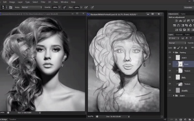
4.3 Shading With Textured Brushes
Hello. And welcome back to Digital Portrait Painting in Adobe Photoshop. My name is Melody Nieves. And this is Lesson 4.3, Shading With Textured Brushes. It was important for us in Lesson 4.2 to create a textured base for our painting. This base allows us to figure out how we want our painting structured. Our two main bases for the background and subject now provide us with an anchor for us to apply even more changes. These changes occur through clipping masks that allow us to paint only on the layers that they're clipped to. And by painting on several different layers, we have given ourselves the flexibility to experiment and even make mistakes. With this lesson, I want you to consider that we're still a little ways away from having a concrete portrait, but the purpose of these underlying layers of texture is that they give our portraits so much character. Not only that, but the easiest way to make digital art look more realistic is to add a bit of grunge or texture to your work. In fact, you can usually tell the difference between traditional and digital paintings because most digital paintings are smooth. This happens because the artists use primarily round brushes for their entire painting. Traditional art, however, naturally has texture to it because of the bristle brushes artists use. Now, of course, there is nothing wrong with primarily using the round brush, but the possible downside is that it's just a little more unnatural looking. After all, most things in nature do have texture. You're also limiting yourself when there's all these great brushes in Photoshop and online that you can work with. Before we move on to shading, I just want to make a quick mention about file size. Digital paintings, especially at a resolution of 300 DPI, can greatly slow down your computer, forcing Photoshop to lag considerably. There are several ways you can combat this, which I've written about here on Tuts+. But the two most common ways is to either save your painting over multiple files or to make sure you merge layers together often. The number of files you'll need for one painting greatly depends on what your computer can take, but merging layers together helps a lot, because every time you merge, the file size gets smaller. Here you'll see me doing this by merging layers that are alike, like the clip layers that I used of the model and background. Now we can finally move on to painting. Using the same chalk brush as before, I immediately attack the darkest shadows of the image first. In order to build upon the realism of our portrait, it's good to gradually decrease the appearance of your sketch layer, because the more that your sketch shows, the more 2D your painting will actually look. Here I bring down the opacity to 70%. And although it may seem like the details are harder for me to see, a lighter sketch will allow me to really focus on recreating the lighting scheme for this portrait. With gray-scale paintings, I like to try to deal with the darker tones first, because it's always easier to add highlights once you understand where the shadows begin and end. Since the darkest tones on the model are on her hair and face, I do my best to carve out these tones using the same chalky brush. A bad habit for many beginners is to assume that every detail needs shadow, but if you look closely, our base layers have already set up where the mid and lighter tones of the portrait will be. So it's really not necessary to touch these areas with dark paint at all. Let the the lighter tones peek underneath and you'll save yourself time having to repaint those areas with highlights all over again. As I move on to hair, I concentrate the shadow towards the bottom of each curl. This will create the illusion that there is weight there and will help to show off the curves created by the hair. By focusing on the darkest shadows first, you'll see that it really doesn't take much to see your painting take form. Keep yourself busy by constantly changing which area of the painting you're working on. By doing this, you'll keep refreshing your eyes so you can concentrate on other details. Next I go back to the hair to add more texture and slowly define the shapes for the curls. Although I'm not looking to make an exact replica of each hair follicle, I still want to get the general movement down pat. And when I look at the model, I know to concentrate the bigger, bouncier curls towards the top of her hair and let the others softly cascade down. Luckily, since the hair curls together at the bottom, you can kind of be a little looser with each brush stroke, because most of the curls are just tangled together anyway. Of course, it's also important to not forget the rest of the body. Just like before, we allowed the dark shadow to do all the work for us in establishing the bone structure for the clavicle. And although it can be a little hard to commit to black, it's important that you eventually work in the darkest possible tones, because it will add more overall sharpness to the face structure, especially around the eyes, nose, and neck. As we close in on the end of this lesson, it's always a good idea to flip through your layers to see how far you've come. I do this often to remind myself that I've still made significant progress even if I sometimes feel like the end result is far away. Let's see the progress of this portrait by toggling the visibility of the shadow and base layers. It's easy to feel like you're not getting far, but, as you see, when we turn the layers back on, the painting is getting closer and closer to our original picture. We've worked extensively with texture for this gray-scale portrait, but now it's time to blend things out. So join me in our next lesson where we'll learn why the standard round brush makes the perfect blending tool.


