
 Lessons: 15Length: 1.5 hours
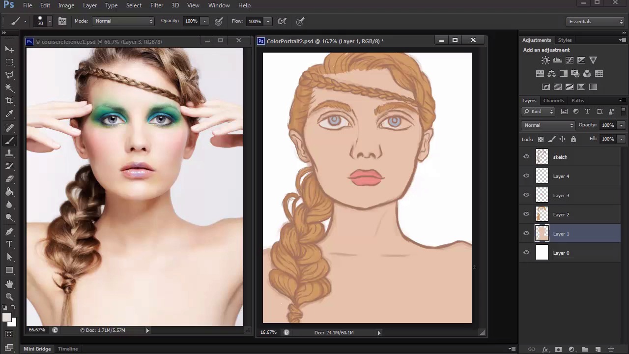
- Overview
- Transcript
3.3 Prep and Create Your Base Colors
Learn how to organize your document for moving on to color. We'll find the perfect base colors using the Hue/Saturation adjustment layer, and use Clipping Masks for better workflow.
1.Introduction
1.1Introduction01:27
2.Setup
2.1Your Workspace02:36
2.2Creating Custom Brushes07:13
2.3Understanding Your References07:52
3.Paint a Simple, Colorful Portrait
3.1Sketch10:21
3.2Exaggerating the Features04:57
3.3Prep and Create Your Base Colors05:42
3.4Shading06:09
3.5Final Touches, Color Portrait09:27
4.Paint a Textured, Grayscale Portrait
4.1Rough Sketch06:14
4.2Creating a Textured Base05:44
4.3Shading With Textured Brushes06:21
4.4Polishing Your Portrait With Soft Brushes06:06
4.5Final Touches, Grayscale Portrait07:25
5.Conclusion
5.1Conclusion02:31
3.3 Prep and Create Your Base Colors
Hello and welcome back to Digital Portrait Painting in Adobe Photoshop. My name is Melody Nieves, and for lesson 3.3, it's time to add color to this portrait. But first, we need to prep it for color. Many artists like to use already-made swatches for the color scheme of their paintings. But if you remember from earlier, I closed out of the swatches panel to free up some room for my work space. The other reason why I did this is because I try to avoid using swatches unless it's absolutely necessary. Every person you paint varies in color in skin tone, so I'd hate to get too attached to using the same swatches over and over again. Of course you can approach this decision in the way that works best for you. But for me I'd rather learn to create the base colors from scratch for each new painting. Although figuring out the base colors for your portrait can seem hard, it really isn't all that bad if you let hue and saturation help. To prove this, I'll fill in the model's skin with a bright color that you wouldn't normally use for skin-tone. Go to color picker and select a bright random color to fill in your sketch. I decided on this beautiful greenish-blue color. Now use a hard, round brush set to 100% opacity with no pen pressure enabled, to begin painting on a new layer. To change this color to a more recognizable skin tone, let's go to image, adjustments, hue and saturation. First move the slider for hue from left to right until that original green color starts to look brown. To get the shade of this color we'll need, lower the saturation then increase the brightness until you come up with a light tan color that'll work well as a base. Continue this technique with each detail of your painting until you have several solid bases for the hair, lips, and eyes. These colors don't have to be the exact colors from the original reference. So feel free to experiment until you decide on colors that you would like for your own unique interpretation of this portrait. Use the same color for the hair to fill in the eyebrows. And don't forget to add color to the whites of the eyes. When you're finished creating your base colors, merge the layers together, and lock the transparent pixels. By locking the transparent pixels, you have now created a layer that you can paint on without going outside of the base border. Here I demonstrate this by painting a bright red color onto the locked layer. You see, no matter where I move my brush, the red will always stay within the parameters of the locked layer. Before we move onto the next part of this lesson, let's quickly address the setup of our layers. So far, we have three layers dedicated to the sketch, base colors, and white background. For each one of these, I'll add a new layer set to clipping mask. By setting these new layers to clipping masks, I'll be able to affect only the layers they're masked to. Not only will this allow me to fully experiment without disturbing the original base, but I can also make sure I'm only painting within the borders of the masked layer. Now let's color the sketch so that it blends better with our bases. To do this, select a new layer above the sketch that has already been set as a clipping mask. Now use the eyedropper tool to select colors from each different base, and use that source color to paint over the sketch with the brush set to 50% opacity. Keep each color you use designated for that particular section of the sketch. So naturally, I'll use the blonde color for the hair sections, the tan color for the face details, and the blue and pink colors for the eyes and lips. Coloring over your sketch helps you save so much time down the line since you won't have to waste any time later painting over the lines. This would be particularly annoying if the original sketch was done in black, seeing as though harsh black lines make realistic paintings appear more graphic and cartoonish. As you complete the step though, you can already tell the difference and see how this change instantly makes your simple painting appear more realistic. Go to Image, Adjustments, Hue and Saturation to bring out the saturation as well as darken these colors for a more intense sketch. Now that we have a great base to work from, it's time to start shading. So join me in our next lesson, where we'll learn how to incorporate layer blend modes into our workflow for easier shading.


