
 Lessons: 16Length: 1.3 hours
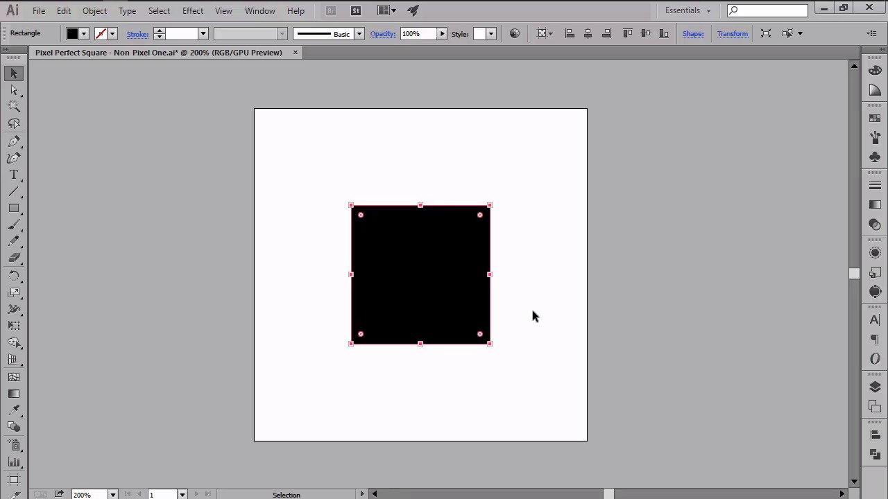
- Overview
- Transcript
2.2 Defining the Concept
In this lesson we will talk about the elusive “pixel-perfect" concept, and explore it by defining and then comparing it to non-pixel-perfect artwork, so that we can better see the differences between the two.
1.Introduction
1.1Introduction01:37
2.Understanding the "Pixel-Perfect" Concept
2.1Understanding How Illustrator Works02:26
2.2Defining the Concept04:09
2.3Advantages of Using a Pixel-Perfect Workflow03:01
2.4Introducing the Grid06:29
2.5Correct Use of Measurement Units06:09
3.Pixel-Perfect Workflow
3.1Adjusting Illustrator for a Pixel-Perfect Workflow04:49
4.Creating the Icons
4.1Size and Consistency05:54
4.2Creating the MacBook Icon06:30
4.3Creating the Window Workflow Icon06:03
4.4Creating the Designer Resources Icon06:11
4.5Adding Colors06:56
4.6Adding Finishing Touches: Highlights and Shadows08:23
4.7Creating Size Variations05:16
5.Saving for the Web
5.1Exporting the Icons03:16
6.Conclusion
6.1Conclusion01:32
2.2 Defining the Concept
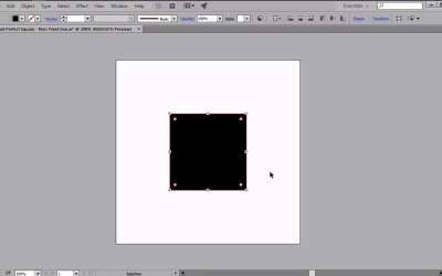
Hi and welcome back to Creating Pixel Perfect Icons in Adobe Illustrator. My name is Andrei Stefan and we are currently at lesson 2.2 Defining the Concept, Comparing Pixel Perfect Artwork to Non-Pixel Perfect ones. If you remember right, in the previous video we talked a bit about how illustrator works or more precisely how vectors work compared to lesser images. In this video we're going to begin our exploration of the pixel perfect concept, and we will do that by first trying to define it. So, what does the phrase pixel perfect actually mean? Well, if you do a quick search on Google for Pixel Perfect meaning or definition, you will shortly realize that there is not one unified definition of the concept out there. The results page will display lists of a couple of forms and blogs that try to explain the concept, but this is mostly done from a webdesign perspective or the emphasis is on the way you arrange the building blocks of a web page from a PSD to the actual code. Although the information is a bit fragmented, once you start reading through the lines, you will start noticing a few common attributes such as precise positioning, careful use of measurements, and sharp details. Even if, at first, these might not seem like much, they are the actual three pillars of a pixel perfect work flow. So going back to our original question, we can define pixel perfect as a rigorous workflow where the designer creates using the pixel grid as a frame onto which he will carefully lay down his elements using precise positioning and correct use of measurements. We will elaborate more on these three pillars, but for now a clean definition will do the trick. So, we now have an understanding of what Pixel Perfect is, but how does it actually look like in the real world compared to non-Pixel Perfect artwork? Let's start with the most basic example, where we will compare two 100 by 100 px squares, one Pixel Perfect and one not, and see what happens once we zoom in on them. I've chosen this geometric shape since its sharp edges can easily reflect the anti-aliasing process applied to the improper pixel alignment, making it the best case scenario. Now, going back to our example I've created two separate layers on my 240 by 240 art board, each containing one of the squares. As you can see, no matter the percentage that I apply to my zoom, each of the two squares looks super crisp. But what happens if I export it to the png files and repeat the same process? Well, as you can see, my non-pixel-perfect one starts reflecting some of the anti-aliasing that was applied to it, looking all fuzzy and choppy. This happens due to the anchor misalignment that prevents the shape to correctly snap to the pixel grid. My pixel-perfect one on the other hand, continues to look perfect at any zoom level I throw at it. Now here's the catch. Most of the times, you might be looking at a piece of artwork that looks so nice and clean, that you can't even tell if it was created on a pixel perfect basis or not. Usually things start to break down once you create small sized pieces of artwork, that get all fuzzy, especially when you zoom in on them. To demonstrate this I've prepared a second example where I have two icons, one created using a Pixel Perfect foundation, and one without. If we take a look at them in Illustrator, you might see some color fadings here and there. But if you zoom in, they look pretty much the same to the untrained eye. Now let's export them and see what happens. I'm not really sure you can see it, but the icon on the left, which is the non Pixel Perfect one, Is looking at that fuzzy at a default 100% preview. If I zoom in any further, you can start seeing the effects of the anti-aliasing applied in order to fix the improper pixel alignment. The one on the right, however, it is the Pixel Perfect one, maintains its sharpness on all straight lines, keeping a small amount of anti-aliasing to the corners. Which is normal, since digital monitors create the illusion of curvature using this method. That was it for today's lesson. I hope that you found the information useful, and most importantly, learned a couple of new things along the way. Stay tuned for the next video, when we will talk about the pros of using a Pixel Perfect workflow or exactly why and when do we want to achieve pixel perfection.


