
 Lessons: 16Length: 1.3 hours
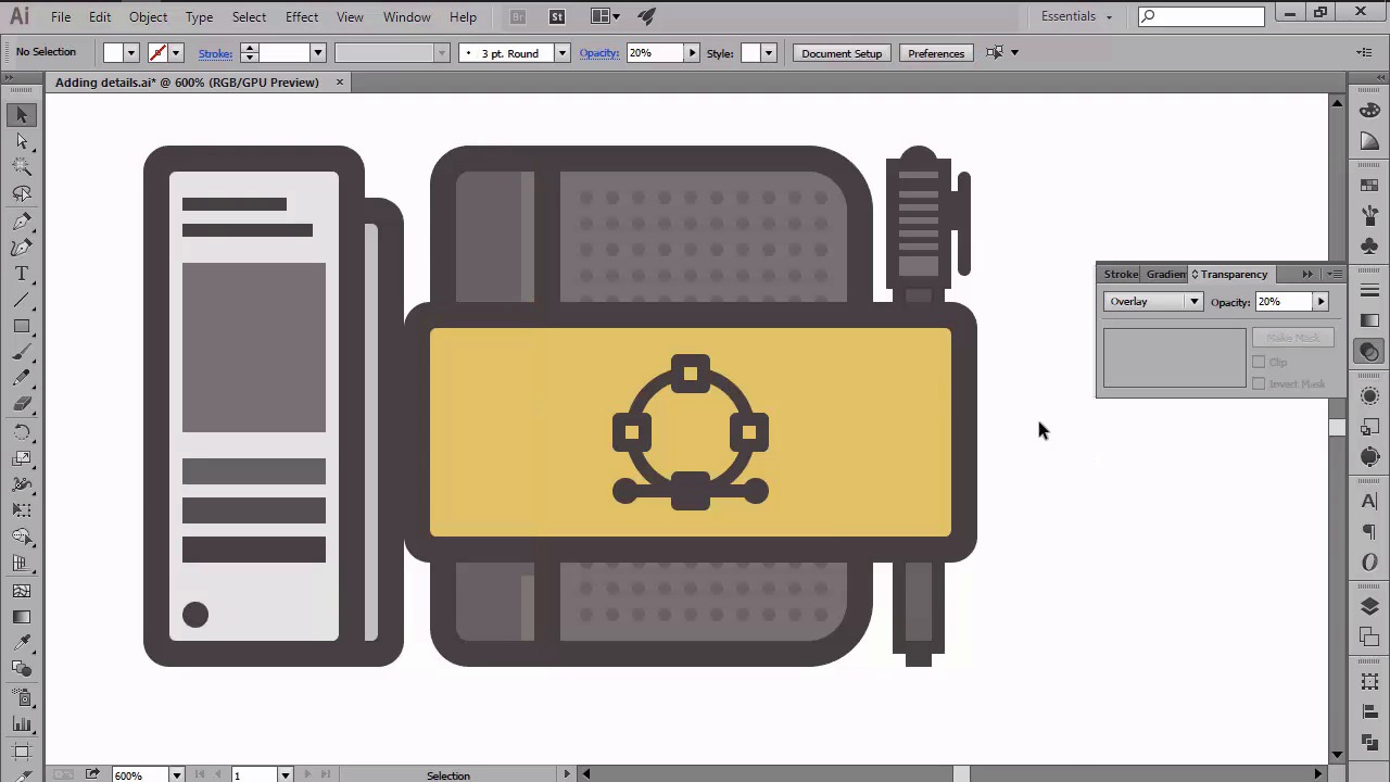
- Overview
- Transcript
4.6 Adding Finishing Touches: Highlights and Shadows
In this lesson we will be adding the finishing touches to our icons. You’ll learn how to use the different Blending Modes in order to create the highlights and shadows.
1.Introduction
1.1Introduction01:37
2.Understanding the "Pixel-Perfect" Concept
2.1Understanding How Illustrator Works02:26
2.2Defining the Concept04:09
2.3Advantages of Using a Pixel-Perfect Workflow03:01
2.4Introducing the Grid06:29
2.5Correct Use of Measurement Units06:09
3.Pixel-Perfect Workflow
3.1Adjusting Illustrator for a Pixel-Perfect Workflow04:49
4.Creating the Icons
4.1Size and Consistency05:54
4.2Creating the MacBook Icon06:30
4.3Creating the Window Workflow Icon06:03
4.4Creating the Designer Resources Icon06:11
4.5Adding Colors06:56
4.6Adding Finishing Touches: Highlights and Shadows08:23
4.7Creating Size Variations05:16
5.Saving for the Web
5.1Exporting the Icons03:16
6.Conclusion
6.1Conclusion01:32
4.6 Adding Finishing Touches: Highlights and Shadows
Hi and welcome back to Creating Pixel Perfect Icons in Adobe Illustrator. My name's Andre Stefan and we are currently on issue 4.6 adding finishing touches, highlights and shadows. So if you remember correct in the previous lesson we had to create a color scheme into the blind tool and edit one of our own to the actual icons. In this video I am going to create the final details by adding some highlights and shadows which we'll create using different blending modes. So assuming you already have your document open, let's take a couple of seconds and start by talking about blend modes. Compared to the blend tool which allows you to blend different colored shapes into smooth transition, blend modes allow you to change the way the color from an object behaves when it overlaps the surface of another colored object. There are a total of 16 different blend modes that can be found under the Transparency tool, which I encourage you to play with, since you will find that they can really enhance your designs once you get the hang of them. Now, going back to our icons, we will be using just two types of blending modes, and that's overlay for our highlights and multiply for our shadows. When it comes to color, we will go with white for the highlights and black for the shadows. Since we will need to tone down the overall effect of the blending modes, we will be using different opacity levels. So, 20 or 40% for our highlights, and 20% for our shadows. In order to create our details, we will be using the rectangle tool to draw the shapes directly onto the icons, making sure to keep them consistent. So let's start by adding the highlights. First position yourself over the MacBook icon and your highlighter over the top bar. Top side of the window buttons. And bottom section of the body. Then draw two sets of diagonal highlights over the Macbook's lid and screen, making sure to mask them using the shapes from underneath. Once you are done, select all the shapes and change our blending modes to overlay, while lowering the opacity levels to 40%. As you can see, the result is exactly what we wanted since we now have our first set of highlights. Next, move on to the second icon and add a couple of highlights to the top section of the left window buttons. On the right side of the second window interface. With all of them selected repeat the same process of changing the blending mold to overlay and lowering your opacity to just 40%. Then do the same for the last icon, but adding a highlight to the right side of the headband, but this time make sure to leave little gap toward the top section of the lower highlight since we'll be adding a shadow later on. Also, we will need to lower the opacity to 20%, since anything above this value will be too bright. Then add some highlights to the band, covering the notebook and the pencil's cap and body. At this point, we're pretty much done with the highlights which means we can now move on to adding the shadows. First, make sure that you've set your field color to black and then position yourself over the MacBook icon again. Now using the rectangle tool, draw a couple of shadows over the top, left and right side of the interface. Then add another one under the entire window itself. And finally, don't forget to add the one where the bottom section of the MacBook meets the lid. With all the shadows selected, change your blending mode to multiply, and lower the opacity to 20%. Once you're done with the first icon, we can move on to the second one. Another shadow underneath the window tab bars. And then another larger one casted by the second window over the first one. We will create a casted shadow by selecting and then applying an offset of four pixels to the outline of the second window. Which will then mask and position underneath it. We can now move on to the last icon and add a shadow to the left side of the bantam book. Then a second one for the small page from its right. Then a couple under the band covering the notebook. As before, don't forget to select the shapes and change your blending mode to multiply and lower your opacity level to 20%. At this point, all we need to add is the little round shadow that goes under each icon. So, using the ellipse tool, create three 82 by four pixel shapes, which will then have the exact same color, blending mode, and opacity level as our previous shadows. Once you're done, don't forget to select each icon and its shadow and group them together so that they won't get separated if you move them around. So, at this point, we're pretty much done creating and detailing our icons. That being said, stay tuned for the next lesson, where we will learn how to create a second side for our icons, using the scale tool.


