
 Lessons: 16Length: 1.3 hours
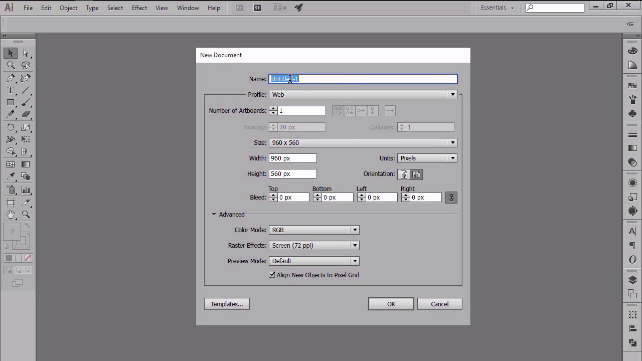
- Overview
- Transcript
3.1 Adjusting Illustrator for a Pixel-Perfect Workflow
In this lesson, we will use the information that we've learned so far to adjust Illustrator for a pixel-perfect workflow, and lay out a strong foundation that we can use on any future project. We will learn how to set up a custom grid, and go over the process of setting up a proper document.
1.Introduction
1.1Introduction01:37
2.Understanding the "Pixel-Perfect" Concept
2.1Understanding How Illustrator Works02:26
2.2Defining the Concept04:09
2.3Advantages of Using a Pixel-Perfect Workflow03:01
2.4Introducing the Grid06:29
2.5Correct Use of Measurement Units06:09
3.Pixel-Perfect Workflow
3.1Adjusting Illustrator for a Pixel-Perfect Workflow04:49
4.Creating the Icons
4.1Size and Consistency05:54
4.2Creating the MacBook Icon06:30
4.3Creating the Window Workflow Icon06:03
4.4Creating the Designer Resources Icon06:11
4.5Adding Colors06:56
4.6Adding Finishing Touches: Highlights and Shadows08:23
4.7Creating Size Variations05:16
5.Saving for the Web
5.1Exporting the Icons03:16
6.Conclusion
6.1Conclusion01:32
3.1 Adjusting Illustrator for a Pixel-Perfect Workflow
Hi, and welcome back to creating pixel perfect icons in Adobe Illustrator. My name is Andre Stefan, and you're going to chapter three, where we'll start adjusting Illustrator for a pixel perfect workflow. This is lesson 3.1, and in this lesson, we will use what we've learned in the previous chapter in order to set up a custom grid, and adjust some of the other settings from within our program. So, up until this point, we've talked about a pixel perfect concept, what it means, and why we should try to adopt it in our workflow. We've analyzed the grid and seen how correctors and measurements can help you achieve more in terms of sharpness and composition. Since we should now have a better understanding of what makes a design piece so perfect, I believe that it's time to start fine tuning some of Illustrator's settings, so that we can layout a strong foundation for any future projects. This should be the first thing you do once you have a fresh install of the software, since you only have to go through the process once, and then you're good to go. So, let's start out by setting up a custom grid. Go to Edit, and then Preferences, Guides and Grids, and set both the grid line and subdivision options to 1, in order to get the super-precise positioning that we want. Next, let's make sure that our keyboard increment is set to 1 px, since we want our objects to jump exactly one pixel when moving them around using the arrow keys. You can do that by going to the general tab, and the first thing you'll see on the top will be the keyboard Increment. As you can see, the 2015 creative cloud version comes predefined with this value. But there are some older versions of this software that some of you might be running, where you will still need to adjust it. So, if that's the case for you, simply modify whatever value you have by entering 1, and you should be back on track with the rest of us. Now let's take a look at our units. As you remember, I talked about the possibility of using either pixels or points for the general and strong values. Depending on what asset you are designing for, you might choose one over the other. I will set mine to pixels, since it has proven to work for me in the past, while leaving the type to points. Remember, you can always come back later and modify the unit as you need, if you find that some of them are not working for you. Also, in case you need to get back to the initial settings, you can reset the Illustrator completely by closing the program and then opening it while holding down the Alt Control Shift keys. Before we end this lesson, I want to talk about the process of setting up a document for any pixel perfect intended project. So, with illustrator opened, let's go to file, new, or use the control plus end keyboard shortcut, and have a quick look at the options that we would normally see when setting up a new document. The first one is name, which is pretty obvious, since this will be the actual name that you will assign to the document. Next, we have number of artboards, which depending on the size of your project, can incorporate one, two, or multiple artboards onto which you can lay down your designs. The third one is size, and we should really pay attention to it when starting a new project, since the wrong number value rule also applies here. If you remember right, whatever you put inside of Illustrator has to occupy the full surface of the pixels from the underlying pixel grid, and the same rule applies to the artboard itself. For this example, I'm just going to choose one of the default values that Illustrator comes pre-packed with. Once we've set up our document size, we can move on to the actual units that we're going to use for our shapes. Since this course is about icon design, which is normally used within the digital medium, we will go with pixels. There are a couple of other options that are widely followed, hidden within the advanced menu. These options can be made visible once you click on the little right-facing arrow. As you can see, we now have the option to set our color mode, which in this case will be RGB, since we are designing for a digital medium. And then we have Raster Effects. This one is also tricky since by default, it comes set up to screen. There are two other values that you can choose from, which if you were to select and use, they would look exactly the same. This is because raster effects control the way drop shadows, textures, and other effects look once they are printed out on paper. Since we are designing for the web, we will just leave this set out to default 72 ppi. Next, we have the preview mode, which again gives you a few options. The first is the default mode, which will allow you to see your design as it will actually look like when uploaded on the web or printed. The second option is pixel, which as you might have guessed, will let us see the actual pixel base on which you are creating. Lastly, we have over print, which is normally used when designing for print, since it provides a unique preview that approximates how blending, transparency, and over printing will appear in a color separated output. I personally tend to leave it at default and switch back and forth into pixel preview mode when needed. Finally, we have the little check box that says align new objects with pixel grid. You should always make sure that you have it checked when gridding for the web, since it will instruct each newly created object to position itself correctly onto the pixel grid, making everything look sharper. That being said, we will now end the current lesson, since you should now be able to properly set up a document intended for a pixel perfect use. Stay tuned for the next lesson, when we will begin chapter four, and start working on our little project. We will apply everything that we learned so far, in order to create a few crisp looking icons.


