
 Lessons: 16Length: 1.3 hours
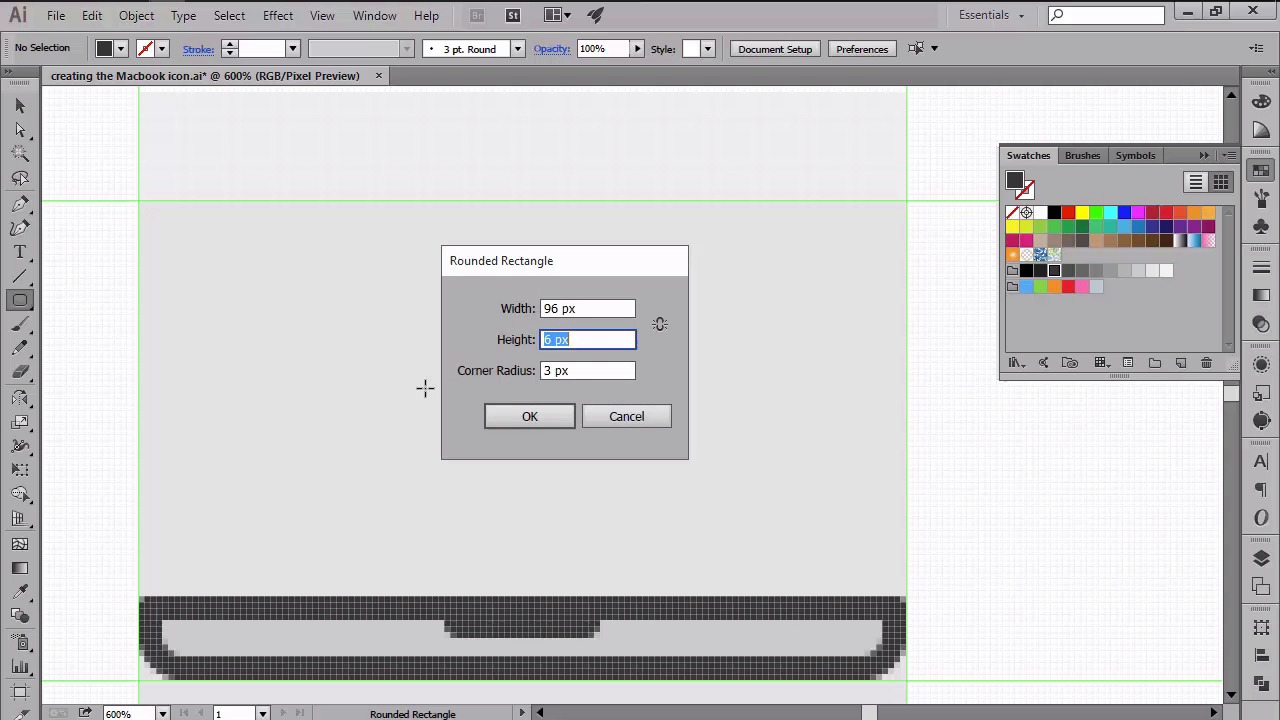
- Overview
- Transcript
4.2 Creating the MacBook Icon
In this lesson we will go over the process of creating the first icon from our little project, using some of Illustrator's basic shapes combined with a couple of other tools.
1.Introduction
1.1Introduction01:37
2.Understanding the "Pixel-Perfect" Concept
2.1Understanding How Illustrator Works02:26
2.2Defining the Concept04:09
2.3Advantages of Using a Pixel-Perfect Workflow03:01
2.4Introducing the Grid06:29
2.5Correct Use of Measurement Units06:09
3.Pixel-Perfect Workflow
3.1Adjusting Illustrator for a Pixel-Perfect Workflow04:49
4.Creating the Icons
4.1Size and Consistency05:54
4.2Creating the MacBook Icon06:30
4.3Creating the Window Workflow Icon06:03
4.4Creating the Designer Resources Icon06:11
4.5Adding Colors06:56
4.6Adding Finishing Touches: Highlights and Shadows08:23
4.7Creating Size Variations05:16
5.Saving for the Web
5.1Exporting the Icons03:16
6.Conclusion
6.1Conclusion01:32
4.2 Creating the MacBook Icon
Hi, and welcome back to creating Pixel Perfect icons in Adobe Illustrator. My name is Andre Stephan, and you're currently on lesson 4.2, creating the MacBook icon. So if in the previous lesson, we learned how to set up some simple guides and grids, in this video we're going to start working on our first icon and see how we can use Illustrator's basic shapes in order to create the main composing elements. That being said, let's continue from where we left off and lock the guide thing with layer and unlock the icons one in order to be able to start developing our shapes within it. Now that we have our layers ready, let's take a couple of moments and talk about the design and structure of our icons. So we have three different access that we will need to illustrate. First, we have the MacBook, then the double window workflow, and finally the designer resources. For each of these icons we'll first read the intersections and then add some weight to them by adding the thicker outlines. We will be using different weights for the outlines, so have your ones mainly for the out-facing elements while keeping the inner ones lighter. Now since we will focus on colors in another lesson, for the moment we will use Illustrator's default grey swatch and concentrate on our shapes and their relation to one another, while leaving the coloring process for later. I do need to point one thing out, and that is we'll be using a darker gray for the outlines, while applying lighter shades for the other shapes. That being said, let's start working on our first icon, the MacBook. From an anatomical point view, the object is made of two sections, the top part represented by the screen and the bottom one, represented by the device's body. We will start working on the lower section, and will do so by first turning on the Pixel Preview mode in order to have total control over the positioning of our elements. Now using the Rounded Rectangle Tool, which can be found under the rectangle tool itself, with 120 by 10 px shape with a corner radius of just 4 px, which we'll then position above the second horizontal guide at the distance of 4 px. Since we need the top side of our shape to be flat, we will use the direct selection tool to select and then remove the top center anchor points by pressing Delete. As soon as you get rid of the anchors, use the Ctrl+G keyboard shortcut to close the path. Now let's color the shape using a light gray and then add an outline to it by going to Object > Path > Offset Path, and giving it an offset of 4 px. The offset will create a slightly larger object that will automatically get positioned under the shape that we used to create it. Since this larger object will act as an outline, we need to color it using something darker so they can be easily noticed. Now since we want the top left and right corners to be rounded, we will select them using the direct selection tool. And then using the Corners function, adjust the roundness to 2 px in order to make them nice and round. At this point, we're almost done with the bottom section. All we need to add is the smaller inner pocket that you would normally use in order to open the device once it's folded. So using the round and rectangle tool, create a 26 by 6 px shape with a 3 px corner radius. And then make sure to remove its top anchor points using the Direct Selection tool. Then simply color the shape using the same dark grey used for the outline, and make sure to position it correctly onto the body by horizontally aligning it towards the top side of the lighter grey shape. Once we are done with the bottom section of the icon, we can move on up towards the top, and start working on our little screen. Using the Rounded Rectangle tool, create a 96 by 66 px rectangle with a 4 px corner radius. And then position it right next to the light gray section of the MacBook's base. Give it a 4 px outline using the Offset Path effect, and then color the two so that you can distinguish one from the other. Now, since the screen needs to go underneath our base, we have to select both shapes, right-click, and then send them to the back by using the Arrange > Send to Back option. Next, we can start working on the actual display by creating a 84 by 50 px rectangle, to which we'll be adding an outline of 2 px. Once you've colored the two, you have to make sure that you are aligned to the center of the lid, so that we now have a gap of 4 px all around the outline. As soon as we're done creating the display element, we can start working on a little separate window but we'll be taking a slightly different approach. This time we will first free the outline and then add the composing elements of the window one at a time. So using the Rectangle tool, create a 70 by 44 px shape and color it using the same gray as for the outline, making sure to position it to the center of the display. Now since we will want to use fewer outlines for the inner elements, we will be creating and layering our shapes so that we'll have an all around 2 px gap between them and the main outline. First, let's work on the top bar by creating a 66 by 4 px rectangle on to which we'll be adding three 2 by 2 px circles. This is a 2 px from one another. Again don't worry about the colors, just use shades that can be easily distinguished. Next, let's add a little left- sided buttons by clicking six 4 by 4 px squares and distributing them vertically at a distance of 2 px from one another. Once we have the buttons, we can move little towards to right and start working on the UI by creating a 52 by 44 px rectangle. Onto which we'll be adding another 48 by 30 ladder rectangle. Then using the rectangle tool, add free building blocks that will represent the actual design of UI in the works. We will finish off the icon by adding a 6 by 34 px shape which will go on the right side of the window in between the UI main shape and the window outline. So at this point we are done with the first icon, since we now have our basic MacBook to which we'll be adding colors and a couple of other details later on in the course. Stay tuned for the next lesson where we will start working on our second icon.


