
 Lessons: 16Length: 1.3 hours
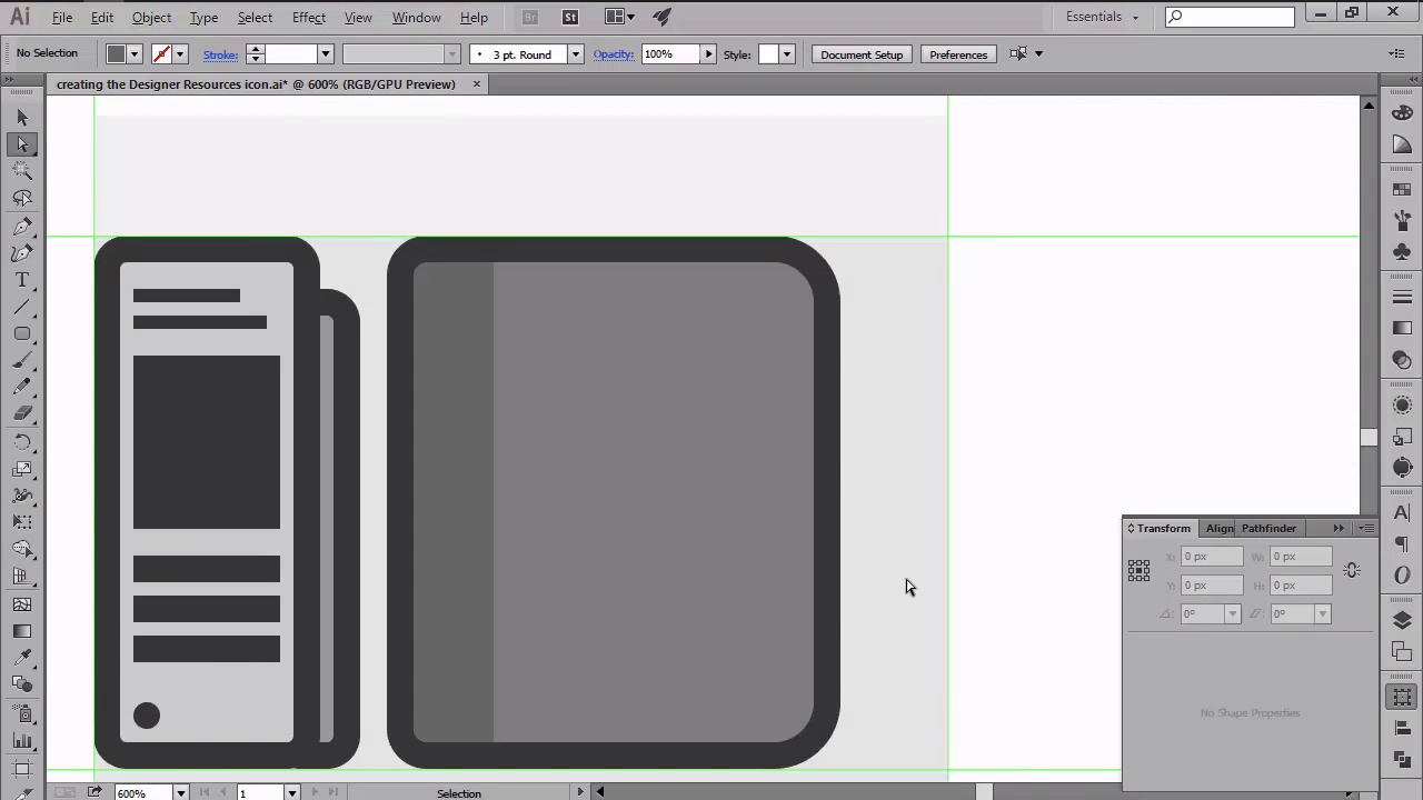
- Overview
- Transcript
4.4 Creating the Designer Resources Icon
In this lesson we will create the third and last icon from our project, by using some of the methods that we've previously learned.
1.Introduction
1.1Introduction01:37
2.Understanding the "Pixel-Perfect" Concept
2.1Understanding How Illustrator Works02:26
2.2Defining the Concept04:09
2.3Advantages of Using a Pixel-Perfect Workflow03:01
2.4Introducing the Grid06:29
2.5Correct Use of Measurement Units06:09
3.Pixel-Perfect Workflow
3.1Adjusting Illustrator for a Pixel-Perfect Workflow04:49
4.Creating the Icons
4.1Size and Consistency05:54
4.2Creating the MacBook Icon06:30
4.3Creating the Window Workflow Icon06:03
4.4Creating the Designer Resources Icon06:11
4.5Adding Colors06:56
4.6Adding Finishing Touches: Highlights and Shadows08:23
4.7Creating Size Variations05:16
5.Saving for the Web
5.1Exporting the Icons03:16
6.Conclusion
6.1Conclusion01:32
4.4 Creating the Designer Resources Icon
Hi, and welcome back to creating pixel perfect icons in Adobe Illustrator. My name is Andre and we are continuing lesson 4.4 creating the designer resource's icon. So in the previous two videos, we saw how easy it is to use some of basic shapes combined with the part of the pixel premium mode in order to create the first two icons from the set. In this one, we are now down to our last icon, the designer resources one, which is basically a pictogram that consists of a Pantone book, a little sketchbook and a pen, which we'll be creating using the same workflow as before. So assuming you already positioned your cells onto the third set of guides and grids, let's start by creating our first element, the Pantone book. Using the rounded rectangle tool, create a 26 by 72 pixel shape with a corner radius of just one pixel. And then color it using a lighter grey. As usual, give it an outliner for pixels, and then position it too so that the outline touches the left and second horizontal guidelines. Next, you have to create a couple of rectangles in order to make it look like a natural Pantone book. So first grab the rectangle tool and then starting from the top, add a couple of elements that you would normally find on these sort of books. Once we have all the rectangles in place, we need to add a little four-by-four pixel circle to the bottom left corner. Since the circle holds all the pages in place, you need to give the object more depth by adding a smaller page to its right side. Using your rounded rectangle tool, create a six by 64 pixel shape with a corner radius of just one pixel. Give it an outline and then with both of them selected send them to the back positioning them towards the right side of the larger page. Leaving a gap of two pixels in between them. We can now move on to our second object, the sketch book, which should be really easy to make. First grab the rounded rectangle tool and create a 60 by 72 pixel shape with a 6px corner radius. Color the object using a darker grey and then position it to the right side of the Pantone book at about eight pixels, making sure to align it to the bottom of the main shape. Since the left side of the sketchbook should be less rounded, we need to select its left anchor points and change their value from six to just two pixels. Once you've adjusted the corners, we can move on and add the outline. Now, since the left side of the sketchbook is held up by the headband, we need to create a duplicate after our main shape. And then adjust it by changing its color and then removing its right anchor points, while shortening the width to just 12 pixels. After that, we need to add the heavier 4x80 pixel delimiter to its right side to properly separate the elements. The next part is a little detail oriented since you'll be creating a grid composed of the two by two pixel circles which will then be distributed both horizontally and vertically at a distance of two pixels from one another. First create a row of ten circles and then while holding down the alt and shift keys drag towards the bottom to create a copy, making sure to leave a two ps gap in between them. Then simply press Ctrl+D about 15 times to duplicate the action, and create many rows. I recommend you group all the circles by selecting and then using the Ctrl+G keyboard shortcut so that you won't misarrange them by accident. Once you've added the circles, we can move onto the pen and start working on it. First, create a four by 56 pixels rectangle, which we'll then position on the right side of the sketchbook, at about six pixels from its outline. Then, give the pen a two px outline. And start working on the cap by creating a six by 16 pixels rectangle, which we'll then position towards the top side of the previously created shape. Give the cap an outline. And then start adding some little horizontal lines using the rectangle tool. Add a six by six pixel circle towards the tip making sure to position it under the other shapes. Then add a small one by six pixel rectangle to the right side of the pen's cap. And draw a two by 16 pixels rounded rectangle with the corner thickness of just one pixel which will then position on its right side. Move on to the bottom section of the pen, and add a small four by two pixels rectangle right under the main outline. Then we will be an adding an ID by 42 pixels rounded rectangle bend with a one pixel corner radius. Which we'll then position over the sketchbook and pen, slide it towards the bottom, making sure to leave a gap of four pixels between the shape and the main grid. As always, don't forget to give it the usual 4px outline using the offset effect. Now, to finish off the icon, add the final detail to the pen covering above the sketchbook and the pen, by reproducing the vector symbol of the initial design. Or by adding a personal touch of your own. At this point, we should be done with the main building blocks of our icons. That being said, stay tuned for the next lesson where we'll be creating a custom color scheme and start adding colors to each of our icons.


