
 Lessons: 16Length: 1.3 hours
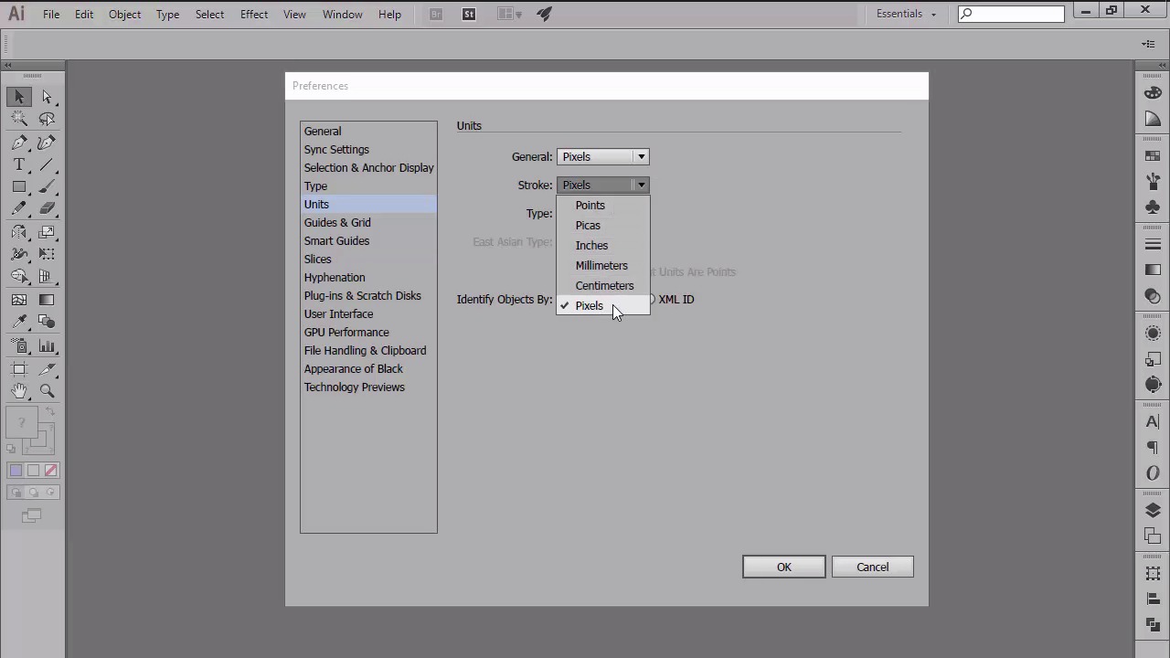
- Overview
- Transcript
2.5 Correct Use of Measurement Units
In this lesson, we will talk about the main measurement units available within Illustrator, and see why we should always use digital measures over type-intended ones when creating for the digital medium. We will also briefly talk about numbers, more exactly size values and their effect over the sharpness of our vector shapes.
1.Introduction
1.1Introduction01:37
2.Understanding the "Pixel-Perfect" Concept
2.1Understanding How Illustrator Works02:26
2.2Defining the Concept04:09
2.3Advantages of Using a Pixel-Perfect Workflow03:01
2.4Introducing the Grid06:29
2.5Correct Use of Measurement Units06:09
3.Pixel-Perfect Workflow
3.1Adjusting Illustrator for a Pixel-Perfect Workflow04:49
4.Creating the Icons
4.1Size and Consistency05:54
4.2Creating the MacBook Icon06:30
4.3Creating the Window Workflow Icon06:03
4.4Creating the Designer Resources Icon06:11
4.5Adding Colors06:56
4.6Adding Finishing Touches: Highlights and Shadows08:23
4.7Creating Size Variations05:16
5.Saving for the Web
5.1Exporting the Icons03:16
6.Conclusion
6.1Conclusion01:32
2.5 Correct Use of Measurement Units
Hi, and welcome back to Creating Pixel Perfect Icons in Adobe Illustrator. My name is Andre Strephan, and you are currently at the end of chapter two, more precisely lesson 2.5, Correctors of Measurement Units. In the previous lesson, we introduced the grid and talked about how it can affect and improve the way you use Illustrator, in order to create sharper art work. In this video, we're going to talk about the second pillar of A Pixel Perfect Work Flow, more precisely round values versus comma delimited ones, and see why we should always use the first over the last. Before we get into the whole number debate, let's spend a couple of seconds talking about the measurement units available within Illustrator. As you probably know, Illustrator gives you the ability to use different units depending on what medium you're creating for. So for example if you're designing for the web, so anything displayed on a digital screen. You have the option of choosing between pixels and points. If you are working on a project that will be printed out, you can choose between picas, inches, millimeters or centimeters. Illustrator gives you the option to choose different units for your general shapes, strokes, and type. It is super helpful since when establishing a pixel perfect workflow, one is to make sure that his building blocks are measured in digital measures and not type in ten in one such as centimeters. Now lets open up Illustrator, and go to Edit > Preferences > Units, and see how we should make use of the settings. The first units case is general, which affects everything on your artboard except the stroke and type. I usually tend to use pixels for this one, since by definition it is the smallest addressable element presented on the digital screen. I'm sure you've seen others working with points and encouraging you to do the same. Well, this is where things get a little strange, since a point is the smallest unit used in typography for measuring font size, letting\g, indent, and the spacing before a paragraph. Typography that wants it use initial work flows. Well, it all comes down to screen density, if you're using points on a 72 ppi monitor, one point would equal one pixel. If you don't believe me, try it out, and you'll see that an object, when you're using points will have the same size as one created using pixels. But once you start creating for higher PPI devices, the ratio between the two starts shifting. This is true for Apple devices, but in order to keep designs consistent among the different screens, these assist in the maps points in the view's coordinate space to pixels in the device coordinate space, which isn't always at the one to one ratio. Apple says that the purpose of using points is to provide a consistent size of output that is device independent. But, if you take into consideration that there are tons of different screens out there that have different resolutions and ppi levels, things can easily get complicated. In the end, it all comes down to what you're designing for. If you are working on projects that are intended to be viewed on 72 dpi monitors, then pixels is just fine. If you need to create apps and assets that will be displayed on higher density displays, such as Apple products then you might need to follow the developer guide on these points when indicated. I myself have been using pixels for a long time now and haven't had any issues in regards to how my work looks like on 72 ppi monitors or higher density displays. Moving on to our second use case, we find stroke. Since strokes are dependent to the object that you applied them to, they should always be in relation to the units assigned for general. So, if you go with pixels for general, then you should set up your stroke in the same way. The first and last use case is in regards to type, well, this is where things get interesting again, since one might be tempted to set a type to pixels. The thing is there aren't any fonts out there that were created with pixel perfection in mind, since type is point base. So, I would recommend leaving this one set to point. Okay, so we've talked about measurement units, but now let's get back to the main topic, round numbers versus comma delimited ones. When creating with pixel perfection in mind, we should always be careful with the dimensions than with for objects. More precisely the number values since these can be easily broken if you're not careful. Don't believe me, let's open up Illustrator and set up a 400 by 400 pixels document and then create a rectangle by simply dragging using the mouse. If you take a look at the size of your object using the transform panel, you might be surprised to see both its width and height are a common delimited values. At a first look, you might say, well, it doesn't matter. See, the shape is looking all nice and clean, well, yeah. Things might look good at the surface, because it's a vector. But what happens if you switch over to the pixel preview mode and give it another look? Well things aren't so good looking anymore since we can clearly see that Illustrator has applied an analyzing effect in order to fill in the space that's unoccupied by those numbers following the comma. This will happen each time you create using shapes that have common delimited values because we now know a piece of surface must be fully occupied in order for it to be crisp. A simple solution would be to use the align to pixel width option found under the transform panel, which will make the objects snap back to the pixel grid, rounding the width and height numbers to the closest values. Now depending on the nature of your designs, whether it's a complicated illustration with organic lines or a more minimalistic one. You can adjust the way you work by either using raw numbers from the start, or by correcting them using the little trick with align to pixel grid. I usually tend to go straight into pixel preview mode and build my shapes by dragging them since they will snap to the pixel grid making sure that my dimensions are always round values. At this point, we will see why we should try and use round number values. But there's another aspect about numbers that we have to keep in mind when striving to achieve pixel perfection and that is even values versus odd ones. When working projects that will need to be resized, such as in the case of icon design, where you will need to create smaller and larger size versions of the original, you should always try to use even-numbered values. The reason is quite simple, if you have shapes that have odd width, and or height values. And try to cut them in half, your shapes will snap up the pixel grid, breaking the design. When dealing with upscaling, things usually tend to go well since the process of doubling odd numbers always result in even ones. Also, never try to scale your artwork by simply dragging using the mouse since this almost always ruins your design. Instead, use the scale function found under threshold tool and then input round values using multiples of 50. At this point I hope that you've understood the importance that number values carry when trying to create with pixel perfection in mind. That was it for today's lesson. Stay tuned for the next one, where we'll start adjusting Illustrator settings for a pixel perfect workflow.


