
 Lessons: 16Length: 1.3 hours
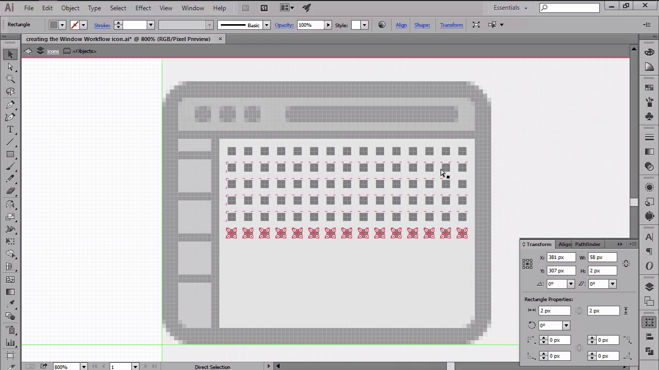
- Overview
- Transcript
4.3 Creating the Window Workflow Icon
In this lesson we will continue working on our little pack by creating the second icon using a familiar workflow.
1.Introduction
1.1Introduction01:37
2.Understanding the "Pixel-Perfect" Concept
2.1Understanding How Illustrator Works02:26
2.2Defining the Concept04:09
2.3Advantages of Using a Pixel-Perfect Workflow03:01
2.4Introducing the Grid06:29
2.5Correct Use of Measurement Units06:09
3.Pixel-Perfect Workflow
3.1Adjusting Illustrator for a Pixel-Perfect Workflow04:49
4.Creating the Icons
4.1Size and Consistency05:54
4.2Creating the MacBook Icon06:30
4.3Creating the Window Workflow Icon06:03
4.4Creating the Designer Resources Icon06:11
4.5Adding Colors06:56
4.6Adding Finishing Touches: Highlights and Shadows08:23
4.7Creating Size Variations05:16
5.Saving for the Web
5.1Exporting the Icons03:16
6.Conclusion
6.1Conclusion01:32
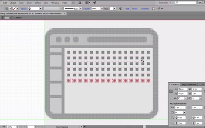
4.3 Creating the Window Workflow Icon
Hi, and welcome back to creating pixel perfect icons in Adobe Illustrator. My name is Andre Stefan, and you are currently on lesson 4.3, creating the window workflow icon. So, if in the previous video we've learned how to build the first icon using Illustrator's basic shapes, in this one we will continue developing our icon set by creating the second one. That being said, open up Illustrator and let's start from where we last left off, by positioning ourselves over the second guides and grids. Now, using the round or rectangle tool, let's put the 72 by 56 pixel shape with our 4px corner radius. We will color the object using a light grey, and then give it an outline of 4 pixels. With both shapes selected, position them so that the left and bottom sections of the outline touch the left and second horizontal guidelines. Once we've correctly positioned the shapes, we can start working on the top bar by creating a duplicate of the inner section using the Ctrl+C, Ctrl+F shortcuts, which we'll then adjust by removing its bottom center anchor points, and shortening its height to just 8 pixels. Then we can add a title bar buttons by drawing three 4 by 4 pixel circles towards the left side, which we'll color using a darker shade of gray. Next, move over towards the right, and add a 42 by 4 pixels rectangle, with a corner radius of just 2 pixels, which will act as a navigation element. Now, since we need to delimit the top bar from the main interface, we will have to add a 72 by 2 pixels rectangle right underneath it, which will act as a thinner outline. Once we are done with the top bar, we can start working on the left-sided buttons, which we'll create using a second copy of the larger window. As you can see, we will need to adjust the shape by moving its right-center anchor points, and reducing its width to just 8 pixels. Since this shape needs to go underneath the top bar, we'll have to select it along with the windows intersection and outline, and send them to the back using the arrange send to back option. With the shape correctly positioned, we can now start delimiting the buttons by adding four 8 by 2 pixel rectangles, which will be distributed at 8 pixels from one another. As with the top bar, we'll have to make sure to separate the bottom section by drawing a 2 by 46 pixels rectangle, which we'll then position on the right side. I will leave you in charge of designing the little pictograms for each button, since this lesson shouldn't be all that rigid. It should give you some creative freedom, in order to express your own vision. That being said, leave the button designing for the end, and let's move on towards the right side, and start working on UI prototype by putting a grid of 2 by 2 pixel squares, which we'll then distance from one another using a gap of 2 pixels on each side. On top of this grid, we will add a bunch of UI elements by simply dragging using the rectangle tool. Again, this text should be a little more loose, since you should be able to get creative and design your own elements. Once you've added the UI elements, you should select all the shapes that you have so far, and group them together using the Ctrl+G keyboard shortcut, since it will be easier to keep track and edit later on. Next, we will be creating the second window by making a copy of the one we already have, and then positioning it toward the right side, so that it touches the right and first horizontal guidelines. Since the second instance of the window will be quite different in terms of content and function, we need to get rid of the horizontal button dividers and UI elements. And adjust the width of the left section from 8 pixels to 24, all while in isolation mode. Then we can start adding some of the code lines to the left side of window, by drawing a couple of rectangles with slightly different widths over the constant to the x height. Next, add the 6 by 6 pixel circle to the lower left corner. And to one px tall lines to its right As with the button section, edit 2 by 46 pixel vertical divider to the right side, in order to separate the different areas of the window. Finish out this icon by adding a couple of new elements to the second window, while keeping things balanced in terms of spacing. So, that was it for today's lesson. Stay tuned for the next one, where we'll be creating our last icon.


