- Overview
- Transcript
4.2 Table of Contents Part 2
Continue designing the second half of the table of contents.
1.Introduction2 lessons, 09:28
1.1Course Overview02:30
1.2Storyboard Planning06:58
2.Setting Up The Document5 lessons, 21:01
2.1Choosing a Size02:16
2.2Choosing a Binding03:01
2.3Create a New Document02:10
2.4Create Master Pages08:41
2.5Page Count04:53
3.Developing A Style Template5 lessons, 34:49
3.1Mastheads07:24
3.2Headlines06:10
3.3Character & Paragraph Styles07:22
3.4Using Word to Import Text05:52
3.5Color & Font Combinations08:01
4.Core Pages8 lessons, 1:05:52
4.1Table of Contents Part 111:02
4.2Table of Contents Part 210:06
4.3Article Spreads Intro03:52
4.4Feature Article Layout-Style 109:03
4.5Feature Article Layout-Style 210:18
4.6Feature Article Layout-Style 307:41
4.7Feature Article Layout-Style 404:31
4.8Placing and Sizing Up Ads09:19
5.Covers3 lessons, 24:14
5.1Front Cover Part 107:16
5.2Front Cover Part 209:35
5.3Back Cover07:23
6.Proofing & Output3 lessons, 13:55
6.1Preflighting04:59
6.2Export Presets05:28
6.3Exporting PDFS03:28
7.Conclusion2 lessons, 03:45
7.1Publishing Options02:41
7.2Final Thoughts01:04
4.2 Table of Contents Part 2
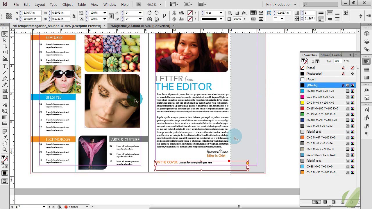
Hi everyone. Let's go ahead and dive right into part two of our table of contents here. We designed this, on the left here, in the previous lesson. So now we're gonna design the right side. Now the right side is gonna have that letter from the editor that appears in every issue, and then the information about the magazine over on the right side. So we're gonna work from left to right here, I'm going to drop in though a dotted line that's gonna run all the way down the page and it's going to have a stroke of three and be a dotted line. This is just gonna give us a guide here of where our content is gonna separate out. And then draw a rectangle here all the way down. Make sure that this goes all the way to the bleed, that is so important. And then we're dragging this just to the middle of the dotted line, making sure that it's behind, it does not have a stroke however. And then we want this to be a very light gray. Okay, just like that. And then we're going to drop in one photo here and this is just going to be the photo of our quote, unquote editor here. So, I just have a stock photo that we're gonna drop in. This would obviously be a real photo in your case. And it's just gonna fit here and we're gonna go ahead and apply that cool corner option effect to the corners, and we're gonna apply a rounded corner to the top left and the lower right. Again it's important to keep those styles flowing from page to page, that way everything looks like it belongs and its a nice cohesive design. All right, and then we can go ahead and type out here our letter from the editor. And then we're gonna go ahead and style this. So I'm gonna make this slightly smaller. This from I'm going to make a script font to just create a visual interest in our otherwise really blocky really modern design here. From the editor though I'm gonna go ahead and make that kind of cyan color. And then I'm going to bring this up slightly to fill the space and then we're going to make this 60. Actually, let's make that more like 50, okay. And then this text let's go ahead and just keep it gray. Line it up there. All right. And then we're going to take another text box. This is going to be for the actual letter part of this. And we're going to use Sarif font for that and we're just going to fill it with place holder text for now. And then I'm gonna style that as so. And this is just gonna be black text and fill in a little bit more place holder, there we go. And we'll make that two paragraphs just for fun to fill the space. And this letter would change out each time depending on the content that you have. We'll fill that like that. And when you have lots of lines, paragraphs, it's nice to have a little bit extra spacing between your lines so it's easier to read. And then we're gonna go ahead and drop in that awesome name here, which is essentially our signature, so drop that down. And that's just going to be a fun script font that is also black, make it slightly larger here. Then we're going to line that up on our right side of our letter and then duplicate that just for an easy text box and this is going to be the title. Editor in chief, we're gonna make that the orange color and then that's going to go back to a Futura font. Font and make it a little bit smaller. There we go, all right. And the last little bit here, I am going to copy this again, just drag this down. This is going to be that cover credit. It's important to always, always. Credit whatever goes on your cover here, so we're gonna offset that. So this is just gonna be the caption for our cover photo goes here, and then we're gonna style that secondary text a little different. We're not going to make it caps, we're going to make it smaller, and we're going to make it black. All right, so that's what we have so far with the left side, and then we just have to fill in this little bit over here. So usually when you have a magazine, you have some type of logo credit here, so we're just going to create this really quickly here for our magazine. This is called Urban Magazine, fun name, there might even be one called that somewhere in the world and then, create this. Now if this was an actual logo, you would drop that in here, but we're just using typography with our fonts that we've already selected to create this look here. Let's see, 35 and then we want to bold that. And note that we're using the same colors all throughout this magazine. It really ties everything together. So we're going to group that and bring it over and see how it fits. Okay, slightly to big here, we don't want that to go all the way beyond this purple, so we're going to shrink that down a little bit in size. Perfect, and then we're going to do the same thing to make that slightly smaller, okay? Take a quick preview of that. Nice. And then underneath that I'm just gonna place a placeholder block right here. This is gonna be for that magazine cover. So for every issue, we just drop in a photo of what the magazine cover would look like. And then we're going to create another text box here and this is just going to hold some information about the cover. So I am going to fill this, with placeholder text. And then we style this with our Futura, bring that spacing back. And then we're gonna make this that dark gray, uncapitalize everything. And then this first section, we're gonna bold that first section. So I'm gonna change that to our bold condensed just to highlight that slightly. And then we're gonna make this fit underneath our box there. And we're gonna justify it so it all lines up. Whenever you're working with publications, it looks really nice when you make that lineup. From there we have the section where we have credits, so we have our editor and then we have name, contact, assistant editor, name, contact. And so forth and so on. So I'm just going to duplicate this really quickly. I'll zoom in a little bit so you can see this. Just to go through this a little bit quicker. So we have our advertising and sales section. And then we have our marketing director. And then we have a couple contributing writers maybe. So I'm gonna duplicate that, we might have a couple of those. And then we have a photographer, can't forget the photographer. All right. And then the final section of this is the credit of location. So questions and feedback. Let's go ahead and make that an and. And then, sticking to that same thing we're going to capitalize all of that and this is just going to be your street address. So this street, city, state, zip, phone number, 555-555-5555, and then go ahead and throw a website for the magazine here too. So we're gonna un-capitalize this, and then we're gonna go back to our Futura, just to create a nice separation there. So not everything is bolded. And then that can stay bolded. Okay. And then we're gonna make sure that this goes all the way to the bottom corner. All right, so there you go. Now, we have a complete two pages to our magazine here. We have a new table of contents ready to go, and now we'll move on to some feature articles.


