- Overview
- Transcript
1.2 Storyboard Planning
Before you begin designing your magazine, it's important to plan out the content and how you want to lay everything out. This saves time and keeps you on track. Open up the included storyboard template and let's get started!
1.Introduction2 lessons, 09:28
1.1Course Overview02:30
1.2Storyboard Planning06:58
2.Setting Up The Document5 lessons, 21:01
2.1Choosing a Size02:16
2.2Choosing a Binding03:01
2.3Create a New Document02:10
2.4Create Master Pages08:41
2.5Page Count04:53
3.Developing A Style Template5 lessons, 34:49
3.1Mastheads07:24
3.2Headlines06:10
3.3Character & Paragraph Styles07:22
3.4Using Word to Import Text05:52
3.5Color & Font Combinations08:01
4.Core Pages8 lessons, 1:05:52
4.1Table of Contents Part 111:02
4.2Table of Contents Part 210:06
4.3Article Spreads Intro03:52
4.4Feature Article Layout-Style 109:03
4.5Feature Article Layout-Style 210:18
4.6Feature Article Layout-Style 307:41
4.7Feature Article Layout-Style 404:31
4.8Placing and Sizing Up Ads09:19
5.Covers3 lessons, 24:14
5.1Front Cover Part 107:16
5.2Front Cover Part 209:35
5.3Back Cover07:23
6.Proofing & Output3 lessons, 13:55
6.1Preflighting04:59
6.2Export Presets05:28
6.3Exporting PDFS03:28
7.Conclusion2 lessons, 03:45
7.1Publishing Options02:41
7.2Final Thoughts01:04
1.2 Storyboard Planning
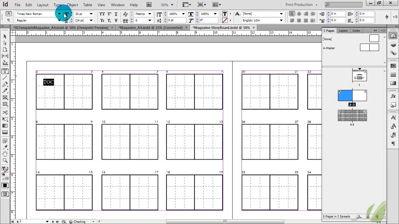
Hi, Everyone. In this lesson, I'm going to talk to you about storyboarding. Now, storyboarding is so crucial when you're working on a large project, or really any project. But, storyboarding is really going to help with your magazine production, and this is a step that I never forget to do, it's so helpful. And the thing about storyboards is that they can change. They're meant to change. They're meant to help you with the planning process so that you have an idea and a plan for your publication. So the cool thing is that this template is included for you to download and use as you need to. Feel free to customize it to your liking, but this will get you started with how to plan out your magazine. So let's go through it really quickly. This is the first page of it, and over here it's just created an InDesign for you. Now, one thing I always do with my magazine storyboard is I print it out so when I open it up, each issue. And, obviously, you're gonna have a title for your magazine, whatever it is, so you would change this to that. And then if you have an issue and a volume number, you can keep track of that here. And then a press date is when it needs to go to print. So that's sort of a big item that your goal needs to be right there for you to look at. And then I print this out because I'm always hand writing on it and jotting notes and things like that. But if you want to just keep it in InDesign, that's fine too. But, for me, I always like to jot things down and keep track. So this is just the front page of this. And you'll see that you have your covers here, so this is your front cover over here, and your back cover over here. So for me, if I was keeping track of this, I would just jot down the front cover items, items for the front cover. And then list them, Item 1. And like I said, this could be done digitally or by hand if you want to, Item 3. So this is just keeping tabs on what you want for your front cover. You're just jotting that down in your story board. This could just be brainstorming or this could be confirmed actions, it's entirely up to you. And then your back cover, items for the back cover. Item one, two, and three. Now, again, your back cover may be an ad, that is up to you. A lot of magazines, actually, the back cover is an ad. So you're either gonna have a list of items, or it's just going to be your ad. What are you advertising on that back cover? So that's an example of how to use the front page. Now, as you dive deeper into your storyboard, you can add as many as you want here. I just got you started on up to, let's see here, 73 pages. So, this'll plan out 73 pages of your magazine. If you need to add more, all you have to do is just copy over your page and then just change out these page numbers as you need to. So that's how you can use that. Now, as you continue to plan out here, there's a reason why these pages are broken out like they are, it's for advertising purposes. So as you're laying out your content, for example, these two pages are gonna be your table of contents. So I'm gonna make this larger, and I'm gonna change up my font. And let's make this bold so you can see it. And then I'm gonna make this bright red so it's easier for you to see. Okay, so these two pages are traditionally going to be our table of contents. So when you get into the rest of your pages, you get into the actual content and articles. So one thing about this, and I'm just going to use this as an example, you can break up these pages based on these dotted lines for ads. This makes this so super cool for planning your ad content. And then you can see what you have available in your magazine based on that, and the flexibility of your articles. So we know that we have a table of contents here. Four and five may be an article that we're not willing to move around, that's entirely up to you and your flow. But if you have flexibility you can, for an example, have an ad here that goes all the way down the page, or you can have a very small add that just takes up the corner, or you can have an ad that takes up half of your page, see? Or it could be a full page ad, it's entirely up to you. This also works for planning out your content because you may have your article up in this section, but then you have this lower section for something else that goes with the article. Or, you've seen those articles where they have the content there, but this block right here is secondary information that's relevant to an article, but the article spreads across both of these pages. And then you have this little block of color here that has some additional content. So there's so many possibilities when you're laying out your magazine, and this really helps you see what's available to you for your ads and for your content. And whether you decide to do this digitally or by hand, you can start to block this out. But I encourage you to use this because it's really gonna help you. If you have a 100 page magazine or more, yeah, you're gonna need something that says what is on page five cuz there's a chance you're gonna lose track of that, and this is definitely gonna help. And if you need to move things around, I've done this many times, where I've blocked in my content, but then later down the line I realize, oh, this spread is better here, so we just switch it. It's totally open-ended for you to do that, it's totally fine for you to do that. And then you can also see, again, what ad spaces you have open once you block in your article. Now, just from a standpoint of magazine production, I would block in your must-haves first before you think about your ads, that way you know what space you have available to you. So if you have those articles that have to be in every issue, have to be in every issue on a certain page, block all of that must-have stuff in first, into your storyboard. Then you see, again, what ad places you have. And ads may be one of those must-haves. You may have, for example, this back page ad. This may be blocked in for a year or two. If that's a must have ad, block that in right away, and you know that that's booked and you cannot give that space up. So, you're always going to be referring to this storyboard in many formats, many versions, throughout your production schedule. But it is one way to keep you very in tune with what's going on with your content and those ads.


