- Overview
- Transcript
5.1 Front Cover Part 1
Analyze four different magazine cover designs and learn about the key components of a cover design and why the image makes the biggest impact.
1.Introduction2 lessons, 09:28
1.1Course Overview02:30
1.2Storyboard Planning06:58
2.Setting Up The Document5 lessons, 21:01
2.1Choosing a Size02:16
2.2Choosing a Binding03:01
2.3Create a New Document02:10
2.4Create Master Pages08:41
2.5Page Count04:53
3.Developing A Style Template5 lessons, 34:49
3.1Mastheads07:24
3.2Headlines06:10
3.3Character & Paragraph Styles07:22
3.4Using Word to Import Text05:52
3.5Color & Font Combinations08:01
4.Core Pages8 lessons, 1:05:52
4.1Table of Contents Part 111:02
4.2Table of Contents Part 210:06
4.3Article Spreads Intro03:52
4.4Feature Article Layout-Style 109:03
4.5Feature Article Layout-Style 210:18
4.6Feature Article Layout-Style 307:41
4.7Feature Article Layout-Style 404:31
4.8Placing and Sizing Up Ads09:19
5.Covers3 lessons, 24:14
5.1Front Cover Part 107:16
5.2Front Cover Part 209:35
5.3Back Cover07:23
6.Proofing & Output3 lessons, 13:55
6.1Preflighting04:59
6.2Export Presets05:28
6.3Exporting PDFS03:28
7.Conclusion2 lessons, 03:45
7.1Publishing Options02:41
7.2Final Thoughts01:04
5.1 Front Cover Part 1
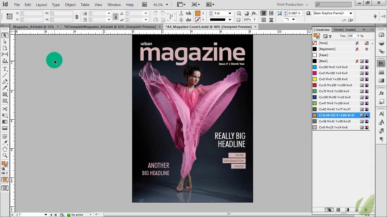
Hi everyone. In this lesson, I'm going to talk to you about the oh-so-fun magazine front cover. Now in the first part, I'm going to actually show you some tips and share with you several different cover ideas as we move through. And then in the second part, we'll go ahead and create a magazine cover. So let's go ahead and get started. I have a separate document here in InDesign, because I want to talk to you before we actually get into designing. I actually wanna talk to you about some things to keep in mind when you are looking at designing a magazine cover. Now, the number one most important part of a magazine cover is not the text. It's not the title. It's actually the image that goes on the front cover. There's so much emphasis when it comes to magazine covers and the image around it/ Because that's what, essentially, is going to sell the magazine. Get somebody to open it. Intrigue someone to just look at the magazine. So it's important to have a very eye-catching, dramatic photo on the cover to make sure that that happens. And alongside that, once you have an image chosen, there's lot of different things that you can incorporate into the rest of the design. And the number one thing is to incorporate the colors from the image into your text. And we do that on the inside of the magazine. And we wanna make sure that we do that on the cover. So, in this first example, we have a very dramatic, high contrast photo. It's very monochromatic. We have a lot of dark grays, a lot of blacks, and we have this great pop of pink. And we didn't just leave it in the image. It's seen throughout the rest of the text. So we have it highlighted here in the actual title of the magazine. Then it's, again, highlighted throughout our headlines. And you can have as much text or as little text as you want. But I will say that you don't want to have so much text on a magazine that it takes away from the overall image. The image is still the most important aspect of your magazine. Therefore, you wanna have a equal balance of text and have that image still pop off. And you can see that the placement here. We don't have any of the text on top of the actual figure in this photo. It's all in the space around. And that's what really helps with a good image when you're looking for images. Whether they be stock photos or you're taking them yourself. Or someone is supplying them to you. Having that space around your subject is so important, so that you don't end up covering up large parts of your image with text. So again, using those colors to really make this magazine cover pop. And you can play with different styles and different things. For example, this gray here can easily be a pink. And then you would just use darker text on the inside so that you can see that. So you can almost just reverse everything that was in there originally. So just because you have an example here doesn't mean that that is actually the one and only example for you. You can continue to play with your color options and see what really works. And here we have two colors working for the title. But we could just stick with a pink as well. And that works just as well. But you can see that when we add that little punch of gray, it just adds a little bit more drama to our overall cover. So this is one version. It's elegant. It's dramatic. It's very colorful. And, if you wanna see how much an image can change the feeling that you get when you look at the cover, think about what this cover is telling you. How you feel about it. High drama, but it's still elegant. But what happens if you get a high energy photo like this? All of a sudden, we have basically the same design, just a few things have been tweaked. Really the only thing that's changed is the image. But we have such a huge difference between this image and this image in the way that it feels. And, therefore, you can expect that a different audience is going to be attracted to this magazine. Now, we've again, we've used a pop of orange, which you can see here in his jacket. So we've used that to highlight this headline and to highlight the magazine title. Now this works really well if you have an issue and you're changing your images per issue and they're very different. So this could still be the same magazine, just from one issue to the other. But you're translating that cover in a way that really resonates with the image that you have on your cover. So you're using those colors, but you still have similar fonts, similar placement, so that these magazine covers could work together as one cohesive unit. And then we have some black here that pops this off. And then we've changed the font for the headline. Just so it fits a little bit more with this really high energy, hip-hop, urban-type feel. And then one more option for you is to completely change it yet again. And that is to go with something like this. Again, all three of these covers work well together. They're not so far off that they wouldn't fit for one magazine company. But they are different enough that they really engage the viewer in different ways. So this one has a music theme. It's still urban. It still fits with the theme of our magazine. But instead, we've just gone for a much more simpler color palette. We have black here, and then we have a really bright yellow. Now, in a lot of magazine covers, you can change the color of the text that you use for your headline here, for your logo. That's okay. It still ties these together. And this is really gonna depend on the image, again, of the cover image. That will dictate what color is possible for that. Otherwise, you can always just stick with the same color palette. That's fine too. The other thing to note here, is that this version really gives a bigger emphasis on the image. There's not a lot of text on this. There's hardly anything covering her up at all. You just have a little bit right here. So this is really playing up the image and only the image, as a way to get people to look on the inside. Whereas we offset a high impact image with text on our other covers. So, it's important to really look at this image. And once you have that image, everything else is gonna fall into play a lot easier. You can use the colors from the image. You can see what text is capable in the space that you have available to you. So in part two, we're actually going to design one of these covers.


