- Overview
- Transcript
4.3 Article Spreads Intro
In the next set of lessons you'll learn how to design four different layouts for your feature articles.
1.Introduction2 lessons, 09:28
1.1Course Overview02:30
1.2Storyboard Planning06:58
2.Setting Up The Document5 lessons, 21:01
2.1Choosing a Size02:16
2.2Choosing a Binding03:01
2.3Create a New Document02:10
2.4Create Master Pages08:41
2.5Page Count04:53
3.Developing A Style Template5 lessons, 34:49
3.1Mastheads07:24
3.2Headlines06:10
3.3Character & Paragraph Styles07:22
3.4Using Word to Import Text05:52
3.5Color & Font Combinations08:01
4.Core Pages8 lessons, 1:05:52
4.1Table of Contents Part 111:02
4.2Table of Contents Part 210:06
4.3Article Spreads Intro03:52
4.4Feature Article Layout-Style 109:03
4.5Feature Article Layout-Style 210:18
4.6Feature Article Layout-Style 307:41
4.7Feature Article Layout-Style 404:31
4.8Placing and Sizing Up Ads09:19
5.Covers3 lessons, 24:14
5.1Front Cover Part 107:16
5.2Front Cover Part 209:35
5.3Back Cover07:23
6.Proofing & Output3 lessons, 13:55
6.1Preflighting04:59
6.2Export Presets05:28
6.3Exporting PDFS03:28
7.Conclusion2 lessons, 03:45
7.1Publishing Options02:41
7.2Final Thoughts01:04
4.3 Article Spreads Intro
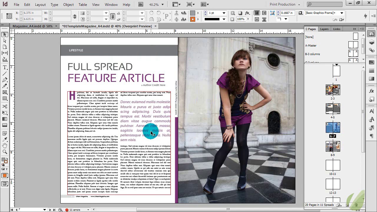
Hi everyone. In the next set of lessons, I'm going to show you how to design various styles for your feature articles. Now, just like a lot of things in design, there are so many different ways that you can do this. So, this is just gonna get you started thinking of how to lay out your content, some different options to you, how to use your pages effectively. So before I show you how to design it, I am going to just give you a few pointers here to get you started, and then we'll go right into the designs. So this is what we're going to, one of the article spreads that we're gonna be designing for. So a couple things to note here. This spread features a different color palette than the other one. So you notice that if we go up here, we were designing these in earlier lessons. We were really sticking to this orange, teal color, and this gray. But this article, though it has the same look and feel, it has a different color palette. So with your articles, you can use a different color palette. And one of the best ways that you can branch off and still keep a cohesive design is if you'll notice here, these colors play right out of this image. This is something I've said in other print design courses, that you can always get color inspiration from the images that you're using in your designs. This way, you're still keeping to a cohesive style, but you're varying your colors a little bit based on the image, and it all goes together so nicely. So this purple is used throughout the entire article. We have a highlight line here just for a little design element. Then we have the blacks and the grays that dominate the rest of this image throughout the article. So that's a great way to have a little varied color from article to article, but still keep that cohesive design. Use those colors that reside in all of your images. The other thing to note here is that we have really blocked this off as a complete image on one side, and an article on another. Feel free to really play with this and use both sides of your paper. Just keep in mind where your fold line is and don't keep anything super important too close to that. But you can definitely have fun with taking text over, taking images over, and I'll show you that as we branch off into our other designs. The other thing to keep in mind here is that in magazines, one of these pages may be an ad. So you may have an article on one side and an ad on the other or vice versa. So that is another option to you. The other thing to note is, take a look over in your pages palette, and you'll see that we have a variety of our master pages applied. We can see that we have 3 columns applied here, 2 columns here. You can see that in action right here, that we are using the two column design, and then we have our footer applied to the bottom. Our image is covering the other footer, but it still resides there. We have the image over the top of it. That's one way to have a page number on one side and not the other. And then you can see on another one we don't have anything applied to the left side, but we are using that two column style again. So you can mix and match these master pages depending on the designs you have. So that's something that we're going to be using quite a lot, and using a variety of those master pages. And then of course, our character and paragraph styles are gonna come into play heavily here as we work through these different layouts for our articles. So let's go ahead and start designing this layout.


