- Overview
- Transcript
5.3 Back Cover
Learn how to design a very simple yet effective ad for your back cover.
1.Introduction2 lessons, 09:28
1.1Course Overview02:30
1.2Storyboard Planning06:58
2.Setting Up The Document5 lessons, 21:01
2.1Choosing a Size02:16
2.2Choosing a Binding03:01
2.3Create a New Document02:10
2.4Create Master Pages08:41
2.5Page Count04:53
3.Developing A Style Template5 lessons, 34:49
3.1Mastheads07:24
3.2Headlines06:10
3.3Character & Paragraph Styles07:22
3.4Using Word to Import Text05:52
3.5Color & Font Combinations08:01
4.Core Pages8 lessons, 1:05:52
4.1Table of Contents Part 111:02
4.2Table of Contents Part 210:06
4.3Article Spreads Intro03:52
4.4Feature Article Layout-Style 109:03
4.5Feature Article Layout-Style 210:18
4.6Feature Article Layout-Style 307:41
4.7Feature Article Layout-Style 404:31
4.8Placing and Sizing Up Ads09:19
5.Covers3 lessons, 24:14
5.1Front Cover Part 107:16
5.2Front Cover Part 209:35
5.3Back Cover07:23
6.Proofing & Output3 lessons, 13:55
6.1Preflighting04:59
6.2Export Presets05:28
6.3Exporting PDFS03:28
7.Conclusion2 lessons, 03:45
7.1Publishing Options02:41
7.2Final Thoughts01:04
5.3 Back Cover
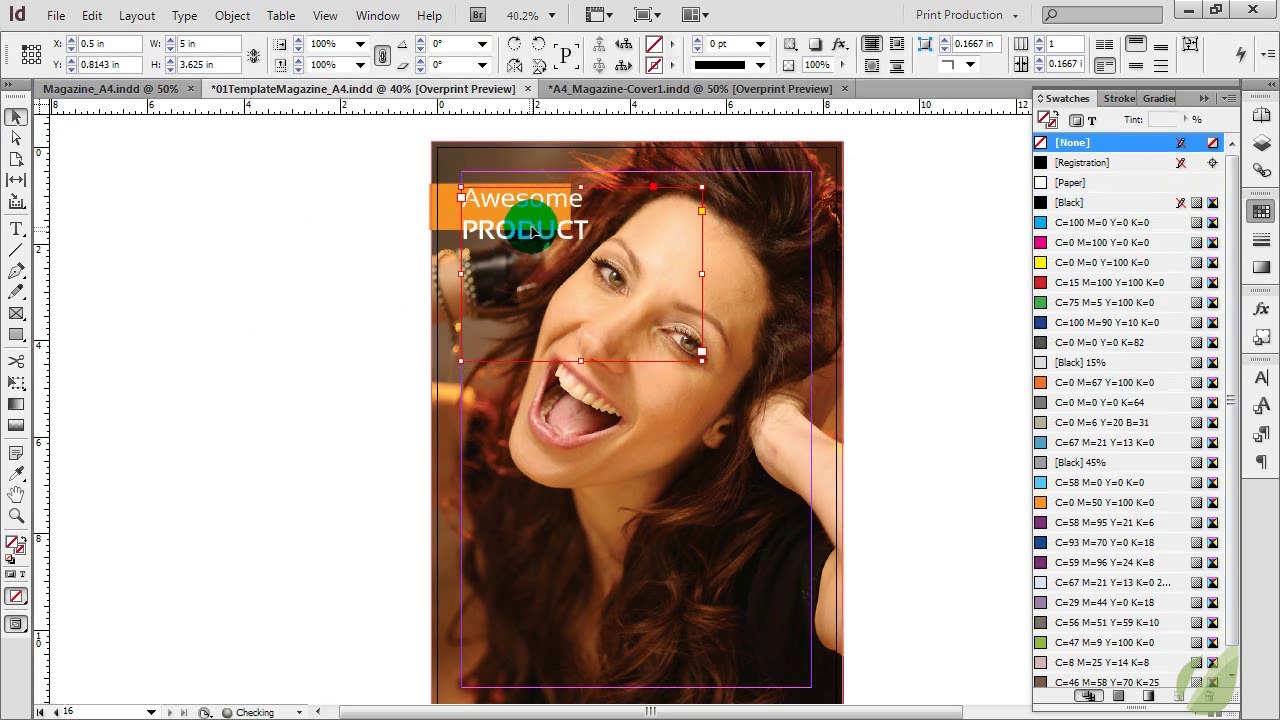
Hi everyone. In this lesson, we're gonna wrap up our magazine design, and that means tackling the back cover. Now, most of the time if you're working with any sort of commercial magazine, more than likely the back page and this is that back outside cover is going to be an ad of some kind. So if it's your own personal magazine, you may do something different with the back, but more than likely it is going to be some type of an ad. So what I'm actually gonna do because we have looked at all other sorts of articles and designing the front cover, I'm actually gonna show you how to design this ad. Just in case you get into the point where you have to design some ads, this will give you a little bit of extra into that to know how to approach this. And then you're designing the back cover as well. So let's go ahead and get started. Okay, so I'm on the very last page of our magazine here. It is the back cover. This of course will be the back cover for you however long and however many pages your magazine has. So we are not going to apply a master page to this because, like I said, it's going to be an ad so we don't need any of that. We don't need the page number or any of that on there. So just like with a lot of things in magazine production, when it comes to ads, less is definitely more. So in this scenario in the ad that we're gonna design here, it's the same principle. It's all based on a really awesome wow type image, and then we place some text around that. So let's go ahead an drop in a stock photo here. Seeing as we kind of have an urban lifestyle magazine, this image sort of works for a lot of different things. It could be advertising technology, it could be advertising make up. Whatever works here, so we're just sizing it to fit our back cover, and making sure that it goes all the way to the bleed line. Okay, so once we have that dropped in, it's just a matter of placing some text. So again, when it comes to ads, less is more. You need to identify what it is, how much it is, and where can they find out more information. That's pretty much it, because this image needs to sell the product. So, with that in mind, we're going to use similar concepts that we used in our feature articles here. We're going to drop in an orange block here for some text. And this orange just works really well in a lot of ways. It's helped us a lot in our design of our magazine. But it's also gonna help us with this ad because this is a very warm image. So this orange really looks good. If you want an alternative though, you can definitely use a cool color to offset that. That works as well. But we're gonna keep a very warm ad here. And then we're just going to call this, Awesome Product. And I'm gonna use the same font that we've used throughout the majority of our magazine. If you were designing this, you may be required to use a different font, and that's okay. But we're just gonna use the same principle here. And I'm creating visual interest in this by having a lowercase for the first word, uppercase for the second word. And we're gonna bold this. And then this altogether needs to be somewhat smaller so it fits into our square. And this text is going to be white. And we're gonna line it up here, see how it fits, and it needs to be smaller still. There we go. And we're gonna shrink up that space between our lines, very good. All right, so that's the name of our product. The next thing to do is to identify how much this awesome product is. So we're gonna have a little bit of fun with typography here. When you have a really big image and you don't have a lot going on outside of that, you can definitely have fun with typography. So we are going to do that based around our price. So our price is $19.99 here, and we're gonna bold this. And we're gonna make this brighter yellow here. And one little tip for this 99 is we're gonna use this superscript just to make it look more like a price. And we're gonna bring this down into her hair slightly. All right, and then I'm just going to duplicate this and we're gonna use the word, from, here. We're saying that this product is new starting at $19.99. So I'm gonna make this a little bit smaller, and we're not going to bold this text here. And I am going to put a little bit of spacing from that. And then to have some fun with some hierarchy, we're just going to line this up with our $19.99. So we're not gonna line it up with the $ sign, we're gonna line it up with the number 1. And this just creates some interest. If you put everything on one line, yeah that's great, but this just makes it so much more visually intriguing. And then we're just copying this again, using the same font, same style. And we're going to line up the word NEW, line that up with the top part of our $ sign. And see it just sort of creates this neat little layout for our typography. And then usually when you have ads, there's some sort of disclaimer. So we're gonna say, Some Restrictions Apply, See Store For Details. Okay, and then we need to make that a lot smaller. This is what you would call the fine print here. And then line that up, and we are going to center align this. And then we are going to center it under the $19.99. All right, and then I'm just going to add a design element here of a line right underneath this $19.99. We're gonna make it white, and we're just gonna make it a very thin line. And then that gives us something to line this text up to as well, because we want it centered underneath that, all right? And then I'm actually gonna make that even a little bit smaller, make that 9. It doesn't need to be as large. Okay, and then I'm going to duplicate this one more time, drag out our box. This is going to center it across the whole page. And this is going to be, visit us online at www.awesomeproduct.com. You always wanna have some way for people to contact you when you're making an ad, whether that be a website, phone number, or both. But a website nowadays is really important. All right, and there you have it. Now we have the final back cover and a very simple, but effective way to design an ad on the fly.


