
 Lessons: 15Length: 1.6 hours
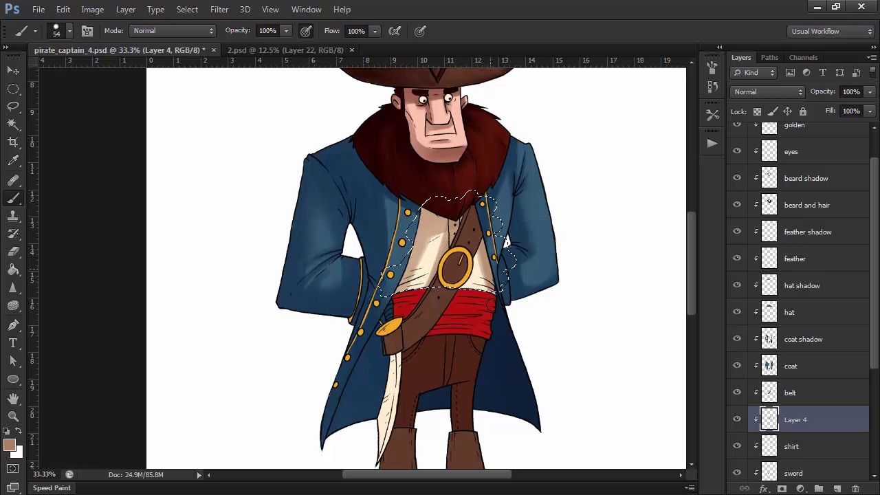
- Overview
- Transcript
3.7 Shading and Texture
We'll use different brushes to create varied textures and apply shadows and highlights to our character.
1.Introduction
1.1Introduction01:51
1.2Tools and Resources01:34
2.Creating a Cute Pirate Character
2.1General Form and Sketching06:07
2.2Detailing06:32
2.3Line Art07:10
2.4Base Colors04:55
2.5Light, Shadow, and Texture09:01
3.Creating a Tough Pirate Captain
3.1General Figure and Pose05:37
3.2Detailing the Figure08:05
3.3Expression09:00
3.4Detailing the Head04:55
3.5Detailing the Body08:15
3.6Line Art and Base Colors11:09
3.7Shading and Texture09:05
4.Conclusion
4.1Conclusion01:31
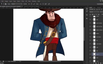
3.7 Shading and Texture
Hello and welcome back to the final lesson of Illustrating Personality in Character Design. My name is Ioana Sopov and this is chapter Three, lesson 3.7, Shading and Texture Texture for our pirate captain. In this lesson, we'll use the same technique as the previous chapter, to layer our shadows and highlights onto our character, while creating texture with different brushes and strokes. So let's get started. Because we have each element layered from our previous step, we're going to start adding even more layers, this time in between our existing ones. The first one should come directly on top of the base fill layer, so that we can shade the skin. Create a new layer, and it will automatically become a click mask, just like the ones above. Set the layer mode to multiply. Choose a dark red color, like that of the beard, with the color picker, and use a round brush to start filling in the shadows on the face. Make sure you have the Always Use Pressure for Opacity option selected. This is the eye contour to the right of the opacity value, in the top tool bar. Now try to imagine a light source, and it's position relative to the character, and visualize where the light will hit your characters face. While we were designing our character, we though of each shape as a 3D volume, so this is where that manner of thinking comes in really handy. Try to imagine how the light would hit a simple volume similar to our character's individual parts, and then render the shadow accordingly. For this exercise, I imagine my light source somewhere in the top right for my character. For example, thinking of his head as a box shape, will help me a lot in figuring out how to shade it. For the beard, I'll create a new layer as well. I'll set it to multiply, and using the same dark red color, I'll fill in the basic areas of shadow. Make sure that each layer of shadow is directly on top of its corresponding layer of base color. This makes it easier to keep track of everything. Also, it's a really good idea to name your layers. After I'm done with the large patches of shadow, I'll want to add some texture. So I'll select a tapering round brush, reduce it's size, and draw finer lines to simulate the hairy texture of the beard. You can also use the eraser tool, with the same type of brush, to erase hairs inside the shadow and add to that effect. Once I'm satisfied with the beard, I'll create another layer on top of the hat, set it to multiply, and proceed to shade it in the same way. I'll use a similar technique with what I did on the beard. I'll fill in the large patches of shadow with the round tool brush. And then I'll use an oil pastel brush from Photoshop's library, in combination with shorter strokes, to create a rougher texture for the hat's material. I'll also use the eraser tool with a round brush, to tone down areas that are too dark. For the feather, I'll go with the round brush again, to get a softer texture, switching to a darker yellow color for this shadow. You can layer different colors on top of one another, to create deeper shadows. In this case of the feather, I go with two darker shades of yellow and beige, where the feather goes in between the folds of the hat. For the coat, I'll go with the darker blue color ,and I'll leave this layer on normal mode, because blues tend to darken very quickly, and this way I have more control over the intensity of the shadow. Cold colors like blue or green, usually get colder as they darken. So don't adjust the lightness only. Go towards a deeper blue when choosing the color of the shadow. I use the round brush tool, to fill in the large surfaces of shadow. And then reduce the size of the brush to shade the details, like the creases and the folds. The inside of the coat, on the right side, will be the darkest, in this case, because no light would get that far, considering our virtual lighting setup. I'll add most of the shadows on the coat, and then go back and soften the edges where I feel it's necessary, to emphasize the cylindrical volume of the arm. For the shirt, I'll go with a dusty dark beige, and after filling in the shadow, I'll use the eraser tool to soften up the edges. Now that I have more shadows on my character, it seems like the coat shadow is too light by comparison. So I select the layer, and I darken it up with the hue saturation panel. The shortcut for that is Ctrl+U, by the way. I continue the process of shading, by adding a separate layer for each existing layer of base base color. And then I experiment with different brushes and strokes to get different textures. For the boots for example, I go with a round brush of a smaller size, and create high contrast shadows, so that I get a shiny texture to them. This is where you should explore Photoshop's existing library of natural media brushes, or search for some on the internet. There are all sorts of brushes with which you can play around. It would really be a shame to not explore your options. You can even create your own brush tailored to your needs. The possibilities are almost infinite. They're only limited by your imagination. Once we're done with the shadows and textures, we need to tackle the highlights. These will be sparses in the shadows, but will ultimately make our character really pop out. Let's create a new layer, between the line art and the rest. Name that layer, highlights. Make it into a clipping mask, by holding the ALT key and pressing the line between it and the layer beneath it, in the layers panel. And then fill it with black. Then set the layer mode to color dodge. Now select a color for your light. A very light yellow in this case. And with the round brush tool, start adding highlights to our character. Visualize the same light source that you did in the previous stage with the shadows. Like I've said, highlights should be sparser. Use the eraser tool to lower their intensity, if they get too out of control. Instead of adding bulks of highlights like we did with the shadows, build them up little by little, with little strokes. Use a smaller size brush for highlighting the details, like the folds of the coat and the hairs in the beard. The golden parts will have a really strong highlight, because of the metallic surface. So will the boots, because we want to give them a shiny appearance. I'll also emphasize the seams of the pants, with some subtle highlights as well. If we don't like the color of the highlights on a certain base color, we can change it with the hue saturation panel. For example, I'm not really satisfied with the orange tone of the light on the hat. So I lasso that part of the highlights layer, and shifted to a more yellowish hue. After I'm done with most of the highlights and shadows, I'll add a new layer, name it shadow details, and set it to multiply. Then lightly add any of the shadow that I find missing from the character, like maybe around the eyes. I use this layer to deepen existing shadows as well. I'll do a similar thing for the highlights. Create a new highlight detail layer, and without changing the normal blending mode, add little white specs of highlights on the golden parts, as well as maybe increase the saturation of the highlights on the boots. Another thing that you can try after completing this stage, is to add a photo filter adjustment layer, to unify your character's palate, lights, and shadows. In this case, I settle for a light, warming filter that brings the entire character together. And just like that, we're finished with rendering our character. And this hardy pirate captain looks ready for some adventures on the high seas. Whoa, that was quite a ride, right? There's only one more video to go, and that will be the concluding lesson of this course. Tune into that for a nice recap of the steps we've taken together throughout this course. As well as a few further recommendations, that I want to give you when approaching the subject of character design.


