
 Lessons: 15Length: 1.6 hours
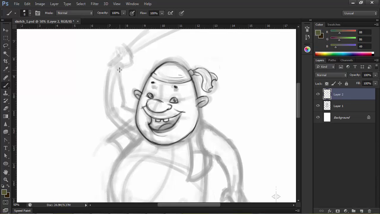
- Overview
- Transcript
2.2 Detailing
Now it’s time to develop the character's anatomy, clothing, and features. Here we'll go a little further in creating our character by detailing the rough sketch we have from the previous lesson.
1.Introduction
1.1Introduction01:51
1.2Tools and Resources01:34
2.Creating a Cute Pirate Character
2.1General Form and Sketching06:07
2.2Detailing06:32
2.3Line Art07:10
2.4Base Colors04:55
2.5Light, Shadow, and Texture09:01
3.Creating a Tough Pirate Captain
3.1General Figure and Pose05:37
3.2Detailing the Figure08:05
3.3Expression09:00
3.4Detailing the Head04:55
3.5Detailing the Body08:15
3.6Line Art and Base Colors11:09
3.7Shading and Texture09:05
4.Conclusion
4.1Conclusion01:31
2.2 Detailing
Hi guys, and welcome back to illustrating personality in character design. My name is Ivanna Shapov, and this is chapter 2, lesson 2.2, detailing and facial features. In this lesson, we're going to work on our previously elaborated rough sketch detailing our character's features such as the face, expression, hands, feet, and costume. This stage will serve as a stepping stone towards the final line art, at the end of which we should have a pretty detailed preview of how we want the character to look like. Again, we won't be focusing too much on line quality, but we will definitely try to go towards attaining a cleaner and clearer sketch. First off, let's increase the size of the document to 300 dpi watt. This will blow up the pixels of our initial sketch, but we will be drawing on top of it, so it doesn't really matter that much. Let's go to Image > Image Size and modify the resolution from there. Now, I'm going to use the same sketch tool brush preset for this stage. This time at about 8 pixels in size, and so I want to go into a little more detail. I'm going to select the layer with the initial sketch and turn the opacity down to about 40% so that I can clearly see what I'm drawing on top. And then create a new layer for the new sketch on which we're going to draw. Let's zoom in a bit and start redrawing a more refined version of his head and face. Based on where I initially marked the placement of his features, I'm going to start adding the eyes, nose, and mouth. We've established that this guy is cute and easy going and that he's giving a big friendly smile towards the viewer. His head is egg shaped so the size of his facial features will reflect that. His eyes will be smaller, his nose will be bigger, and his mouth will be the biggest feature of his face, being in the lower part. He also has rounded ears that move away from his head, adding an almost endearingly silly quality to his look. His eyes will be also pretty close to his nose, a feature that we usually associate with cuteness because it usually reminds us of babies or children. We'll give him a big, rounded nose, because we don't want him to be too baby like. His wide smile will complete his face and let's define that head scarf a bit as well. When placing his features, don't forget to visualize the volume of your character's head and face and try to imagine how these features wrap around this volume. Notice how my lines are a little more calculated, as I am using a smaller brush at a higher resolution. This stage gives you enough leverage to still play around with the contours of the shape while bringing a little more discipline into your line work in preparation for the final stage. This means that you can still draw in a relaxed manner without trying to be too precise. You can play around with the character's features until you're satisfied. Note that most times, the essence of the expression lays in the eyes and the eyebrows, where very subtle changes can affect the overall expression on your character's face. I chose to draw his tiny eyebrows way above his head to illustrate excitement or eagerness by being paired with his wide smile. After we're done detailing his face, let's redraw cleaner lines for the rest of our character. Follow the lines of the initial sketch and try to add detail and shapeliness to individual parts. Let's start with the arms and hands. His arms aren't really much more detailed than what we have established in our original sketch. So just following the contours and adjusting the thickness here and there, we get our desired results. Now, onto the hands, we kind of know how we want his right hand to be like since he's holding the cutlass. So if you try looking at your own hand while holding something similar, you'll see that the thumb comes on top and then the fingers wrap around the object and go under the thumb. So we'll draw the thumb and mark three guidelines for the finger then draw the fingers with volume following those guidelines. I've added some wear and tear to his cutlass because knowing pirates, none of them have brand new, shiny weapons. This is part of our character's personality as well. Nothing should be random in our character's design. Try to imagine a story or a short description of your character when detailing his accessories or clothing. This will make imagining what they're wearing or doing much easier. For example, our character is like I've said a friendly, easygoing pirate who's probably been on the sea for a while now, hence the chipped weapon and torn shirt. But has let the hardy buccaneer lifestyle get to him. For the other hand, let's go with a relaxed open position. You may encounter difficulties when drawing hands don't worry, it only takes practice and by practice, I mean drawing lots and lots of hands from photo references or from life. I've included a little guide in the source files for this lesson, showing you how to break down the hands into basic volumes. For drawing characters, it will definitely be easier since most of the time the hands are stylized versions like our character has, with a thumb and three not very detailed fingers. Moving on towards the body and legs, I think he should have a belt for those pants of his. Keep in mind that the belt is not a flat object, it has a thickness that you should be able to see. The seams of the pants add a bit of detail and shape to the lower half of the body. And we finish the legs off with some swashbuckling boots. I made his feet very small in comparison to his body because one of the key elements in making the character visually interesting is contrast. Contrast between the size of the features, between soft and sharp angles, between the size of the head and the body and so on and so forth, can make or break a character design. So use it wisely and with purpose. After adding a little more details such as buttons and torn sleeves from his shirt, we can wrap up this part of this process. Turn off the underlying sketch layer and you can clearly see the progress we've made with our character. In the next lesson, we'll move on to the final line art, where line quality will be our main goal. We'll use different brush for digital inking and learn how to get the best of lines in Photoshop.


