
 Lessons: 15Length: 1.6 hours
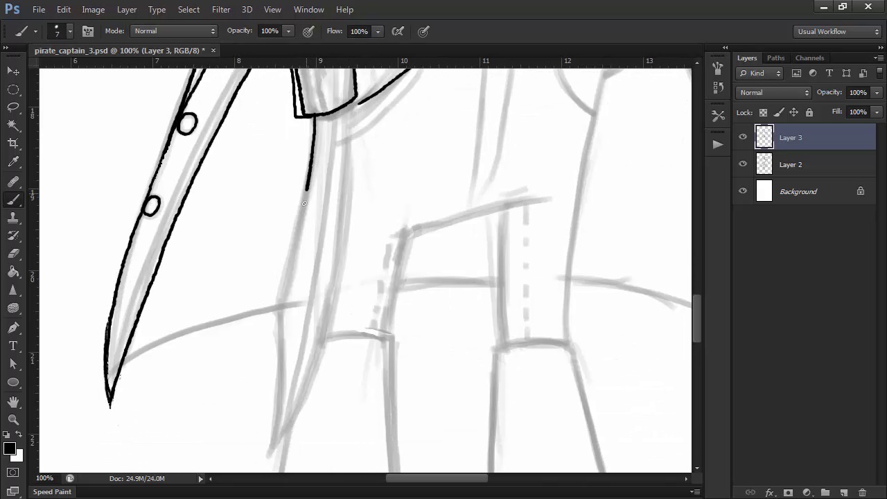
- Overview
- Transcript
3.6 Line Art and Base Colors
Just like with our previous pirate, we'll lay in the final line art and base colors for our captain.
1.Introduction
1.1Introduction01:51
1.2Tools and Resources01:34
2.Creating a Cute Pirate Character
2.1General Form and Sketching06:07
2.2Detailing06:32
2.3Line Art07:10
2.4Base Colors04:55
2.5Light, Shadow, and Texture09:01
3.Creating a Tough Pirate Captain
3.1General Figure and Pose05:37
3.2Detailing the Figure08:05
3.3Expression09:00
3.4Detailing the Head04:55
3.5Detailing the Body08:15
3.6Line Art and Base Colors11:09
3.7Shading and Texture09:05
4.Conclusion
4.1Conclusion01:31
3.6 Line Art and Base Colors
Hello, and welcome back to Illustrating Personality and Character Design. My name is and this is Chapter 3, Lesson 3.6: Final Line Art and Base Colors for our Swashbuckling Pirate Captain. In this lesson, we'll draft the final line art with the previously used inking brush and the techniques that we've learned to use. But we'll learn a few new tricks as well. We'll also lay in the base colors in order to prepare for the final stage of rendering the character. So let's begin. First off, I'm going to set the sketch opacity to 40% as usual in order to get good visibility for the line art. Then, using the inking brush provided in the source files for this course at about seven pixels size, we're going to start inking our character on a new layer above the previous sketch. Let's start with the head and face. Just like in our previous character, I'm using tapered strokes for lines that are not closed outlines. This effect is due to the pressure sensitivity in your tablet. So, the lighter you press on the pen, the thinner the strokes will be. Where you have closed contours, like for the eyes, you can go with just a uniform constant stroke. This of course is a matter of preference or style, but I find that it works best this way. Note that I'm adding details that weren't present in the previous layer of the sketch. Working with the smaller, more precise, inking brush allows me to go into greater detail where I feel that it's needed to spice up the character a bit. I zoom in quite a bit when I feel the need to, and this is why working in 300 dpi high res files is ideal. I'm also using the Rotate Canvas tool, which you can access by pressing R on your keyboard, in order to simulate how I would rotate the paper in traditional inking. This is so that I can comfortably draw every line without having to shift my hands into really uncomfortable positions on the tablet. On the feather, I even draw the fibers outside of the contour to get that rugged textured feel to it. I add more fibers towards the base of the feather where it narrows down, in order to emphasize the shape. Little strokes of varying thickness and number can contribute to making your design more interesting in its line art stage by simulating different textures and materials. I'm also using thicker strokes for the contours and the silhouette, and going lighter on the details like the creases in materials and textures. This is to create depth to my character, even from the line art stage. Keep in mind that if your line art looks good, then your rendered artwork will definitely look good. Continue following the underlying sketch with the line art, fixing what you don't get right from the start as many times as necessary. Like I've said before, you mustn't be afraid of errors, even though you want your line art to be neat and clean. Unlike traditional inking, the digital medium offers you virtually unlimited opportunities to make mistakes and correct your line art. So don't be afraid to use the Eraser tool and redraw strokes that you are not really pleased with. I find that rotating the canvas really improves your line art, especially when dealing with curves or ellipses as well. But for the belt buckle, we're going to use a different technique since ellipses like that are very difficult to get right freehand. Select the Ellipse tool, or press U on your keyboard and create an ellipse. Make sure you are creating a path, and not a shape. Then, press Control+T on your keyboard to bring up the Transform box. Adjust the size and the shape of your ellipse until it fits with your idea for the belt buckle. Then press B on your keyboard to select the brush and reduce its size to five pixels. This is because we're going to select the Ellipse tool again, right-click on the path and select Stroke Path. This will stroke the path using the brush we're already using so that there won't be any difference between the free hand line art and the stroked one. Press Ctrl+T again and reshape the path so that it fits inside the belt buckle and repeat the process. This time, with a three pixel size brush. If it comes out too thin, lightly retrace the stroke to get it to the desired width. After you're done, hit Delete to get rid of the path. Now that we have the belt buckle, we're free to finish the rest of our line art. When finishing up the line art, don't forget to take into account the thickness and volume of each shape that you're drawing, like the belt, for example. The trick is to study these shapes and volumes in real life as much as you can in order to develop a virtual 3D engine in your head. It might take some practice to learn how to see and think in 3D volumes if you're a beginner, but learning about perspective is always a good way to start. When detailing his weapon, remember the breakdown of the parts that we did. Add some extra texture to the blade with tiny, thin strokes as well. When drawing the creases in the waist, use longer, tapered strokes. Try to imagine how the folds in the cloth seem to melt into one another in real life, and then vary the pattern so you don't make it too uniform. For the pants, we'll add the seams that we talked about in the previous lesson, and then go on to draw our boots. I add some texture onto the boots as well, because I want to emphasize the difference in materials between the boots and the pants. Sometimes when you're just finished with the line art, you start to notice things that you aren't totally pleased with in your character. In my case, I'm not really satisfied with the way his face and beard interact, so there's nothing stopping me from going back and correcting it. I adjust the nose a bit as well while I'm there. Try not to compromise. Like I've said before, working digitally gives you enormous freedom, so take advantage of it and change anything at any time if you feel the need to do so. So now that we're done with our line art, it's time to lay in the base colors. Begin tracing our captain's silhouette using a flesh colored shape. Remember to make sure it's a shape with a fill and not a pad. Clicking adds an anchor point, clicking and dragging modifies the direction and angle of the curve, and clicking while having the Alt key pressed on your keyboard resets the handles of the point, making it possible to create sharp angles when you need them. After you're done tracing the silhouette, right-click on the shape layer and select Rasterize Layer. Then, use the Eraser tool to erase the extra fills. Create a new layer above the base one. Hold the Alt key pressed and click on the line between the layers in the Layers panel. This is a shortcut to making the layer above a clipping mask. I then select a larger, round brush and begin filling in the coat on this layer. Holding Alt and the right mouse button pressed while dragging outwards or inwards will increase or decrease the size of your brush for quick changes. I find this trick very useful, because when filling in colors, I often need very large and very small brush sizes in a very fast order to make the process as smooth as possible. I repeat this process by creating a new layer for the hat and filling it in with a brown color. Where you see that your initial shape was lacking, go back to your base layer and fill in the gaps. Then return to the filling of the clipping masks on top. I try to layer each object separately in order to have better control. To select the layer without constantly going to the Layers panel, press V on your keyboard to get the Select Move tool, and then, keeping Ctrl pressed on your keyboard, click on the blue fill for example. This will automatically select the layer that you clicked on. In this case, the Coat layer. Using keyboard shortcuts will save you an amazing amount of time and will make your workflow very fluid. For the beard, I go with a darker red color and after filling in most of the shape with a round brush, I decide to switch to a tapered round brush in order to get the finer details more easily. I also zoom into the parts where there are details, to make sure I fill them in correctly and I also use the Rotate tool sometimes for this part as well. When choosing colors, always remember that you can change them anytime with the Hue Saturation Panel found in Image Adjustments. Remember that when choosing a palate, you have many ways in which to do so. We are going to stick with a similarly classic palate like the one we used in our previous character for this pirate captain. This means large patches of lower saturated, more neutral colors, brightened up by patches of accent colors like bright red, and gold and orange. This doesn't mean that you aren't free to experiment. These are just general guidelines to follow, but you can go wild and try different pallets and colors until you find what's right for your character and style. The layering of different elements is very useful and saves a lot of time. Some edges will be hidden by objects on top, so that you don't have to bother filling them in to perfection. The waistband for example, will be covered by the belt. So where they overlap, I won't waste time trying to get a perfect edge. The large patch of lower chroma or desaturated blue on the coat needs an accent color to break the dullness. So I'll make his buttons golden and also add some golden trims here and there. Always try to spice up larger areas of dull colors with accents or details, like this. Now that we have our line art and base colors in order, that we've learned how to use keyboard shortcuts, and how we improve our color palettes, it's time to move on to the final stage of this course. We're going to render our awesome pirate captain. And this means using brushes to create textures, and layer modes to create lights and shadows.


