
 Lessons: 15Length: 1.6 hours
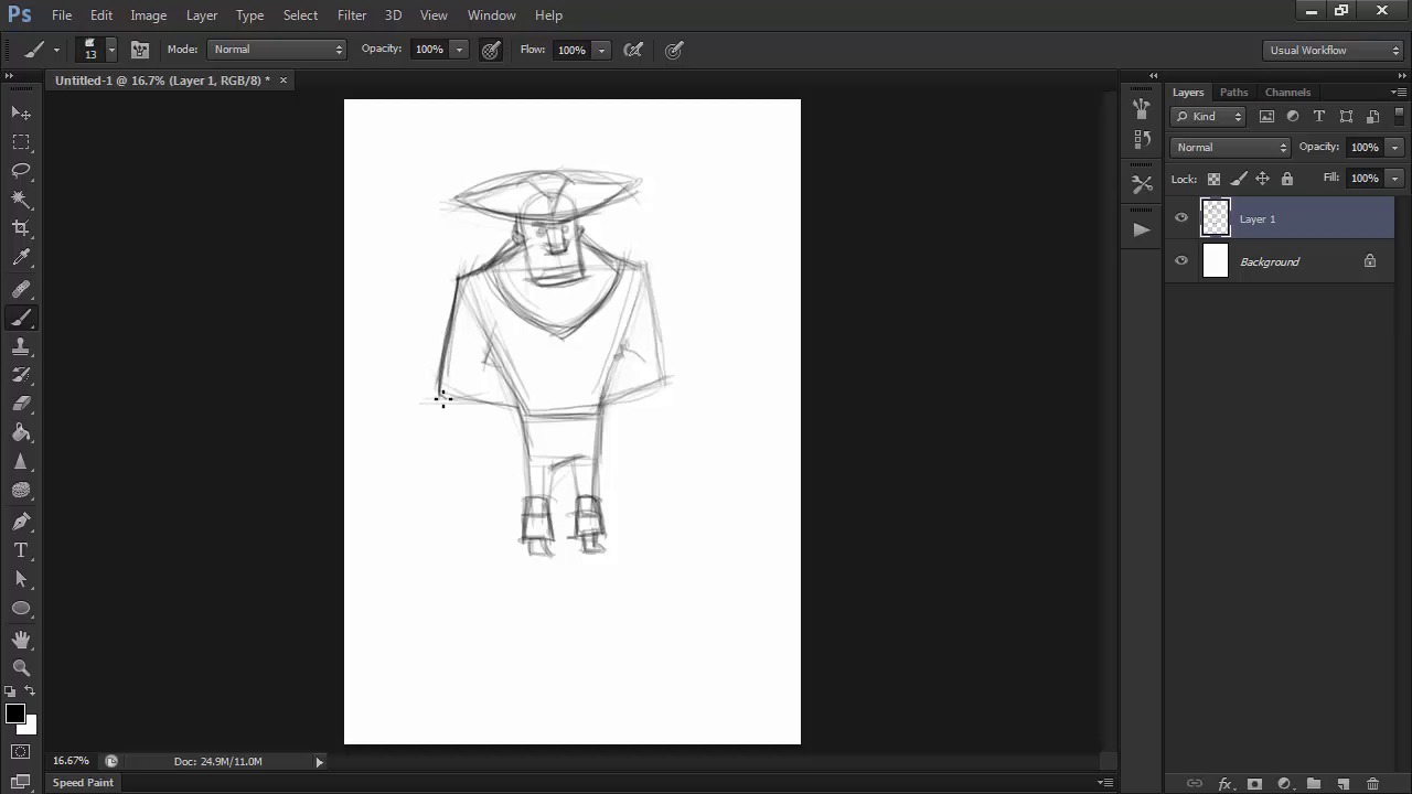
- Overview
- Transcript
3.2 Detailing the Figure
Let's define our character further by developing one of our earlier thumbnails into a rough sketch of his anatomy and costume.
1.Introduction
1.1Introduction01:51
1.2Tools and Resources01:34
2.Creating a Cute Pirate Character
2.1General Form and Sketching06:07
2.2Detailing06:32
2.3Line Art07:10
2.4Base Colors04:55
2.5Light, Shadow, and Texture09:01
3.Creating a Tough Pirate Captain
3.1General Figure and Pose05:37
3.2Detailing the Figure08:05
3.3Expression09:00
3.4Detailing the Head04:55
3.5Detailing the Body08:15
3.6Line Art and Base Colors11:09
3.7Shading and Texture09:05
4.Conclusion
4.1Conclusion01:31
3.2 Detailing the Figure
Hi, and welcome back to Illustrating Personality in Character Design. My name is Loana Sopov, and we are on our way to creating an awesome pirate captain character. This is chapter three, lesson 3.2, detailing the figure, in which we'll work with what we've established in the previous lesson about our character's figure and pose to create a more detailed and larger version. Let's get started. First of all, I'll be working on an A4 size 300 DPI wide file, just like with our previous character, and using the same sketch brush tool preset that we've used in the previous lessons when sketching. Working at a high resolution is great, not just for print but also getting a lot of getting a lot of details in the art work when working in Rastor. At this point, we already know what we want our character's general look to be like, so let's just start off with a simple ball shape to create the head. This method is derived from Andrea Loomis' technique of drawing the human head. Based on the observation that the top part of the head can be reduced in it's basic form to a sphere with the sides cut off. I know my character needs a boxy shape for the head in order to fit his hardy masculine personality. So, I'm going to use a rectangular shape for the lower part of his face. We want our character to have a big broad nose and tiny eyes to go with his protruding chin. Strong thick eyebrows and tiny ears complete the look we're going for. Don't worry about adding too much detail. Just focus on the general proportions and shapes of the features. We'll get around to detailing them in the next lesson. Next come the shoulders. I draw a line from shoulder to shoulder to establish the width of his upper body. His shoulders should be connected to his neck, even if we're not drawing or showing his neck because it's short or concealed by his long, boxy face. So, connect the points of the shoulders to the head using slanted lines. Like we've established in the thumbnail version, we want his body to be like an upside down trapeze to emphasize his more intimidating figure. Because I'm using a lot of lines until I find the ones I like the most, I'll just use the eraser tool to erase some of them and try to make the sketch cleaner. Remember, we'll need the sketch to be as understandable as possible for the next stage of detailing. Moving on towards the waist, let's use some more contrast in the relationship between proportions and shape to give him a shorter, thinner pair of legs compared to his body. Try to maintain the same boxy, almost rectangular shapes for his legs as well. As we are interested in keeping the language of the shapes we use constant throughout his design. His arms will go behind his back just like we planned in the thumbnailing part. The arms will be thicker than the legs, part of the same typical muscular, masculine silhouette. And even though elbows are not really sharp in appearance in real people, we'll go with an exaggerated sharpness to add to the overall impact that we want. For the hat, we might have to change this a bit. But that works in our favor here, because the hat is not part of his body, and the contrast between sharp and curved lines will create an interesting silhouette overall. A typical pirate hat looks almost triangular, because of the three folds that come together to form the top part. Two of them meet in the middle of the front part, and the third fold connects the two in the back. The center will be a half sphere between them where the head would be. While we're here we can't have a rugged pirate captain without a beard, so lets go for a shape that will compliment the ones we already have in his body. The beard will overlap with the shoulders and taper off towards the bottom. This shape will not affect our silhouette, and will only compliment it. I'll go over a few lines again to make them stronger and thus more visible and then I'm going to start thinking about his clothes for a bit. Pirates wear all sorts of clothes. But I want this one to have a longer coat, so that he has more of a captain's costume. I'm going to balance out his figure with the shape of the coat that will become wider towards the bottom. The bottom of the coat will end in sharp angles as well to contrast with the curved back of the coat. Because his coat is open, the edges will move away from his body to obtain that opposite shape to balance out his figure. I'm also going to change the position of his foot because of this balance that I'm trying to obtain. So I'll redraw it facing in the opposite direction. His hat seems to be missing something, so I'll add a huge feather to complete it. I'll check the position of his feet by drawing a straight line between them, just to make sure they're on the same level. Holding the Shift key pressed while drawing, will get you a stick straight line, to verify the level of your feet. He could use a belt of some sort and a diagonal belt as well to act as a holster for his weapon. After sketching out these ideas in our figure, I think that his head is a bit too big. So using the lasso tool to select it and then press Ctl+T to get the transform tool and to reduce it's size as well as shift it's angle to better suit the pose I am going for. This stage of the character's development should be entirely focused on getting the proportions right. So take your time and don't avoid changing what you don't entirely like about your character. Feel free to try different things in this stage just like in the previous thumbnailing one. The only difference being that you'll be working on this idea alone and not trying to come up with at least three different ones. This is why you shouldn't really pay any attention to creating quality in your line work at this point, and just enjoy the freedom that this part offers you to explore your options for the character's design. Now, I'm not entirely happy with the pose that I got because it seems a bit rigid since we've been using these boxy, straight shapes. So I'll go back and I'll try to find the curved action lines that I've kept telling you about, and slightly shift our established shapes to fit these lines. This means curving the really rectangular and rigid shapes a bit. But we won't be losing the overall sharp quality of the silhouette. This contrast of sharp and curved will actually enrich our design and make it more visually interesting as well as add volume to our character. This reinforces what I said before about not being afraid to change things in this stage of the process. When in doubt about your character's pose or figure, it's always a good idea to return to the thumbnail and see if the motion and volume you've captured in just a few lines and shapes is present in your more detailed sketch as well. If the sketch seems lacking, try to analyze what is missing from your sketch. In my case here, it was the action lines that gave my character a little life. Oftentimes, you might get too attached to the effort you've put into it up until this point and might hesitate to erase and redraw. But nothing bad can come out of retracing your steps and improving things that you've already worked on a lot. Now that we're happy with the rough sketch for our character and have established his general traits, it's time to move onto the next stage. Detailing our characters expression and facial features. Join me in the next lesson where we'll explore the possibilities of these key elements of our character's look and personality.


