
 Lessons: 15Length: 1.6 hours
- Overview
- Transcript
2.3 Line Art
In this stage we'll load the inking brush provided or create our own unique one, and then use Adobe Photoshop's tools to create our final line art.
1.Introduction
1.1Introduction01:51
1.2Tools and Resources01:34
2.Creating a Cute Pirate Character
2.1General Form and Sketching06:07
2.2Detailing06:32
2.3Line Art07:10
2.4Base Colors04:55
2.5Light, Shadow, and Texture09:01
3.Creating a Tough Pirate Captain
3.1General Figure and Pose05:37
3.2Detailing the Figure08:05
3.3Expression09:00
3.4Detailing the Head04:55
3.5Detailing the Body08:15
3.6Line Art and Base Colors11:09
3.7Shading and Texture09:05
4.Conclusion
4.1Conclusion01:31
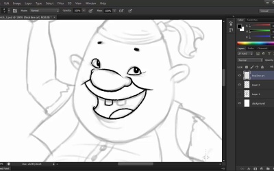
2.3 Line Art
Hi and welcome back to Illustrating Personality In Character Design. My name is Ioana Sopov and this is Chapter Two, Lesson 2.3, Final Line Art. In this lesson, we're going to learn how to create a digital inking brush and how to use that brush to create the final version of the line art for our tiny pirate character. We'll go through the basics of digital inking and the tools you can use to master it. I've also provided the brush that I created and used in the source files for this course. So you can just load it up and start working. So let's get started, shall we? First off, let's load the brush tool that I provided in the source files for this course. Go to the brush tool, click on the arrow on the right side of the tool, go to the more options menu and click on the Load Brush preset. Then just browse the folder containing the source files and click on the ABR file called Inking Brush. Now I'm going to show you how I created this brush just in case you want to create your own. I'm going to access the brush preset panel and I'm going to start off with the round, hard and tapered standard brush tip shape. I'm going to set the spacing to 1%. And this is very important to get your lines fluid without any gaps in them. And then I'm going to modify the roundness variable so that our brush will have an elliptical shape instead of the perfectly round. Set it to about 80%, and then add an angle of 45 degrees. I also have the Dual Brush option activated. And this is because I like to have my brushes with some texture to them, and sort of simulate the way traditional media works and looks. So what the dual brush does, is that it adds a layer of texture to your existing brush, with any type of brush tip that you want as a second layer for your brush. You can also fiddle with the blend modes of the two brushes, the Size, Scatter, and Count variables until you find something that you like. I'm going to work with the brush that I've already created for this course, but feel free to experiment. Now, let's start the actual inking. Notice that I've set the opacity of the layer with our previous sketch to 40% so that I can clearly see what I'm doing on top. I'm going to create a new layer named final line art that we'll be working on for this lesson. We're going to zoom in a bit since the line art is supposed to be clean and precise. So let's start out with his face, his most important feature. The first thing you'll notice is that my lines are not of the same thickness from start to finish. This is where your tablet's pressure sensitivity shines, because it allows you, by varying the of pressure with which you're drawing, to create dynamic, fluid strokes. Just lightly press your pen against the tablet when starting the stroke, and gradually increase the pressure towards the body of the stroke, while tapering it off again towards the end. It takes a lot of practice, at first, but after a while, you'll see that the control that you will gain over your stroke width will become better and better. Now this is a matter of style, but i prefer to have the thickest part of the stroke towards the middle and taper it out very much towards the ends. You can play around with the proportion of thickness to suit your preferences though. While we're talking stroke width, note that we won't be using the same one on all of our lines. Try to use thinner strokes for details and thicker ones for contours. Notice the little smile lines next to his eyes, the inner fold of his ear, and so forth. This contrast between strokes will make your drawing pop out even more, and will create a visual hierarchy for the elements that make up your character so that it becomes much easier to perceive as a whole. One of the many advantages of digital art is that you usually don't have to worry about making mistakes. Even though the line art should be clean and precise, try to be relaxed and try to draw each stroke with confidence and purpose. If you don't get it right, you can always fall back on the eraser tool or undo and can always have another go at it. Knowing this, take chances with your strokes. Try to draw them in one movement of the hand so that they'll be as fluid as possible. To draw a longer line like the contour of the head, we're going to have to go for a little segments that blend together to get a nice fluid stroke. That is the best way to approach more challenging strokes. Little by little, step by step and focus on getting the thickness to match so that you don't have any weird gaps in your line art. I'm also going to add details within the line art that were not present in our previous sketch. These are mostly wrinkles in the clothes or very subtle textures like on the vest. Sometimes it's best to try to indicate different textures within the line art even if you intend on adding color and texture afterwards. It just adds to the effect and makes the design more interesting. For the rest of the body, we'll just follow the same principles that we used in the inking of the head and the face. Just follow the lines of your previous sketch, going with thicker, more uniform strokes for the contours and thinner strokes for the details and textures that you add along the way. If you're not happy with the way the previous sketch looks like with the final line art, feel free to improvise and change the placement or number of the strokes. You can emphasize the worn out quality of our pirate's cutlass by adding tiny details of texture to the blade. We can also make the handle more interesting using a rib design. In traditional inking, one might have to rotate the paper in order to get some lines nice and straight. Thankfully, we have that tool in Photoshop as well. Pressing R on your keyboard will activate the Rotate Canvas tool. Feel free to use it just like I am in order to make it easier to draw out some more difficult strokes. I especially use it when I have to draw curved strokes or just weird angles that maybe go against using a tablet in the first place. In successful character design, the devil is always in the details. The fact that the belt has a certain thickness and is not just a flat shape, just like the belt buckle adds to the character's 3D quality. The wrinkles on the shirt also give the impression of volume. The seams on his pants, and the varying thickness of the strokes add to this effect, as well. Unless you want your character to appear flat as a styling choice, three dimensionality is what we're going after. And if you put enough effort into making your character pop out in the line art stage, then it will definitely look amazing with textures, light and shadow in the next stage. Now turn off the sketch layer and see how your finished line art turned out. Pretty nice, right? In the next lesson, we'll be adding base colors to this line art in preparation for the final stage of designing our character. The rendering of lights and shadows. We'll learn how to use Photoshop's tools to make filling in the base colors easier and faster than anything.


