
 Lessons: 15Length: 1.6 hours
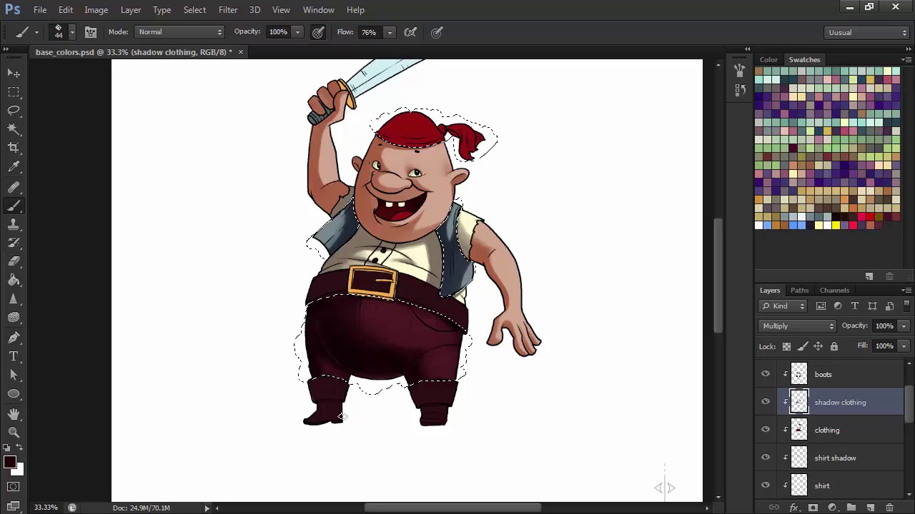
- Overview
- Transcript
2.5 Light, Shadow, and Texture
In this lesson we'll start using layers with different modes and different brushes in order to render our character.
1.Introduction
1.1Introduction01:51
1.2Tools and Resources01:34
2.Creating a Cute Pirate Character
2.1General Form and Sketching06:07
2.2Detailing06:32
2.3Line Art07:10
2.4Base Colors04:55
2.5Light, Shadow, and Texture09:01
3.Creating a Tough Pirate Captain
3.1General Figure and Pose05:37
3.2Detailing the Figure08:05
3.3Expression09:00
3.4Detailing the Head04:55
3.5Detailing the Body08:15
3.6Line Art and Base Colors11:09
3.7Shading and Texture09:05
4.Conclusion
4.1Conclusion01:31
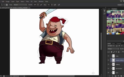
2.5 Light, Shadow, and Texture
Hi, and welcome back to Illustrating Personality in Character Design. My name is Iwana Shapov, and this is chapter two, lesson 2.5, light, shadow, and texture. In this lesson, we'll bring our character to life using brushes and layer modes to fill in the shadows, highlights, and play around with some texture. Let's get started. So we have our base color layers here. Let's start adding shadows first. Create a new layer just above the base fill layer, and that will automatically become a clicking mask because it's in between your other masks and the bottom layer. Now, set that layer to multiply, pick a smooth round brush, since we want his skin to be smooth, and pick the same skin color with the color picker. Now try to visualize where your light source is coming from. I'll go with the source places in the upper left of our character. This is where what we have established in the previously stages, namely that our character is composed of 3D shapes and not just flat shapes, comes into play. Try to imagine how the light casts shadows onto these volumes. This is something that often times comes with a little bit from instinct, but mostly it's just practice and understanding how light works in nature. The best way to get better at identifying shadows and highlights is by observation and studies, either of photos or from life. With this brush, you can create really sharp, crisp shadows, as well as gradients, like I did above his right eye. I achieved this by using shorter, lighter, upward strokes in the direction that I wanted my gradient to end. Contrast between sharp and soft shadows is something that often times might be a matter of taste, but I find it brings a little bit of realism into your character's rendering. If you find that your shadows aren't quite as intense as you'd like, just go to images adjustments, hue saturation and darken them up a bit. Increase the saturation so that they won't look dull. Next let's move on to the mouth. Our base shape is on the face layer, so with that layer selected, let's shape the inside of his mouth. It's easier to select the layer and keep the selection active so that you don't go over the edges. Keep the Ctrl key pressed while clicking on your layer thumbnail in the layers panel and you'll select the layer. Now paint the inside of the mouth on a new layer set to multiply with a darker red or brown color. This is the same process that I'll use with each layer, continuing with the shirt. On the shirt, we'll have a shadow coming from the head, and the shadow that the vest projects on the right side as well as the wrinkles. For the vest, I'm going to choose a darker blue grey. But if I'm not perfectly satisfied with the shade, I'll go into hue saturation again and then alter it until I think it integrates perfectly into into the scheme. Now for the pants I could go with the same smooth brush but that wouldn't be too interesting. Let's choose a pastel brush from Photoshop's library to get some texture into those pants. I go for shorter strokes, one on top of the other, until I get the desired effect. Using different brushes creates the impression of different materials and that always makes for a more interesting design. I fall back on the smooth, round brush to finish off the shadows if I need darker areas on the pants and then switch back to the oil pastel for details. I also use the eraser tool quite a lot to give shapeliness to my shadows. Lighter than shaded objects interact with each other giving birth to reflected light. To better emphasize the seams of the pants and the thickness of the material I go for some reflective light showing near the seams. All of these lighting techniques might seem hard to understand at first but there are tons of resources out there to help you. I recommend the book called Color and Light by James Gurney. A very comprehensive guide on lighting in art. Now, moving on towards the boots, I want them to be just a bit shiny so I'm using the same round brush tool. Note how after the highlighted portion in the center, I add another shadow. That's what gives them that sort of shiny texture. I go for short strokes to create a subtle texture along the way. For the head scarf, I'll go with another brush from the library. This is where I should experiment with brushes and figure out what works best for you in your design. Don't be afraid to try out all of them. You can achieve some very interesting effects. Now it's time for the cutlass. With the darker blue color let's add the shading on the blade. Metal is very shiny and reflective, so let's add some bold, diagonal shading portions to emphasize the mirror-like surface of the blade. So we're finished with our shading part. It's time to move on to the highlights. Create a new layer above the skin and name it highlight skin. Set the layer mount to color dodge and fill it with black. This is because color dodge works with the grays that the black fill combined with the light color creates. Otherwise, it will really burn out the colors and not give a real lighting effect. Now with the same smooth round brush, grab a light yellow color, or whatever light color you want, and start adding highlights to the shapes. If you find that the color is still too intense or burned out, try reducing the opacity of your strokes. Don't go overboard with the highlights, try to use them sparsely by adding light strokes, one on top of the other, to build up light on your character. Now repeat this process for each layer, just like we did with the shadows, only that instead of setting the new layers to multiply, we set them to color dodge and give them a black fill before painting in the highlights with a lighter color. If the light turns out too intense and off-putting, still, use the trusty eraser tool to softly remove some of the intensity. You can try and experiment different colors for the lighting on different materials, but in this exercise we'll just use the same light yellow color all around. For the cutlass, we'll want some really straight and shiny highlights to match the shadows. Set the opacity to about 75% to avoid any pure whites that might result. Now after adding both shadows and highlights, I find that the contrast is a bit lacking. So I create a new layer on multiply and with the soft round brush and a dark brown color fill I place the shadows where I feel the character might need a little more contrast. Make sure this shadow layer is just beneath the final line art so that it affects every layer beneath it and not just a few. Now after all of this, I notice that I forgot about his belt buckle. So let's add a shadow on that as well. Being metallic, the shadows will sort of be similar to the cutlass, diagonal, straight shadows emphasizing the shiny texture on the buckle. This stage is often times the most challenging. There's a lot to master here, from the placement of the shadows and lights, to material interactions, textures, and so on. But this is also the most rewarding stage. Take a look at our little pirate. Doesn't he just look ready for some swashbuckling adventures? In the next chapter we'll take on a more complex character design in the form of our little mate's captain. The steps we'll undergo will be mostly the same, however we will go into a little more detail in each stage's development.


