
 Lessons: 15Length: 1.6 hours
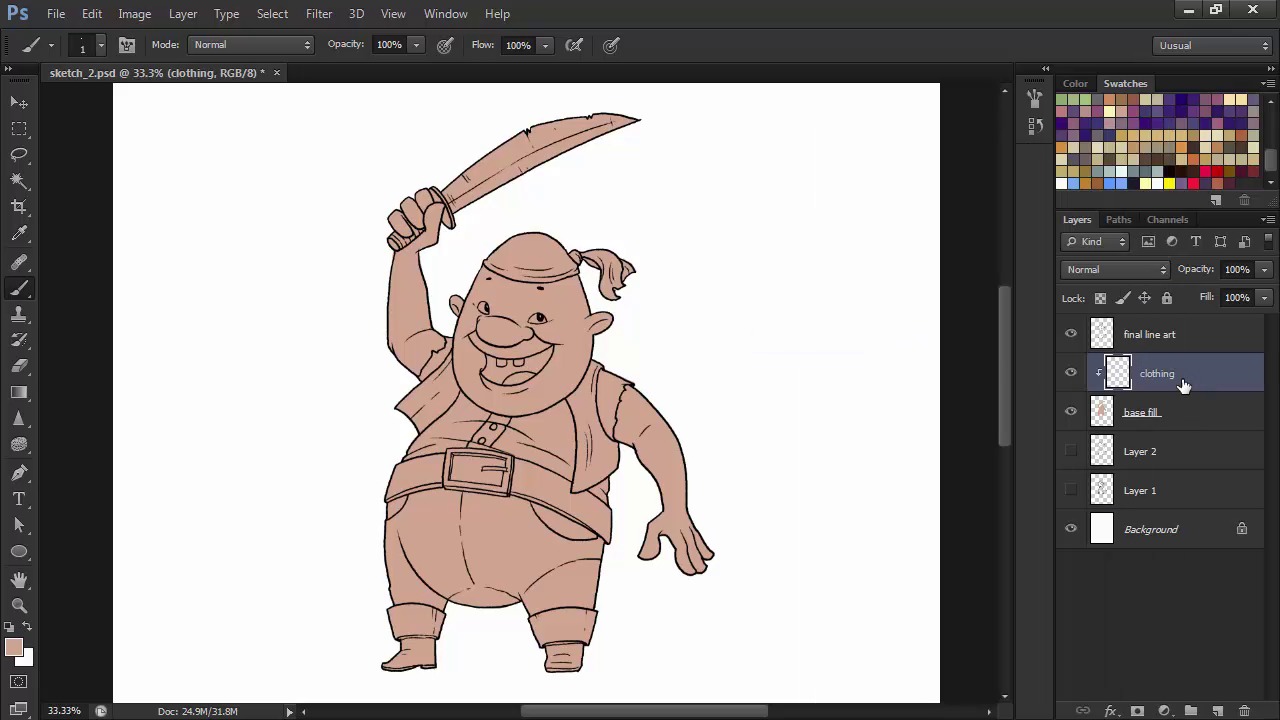
- Overview
- Transcript
2.4 Base Colors
Using the Pen Tool and clipping masks, we'll now fill in the base colors for our character in preparation for the rendering stage.
1.Introduction
1.1Introduction01:51
1.2Tools and Resources01:34
2.Creating a Cute Pirate Character
2.1General Form and Sketching06:07
2.2Detailing06:32
2.3Line Art07:10
2.4Base Colors04:55
2.5Light, Shadow, and Texture09:01
3.Creating a Tough Pirate Captain
3.1General Figure and Pose05:37
3.2Detailing the Figure08:05
3.3Expression09:00
3.4Detailing the Head04:55
3.5Detailing the Body08:15
3.6Line Art and Base Colors11:09
3.7Shading and Texture09:05
4.Conclusion
4.1Conclusion01:31
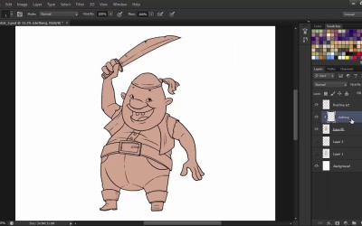
2.4 Base Colors
Hello and welcome back to Illustrating Personality in Character Design. My name is Lana Shapol and this is Chapter Two, Lesson 2.4 Base Colors. In this lesson, we're going to learn how to efficiently fill in our liner with the base colors. We're going to use the pen tool and Clipping Masks for maximum speed. Let's jump right in to it. First of all, we're going to use the pen tool to trace our character's full silhouette, not focusing on different areas of material. Make sure that the option selected in the drop down menu, on the top, left side, is shape and not path because we need a visible fill for this layer. Let's start with a flesh colored tone so that we can add clothing and other things on top afterwards. After selecting your color, start wherever you want. Move the shape layer beneath the line art, so that you can see what you're doing, and continue with the contour. Clicking and releasing creates an anchor point. Clicking and dragging modifies the direction and the intensity of your curve. Also, holding down the alt key while clicking on an anchor point resets the direction points of that anchor, allowing you to continue the path at a sharp crisp angle. The pen tool in Photoshop works similarly to the one in Illustrator. But the two have some subtle differences between them. However strange the pen tool might seem for a beginner, it is the fastest way to color the base silhouette of the character. Don't worry about getting all the edges right. We can go back and correct them later. After closing the shape, right-click on the shape layer and select the Rasterize Layer option from the drop down menu. We're doing this so that we can edit the edges of our shape with the brush and eraser tool rather than editing the anchor points. Then correct any edges that go over the line art or gaps that we have in our base fill layer. Now we're going to create a new layer called clothing. Right click on this layer and select create clipping mask. This means that whatever you draw or paint on this layer will be contained to the contours of the layer beneath it. Select a deep red color and let's fill in the head scarf. Notice that no matter where I paint, the edges never go over the basefill layers. Just like with the headscarf, continue adding colors onto your character. I'll fill in the vest with a blue-gray and choose a very brown color for the pants. To better save time, let's layer our colors even further. Create a new Layer, turn it into a clipping mask as well. Name it boots. And with a darker brown, fill in the boots and belt. Why do this? Because when layering objects you don't have to worry about some edges, as the objects come on top of each other and masks errors. Try to think of an order that works best for your character and just go with it. It never hurts to have too many layers. You can always merge them down, if you need to do so. You can save some time in creating clipping masks by holding down the alt button and clicking between layers to convert the top one into a clipping mask as I've done for the layer for the belt buckle. Next I'm going to finish filling in the colors, using a light yellow for the shirt, eyes, and teeth and some blue, gray, and gold for the cutlass fills. Try to avoid pure white even for very light surfaces. It seems very artificial. Unless, of course, you work with a limited pallet, or that's the style you're actually going for. My choice of colors is not random. When picking a color scheme for your character, always go for a clear hierarchy. Muted neutral colors for the large patches of fills, accent colors for smaller portions. In this case, I use beige, brown and blue-greys together with smaller blocks of deep red and even smaller patched of yellow for accents. This is a classical way of obtaining a balanced color scheme, but if this doesn't fit your style, you can always go wild and experiment crazy color schemes. Now that we have all of our base colors, layered and ready, it's time to move on and tackle the texturing and shading stage. In the next lesson we'll learn how to bring our character to life using brushes and layer modes.


