
 Lessons: 16Length: 1.4 hours
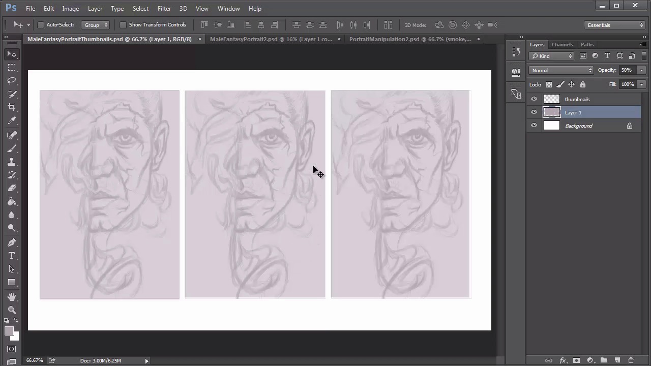
- Overview
- Transcript
3.2 Male Portrait: Thumbnails for Light and Shadow
Learn how to use thumbnails to fully understand your composition and experiment with it prior to painting. Practice several potential lighting scenarios before committing to one.
1.Introduction
1.1Introduction01:37
2.Set Up
2.1What You'll Need06:25
2.2Developing Strong Concepts06:29
2.3Manipulating Your References: Male Portrait06:30
2.4Manipulating Your References: Female Portrait05:59
3.Paint a Male Fantasy Portrait
3.1Male Portrait: Sketch05:49
3.2Male Portrait: Thumbnails for Light and Shadow05:56
3.3Male Portrait: Create a Base Painting05:11
3.4Male Portrait: Shading05:40
3.5Male Portrait: Final Touches05:13
4.Paint a Female Fantasy Portrait
4.1Female Portrait: Sketch05:15
4.2Female Portrait: Thumbnails for Light and Shadow05:01
4.3Female Portrait: Create a Base Painting04:12
4.4Female Portrait: Experiment With Shading05:49
4.5Female Portrait: Final Touches05:33
5.Conclusion
5.1Conclusion02:14
3.2 Male Portrait: Thumbnails for Light and Shadow
Hello and welcome back to Fantasy Digital Portraits. My name is Melody Nieves and in this lesson, I'll show you how to take the sketch we just drew and turn it into three small thumbnails dedicated to light and shadow. There are many reasons why artists create thumbnails. Not only are they a great way to experiment with different compositions, but you can learn a lot about the lighting scheme you would like to use. You'll hear me say a lot in this course that this step is like test driving your painting. Oftentimes we jump right into the painting process after the sketch is done. Then a couple of hours into painting, you realize you completely hate what you're working on. By experimenting now, you can figure out what works and what doesn't. It's really as simple as that. So let's create the setup for our thumbnails. The first thing you wanna do is merge all your sketch layers together. Then add a new layer above it. Select the Rectangular Marquee tool and hold Ctrl+A to create a selection around the border of your sketch. Right-click and go to Stroke to create a purple border of five pixels. Now, select the layers for your sketch and border to create duplicates. Merge the duplicates together. Hit the Print Screen function on your keyboard and create a new document. Because we hit Print Screen, the size of the document will automatically reflect what's been copied to the clipboard. In this case, it's 1366 by 768 pixels. Once you've created a new document, copy and paste your sketch along with its border onto the new document. Because there's a huge difference in resolution, first sketch will appear way too big for the canvas, so hit Ctrl+T to free transform it, resizing it until it's a much smaller size. This will act as your first thumbnail. With the layer still selected, hit Ctrl+J to duplicate it two more times for the second and third thumbnails. Now position each new thumbnail into place until you've got three side by side. Use the rectangular marquee tool to create three boxes behind each thumbnail. Fill the boxes with the same color purple you used to create the sketch, but bring down the opacity of the layer to fifty percent. Once you've got three identical setups, you can move on to experimenting with light and shadow. For the first thumbnail, I'm going to do a lighting setup that reflects the original photo manipulation, with the face as the most illuminated part of the composition. After that quick warm up of what to expect, I'll use the second and third thumbnails to be a little more experimental. For the second thumbnail, I'm thinking of painting lighter tones for the smoke and lower chin, and for the third, I want to create an intense emphasis on the eye. To make sure that I follow the lighting scheme of the photo manipulation, I'll pull out the document window and place it nearby for reference. Using a soft round brush, I use a very bright color to tackle the main highlights first. Then I move on to the rest of the composition, paying close attention to the original lighting scheme for clues of what I should paint. The goal here is to get a basic idea of light and shadow as quickly as possible, so don't spend too much time trying to perfect the thumbnails. Moving on to the second thumbnail, I concentrate the light towards the bottom chin area and push the shadows upward. I essentially try to create a lighting scheme that was the complete opposite of the first thumbnail. Because I'm no longer using the reference as a guide, there are going to be areas that might not make sense in regards to universal theories about light. But that's okay because you might end up with something that is still interesting enough to use during the painting For the last thumbnail, I painted a solid line of light across the face for an interesting effect before moving on to the shadows. Since the thumbnails currently look a little light for my taste, I'm going to add a new adjustment layer for curves. I'll bring down the main RGB curve to make sure that I really get a correct sense of how light and shadow will play in these different setups. Then, I continue to adjust the second and third thumbnails until I'm happy with them. Let's name these thumbnails A, B, and C. Which one is your favorite? Because the first one is the most complete, and based on an actual reference, it naturally makes the most sense for a solid lighting scheme. But there are things that I like about the other two thumbnails. My main decision is to go for choice A, but I think I'll be able to incorporate the brightness that I get in the eye areas for both B and C as well. I also like the idea of making the background shadows more of a soft gradient as a background from the first. See how useful thumbnails can be? Now you have two helpful guides for your painting, the photo manipulation and the three thumbnails for light and shadow. With all of our research and experimentation done, we can finally start painting. To learn how to organize your base layers, join me in lesson 3.3, where I'll show you that and more as we start the foundational shading for this male fantasy portrait.


