
 Lessons: 16Length: 1.4 hours
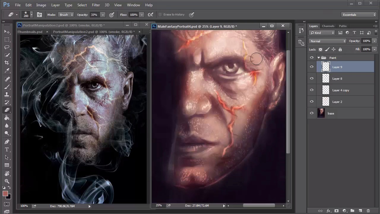
- Overview
- Transcript
3.5 Male Portrait: Final Touches
Add the final details of your painting, including the highlights and smoke for intense realism. Finish it off with adjustment layers to improve the overall color balance.
1.Introduction
1.1Introduction01:37
2.Set Up
2.1What You'll Need06:25
2.2Developing Strong Concepts06:29
2.3Manipulating Your References: Male Portrait06:30
2.4Manipulating Your References: Female Portrait05:59
3.Paint a Male Fantasy Portrait
3.1Male Portrait: Sketch05:49
3.2Male Portrait: Thumbnails for Light and Shadow05:56
3.3Male Portrait: Create a Base Painting05:11
3.4Male Portrait: Shading05:40
3.5Male Portrait: Final Touches05:13
4.Paint a Female Fantasy Portrait
4.1Female Portrait: Sketch05:15
4.2Female Portrait: Thumbnails for Light and Shadow05:01
4.3Female Portrait: Create a Base Painting04:12
4.4Female Portrait: Experiment With Shading05:49
4.5Female Portrait: Final Touches05:33
5.Conclusion
5.1Conclusion02:14
3.5 Male Portrait: Final Touches
Hello and welcome back to Fantasy Digital Portraits. My name as Melody Nieves and this is the final lesson for chapter three. In this lesson, we'll continue painting the final details to our portrait and finish this painting off by adding the smoke. Before we start, let's take a look at the before and after of this painting. Despite having a base of simple colors, we were able to transition well into a more colorful painting. Now it's time to add the final details. If you want, you can save a backup file before the step, but merge all your layers together. Set a new layer to overlay and use it to add warm highlights all over the face. Since the eye area is bugging me a little, I'll quickly bring the portrait into liquefy to adjust it using the forward warp tool. And once I'm done, I continue experimenting with highlights until I'm happy enough to move on. I haven't paid too much attention to those fiery cracks across his face, so now it's time to give them some love. Add a new layer set to overlay, and paint light tan color along the cracks to make them pop. If you need to, use the Eraser tool to soften this effect. Continue adding highlights to the rest of the portrait. You can use the same color to add highlights to the hair and lights double. Because the layer is set to overlay, the color automatically changes depending on the area that you're painting. This creates an interesting effect, especially for the beard because the color change makes the stubble look more realistic. Vary the intensity of the stubble and try not to get too carried away. After all, less is more. Add shine to the areas of the face where you know the light is hitting the most. There is something about highlights that really make a painting instantly more realistic. Since he's an older man with a lot of wrinkles, follow the natural texture of his skin by making sure the highlights are short, squiggly strokes. Ctrl+J to duplicate the highlight layer. This instantly intensifies the effect. You can lower the opacity of the copy, but looking back, I wish I would've left it alone. Continue adding more detail to your painting. This is when you really have to pay attention to the wrinkles and texture of the man's skin. Draw the wrinkles first and use the eraser tool to soften them for a more realistic effect. I also decided to add a little more blue and red tones to the painting, by adding a new layer set to overlay. And experimenting with the effect. If you haven't already guessed it, overlay is a great blend mode for highlighting. I continue to paint with it by using the color white to add more shine. Last but not least, we can't forget the smoke. Initially I was upset at myself because I had painted dark colors over the smoke layer and merged all the layers together. Since I could no longer see the original path I needed to think of a new plan. But then I remembered that I saved this painting over multiple files. So all I had to do was copy and paste the original smoke sketch onto a new layer. After adjusting the size, I brought down the opacity to 25% and added a slight Gaussian blur with a radius of 40 pixels. The preset brushes in Photoshop CC have really been perfect for this portrait. So to paint the smoke I use the soft round pressure opacity brush that relies on my graphics tablet for the intensity of each stroke. I found that the key to painting smoke is to focus on the edges. Since the original sketch is blurred underneath, and act as a nice space for me to paint more details. Continue painting the smoke. Use the rotation tool to create fluids strokes so that your hand creates better, curvy lines. I pretty much relied on the photo manipulation to tell me how to paint the smoke. I decided not to experiment too much with this step because I didn't want to mess it up. With the smoke done, I know that I'm slowly drawing to the finish line of this painting. I added a new adjustment layer for curves to intensify the lighting scheme. And continue tweaking the painting with more details. At this point, I no longer need the photo manipulation as a guide, so I close out of it to move on to the last steps. I add a little more texture to the background by painting small white dots to break up the darkness and brighten the lighting of the smoke. Finally, I created a new adjustment layer for color balance to intensify the warm highlights and bring out cooler, mid tones. And that's it for this male fantasy portrait. I hope you've enjoyed following along and learning how creating a proper set up for your painting makes the whole process much easier. We are just getting started in this realm of digital fantasy art, so join me in chapter four where we experiment more for the next fantasy portrait.


