
 Lessons: 16Length: 1.4 hours
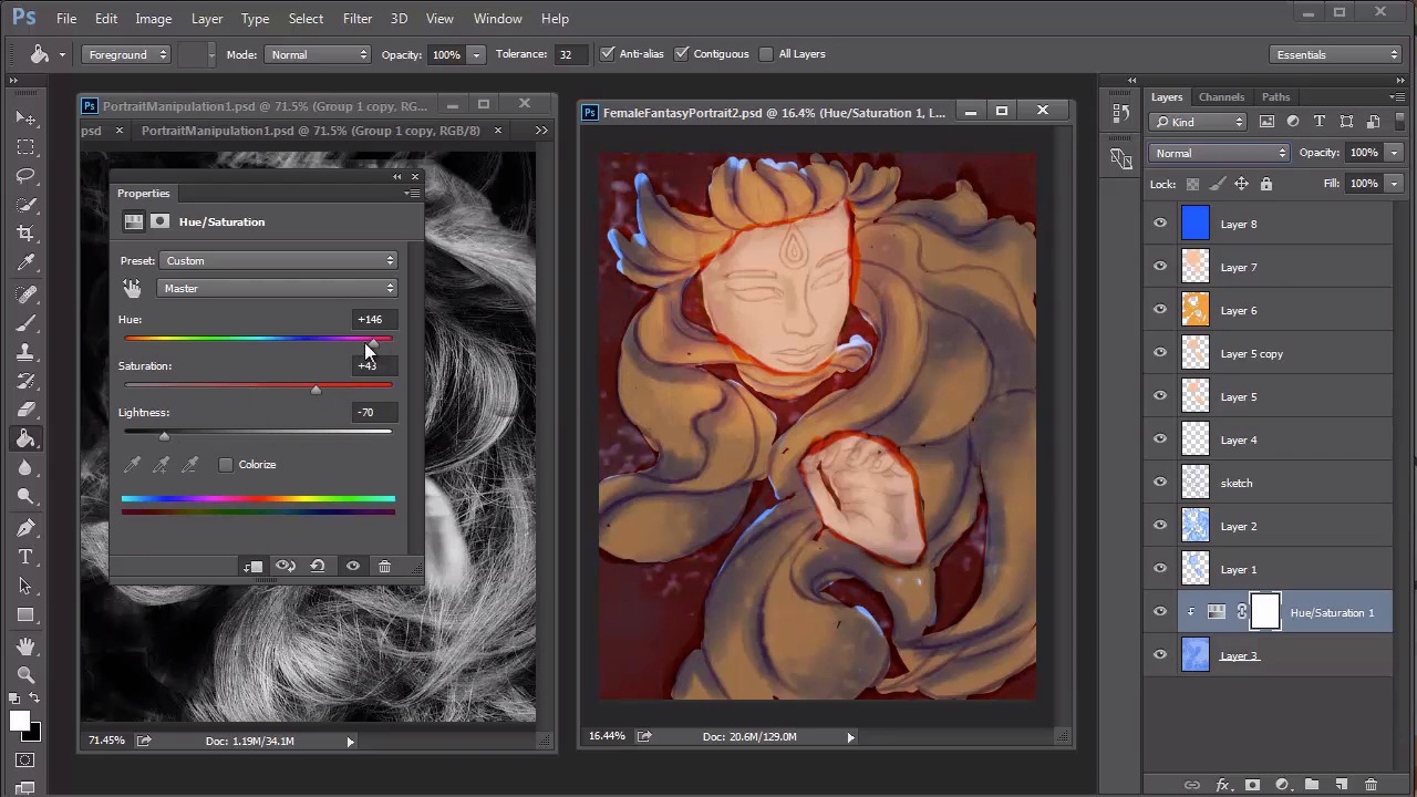
- Overview
- Transcript
4.4 Female Portrait: Experiment With Shading
A little experimentation is always essential in creating fantasy-based art. Let's take the base layers we created in the last lesson, and add more colors to transition into a colorful fantasy portrait. Learn how to tweak and adjust these colors using blend modes and adjustment layers.
1.Introduction
1.1Introduction01:37
2.Set Up
2.1What You'll Need06:25
2.2Developing Strong Concepts06:29
2.3Manipulating Your References: Male Portrait06:30
2.4Manipulating Your References: Female Portrait05:59
3.Paint a Male Fantasy Portrait
3.1Male Portrait: Sketch05:49
3.2Male Portrait: Thumbnails for Light and Shadow05:56
3.3Male Portrait: Create a Base Painting05:11
3.4Male Portrait: Shading05:40
3.5Male Portrait: Final Touches05:13
4.Paint a Female Fantasy Portrait
4.1Female Portrait: Sketch05:15
4.2Female Portrait: Thumbnails for Light and Shadow05:01
4.3Female Portrait: Create a Base Painting04:12
4.4Female Portrait: Experiment With Shading05:49
4.5Female Portrait: Final Touches05:33
5.Conclusion
5.1Conclusion02:14
4.4 Female Portrait: Experiment With Shading
Hello, and welcome back to Fantasy Digital Portraits. My name is Melody Nieves, and after setting up the base layers for our portrait, it's time to finally add color. In this lesson, we'll quickly add color to the base using different blend modes, then develop the shading for an intense fantasy painting. Because our reference is in black and white, any color scheme we create will essentially be entirely made-up. If you think you might ruin your portrait by picking colors that don't go well together, you could always create new thumbnails to experiment with different color combinations. One of the easiest things you could also do is select colors that are very natural. If you go for something more wild and unexpected, it's a sure-fire way to run into problems. Since I'm already deviating from the photo manipulation composition-wise, I'll try to keep the color scheme more natural. First, I add a new layer, and fill it with a solid, tan color. This will be the skin. Then I set the layer blend mode to color. Before moving on to the hair, there is a really big clue that I realize from the reference. If you notice, the tone of the model's hair is rather light. This could only mean that the color of her hair is probably blonde. If her hair was any other color, the black and white tone would show up much darker. Keeping this in mind, I'll take this into consideration for her potential hair color. I use the same tan color to fill in the hair, and set this new layer to linear burn. And changing the hair color is super easy. Just go to an image > adjustments > hue and saturation, and change the hair to a deep, yellow color. These colors look great together so far, but we can't forget the background. Since the background layer already has a significant fill, I'll clip a new adjustment layer of hue and saturation to change it to a dark, reddish brown color Paint two large circles over the face and hand, and even allow the pain to overlap on nearby areas. Make the skin brighter by setting this new layer to overlay. One way to quickly unite the color scheme is to fill a new layer with a color that can be used to tint the entire painting. I'll do this by filling a layer with blue and setting it to soft light. You can restore the red, vibrant quality to the background by adjusting the colors again on the adjustment layer. And feel free to use the current blend modes to add more detail, like the soft light layer for a bright white glow to the eyes, fingernails and mystical jewel. Now that we have all of the colors set, we can move on to the real shading. Create a new group above the one that's used for color, and dedicate to the rest of the painting. Start shading your portrait using natural tones for the shadows. Seamlessly blend the background with the rest of the details by using the red color to paint shadows on the face and hair. A huge part of this process will be experimenting to see what works best. Through trial and error, we'll be able to transform this portrait into a dynamic painting. Let's test out a new effect. Select the yellow layer that's used for the hair. Right-click to go to blending options, and create a gradient overlay that goes from black to white. Adjust the scale to 20%, the opacity to 50% and the blend mode to multiply. By applying this gradient, we are able to create an even more dramatic lighting scenario that allows the face and hand to really pop out. Continue blending the background shadows with the rest of the portrait. Create volume for the hair by pushing the shapes into more shadow. At this time, you should also make sure that the rest of the details don't get neglected, like the hands. Use the photo manipulation to guide you on how to apply the shading Although it's not in color, you can still pick up on the different tonal values in order to create a realistic hand. For the next step, I'll select a bright blue color from the color picker, and use it to cover all the areas where the red background shows through. I wasn't really feeling the red background. So, by setting this layer to color, I can create a color scheme I prefer more. To up the intensity of this painting and for more color harmony, I'll add two new adjustment layers, one for curves and the other for levels. Every time you add adjustment layers, you get an insight to how much more you have to paint. They act as a simple cheat to bring out the brightness and contrast of your paintings without having to manually paint darker or brighter colors. I like to wait till I've got a good sense of the color scheme before adding highlights, but now that we have it generally settled I can start painting them in. So join me in the last lesson of chapter four where I'll show you how I paint the highlights and add the finishing details to this fantasy portrait.


