
 Lessons: 16Length: 1.4 hours
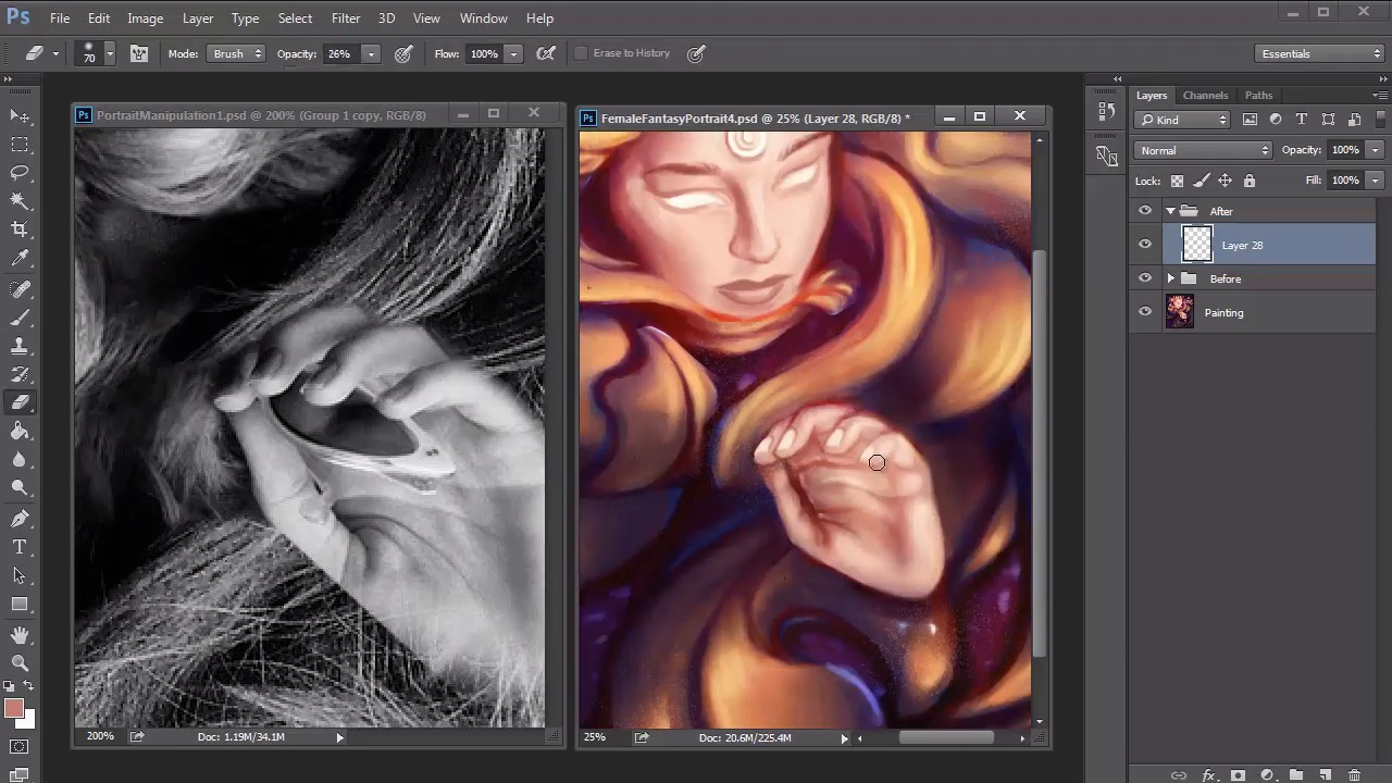
- Overview
- Transcript
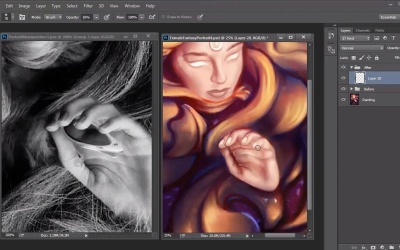
4.5 Female Portrait: Final Touches
Continue adding more colors and experimenting with layer blend modes like Color Dodge as you draw to the finish line of this painting. Add highlights to your work and finish it off with the remaining touches and adjustment layers for added intensity.
1.Introduction
1.1Introduction01:37
2.Set Up
2.1What You'll Need06:25
2.2Developing Strong Concepts06:29
2.3Manipulating Your References: Male Portrait06:30
2.4Manipulating Your References: Female Portrait05:59
3.Paint a Male Fantasy Portrait
3.1Male Portrait: Sketch05:49
3.2Male Portrait: Thumbnails for Light and Shadow05:56
3.3Male Portrait: Create a Base Painting05:11
3.4Male Portrait: Shading05:40
3.5Male Portrait: Final Touches05:13
4.Paint a Female Fantasy Portrait
4.1Female Portrait: Sketch05:15
4.2Female Portrait: Thumbnails for Light and Shadow05:01
4.3Female Portrait: Create a Base Painting04:12
4.4Female Portrait: Experiment With Shading05:49
4.5Female Portrait: Final Touches05:33
5.Conclusion
5.1Conclusion02:14
4.5 Female Portrait: Final Touches
Hello and welcome back to Fantasy Digital Portraits. My name is Melody Nieves, and this is the last lesson of chapter four. In this lesson, we'll continue painting the portrait, adding the highlights, finishing details, and final adjustment layers for intensity. Starting where we left off, I'll jump right into the highlights. The key to effectively highlighting your painting is to pay attention to the light source. Although the light source comes from the right direction, I also want there to be a sense of an inner light that burns from within. To go along with the fantasy theme, I suspect that this light can come from either the jewel on her head or her glowing eyes. Bounce the light all around her hair and take this opportunity to clean up any areas that look particularly rough. To want to conserve on file space of that Photoshop doesn't crash on you, merge all the layers together. Create a misty atmospheric effect by painting warm white across the top of the portrait. Since I've neglected the face for a while, I'll go back in and begin defining the details with a solid high opacity brush. The key to having smooth, well-defined digital paintings is to make sure that you're a bit heavy-handed with your paintbrush. Steadily develop the colors of your portrait. I really like the ideas of adding more vibrant colors, so I continue to push them while cleaning up each area. Even though I chose not to draw or paint the initial hair strands like the original photo manipulation, it's still a good idea to add some directional strokes to reflect the movement in the hair For the hand, I darken the skin color because I thought the former colors were a little too sickly looking. Then I studied my own hand to try to make up for the areas I couldn't really see because the glasses were blocking those details. Continue adding texture and highlights to your painting while adjusting the overall colors. You will see that I incorporated the grainy airbrush from chapter two for a nice textural effect. Initially, it was around this time that I thought I was finished. But after getting feedback from my editor, I added more details to the painting to include better hair texture and to fix the anatomy of the hand. If you ever feel like you're stuck or need advice, ask one of your our peers for help or even seek out a potential mentor. To fix the hand, I really had to study my own. I realize that not only was I missing the indications of where the fingers were, but that the shape of the thumb needed to be fixed. I will admit that after a while I did get a bit frustrated, but you can always tackle a new area of your painting to free your mind from this frustration. Setting a new layer to color dodge I went back to tackle the hair again. In this portrait, I'm not going for that hyper-realistic look like I did in chapter three. So it's important to me to keep experimenting with different blend modes to see how they affect the color scheme. The interesting thing about color dodge is that even if I use the same color around the portrait, the effect automatically changes according to which color I apply it to. Through this blend mode, I'm able to add unique color highlights and bright shades of blue and orange that bring incredible intensity to this piece. After spending enough time away from the hand, I go back to the area to add highlights. Instantly, the hand looks more realistic just by outlining the fingers with a few white strokes. I continue to adjust the hand, adding more shadow to the thumb so that it looks like it's underneath the other fingers. I also clean up some of the extra creases I initially painted so that the anatomy is now correct. After tweaking the hand even further, I knew it was time to finish things up. Taking a cue from the hand, this portrait wouldn't be complete without adding white highlights around the painting and a few adjustment layers. The first adjustment layer I used was curves. Since I only wanted to affect the upper area of the painting where there was the most light, I painted half the bottom of the white layer mask black. Then, I proceeded to adjust the curves for added brightness and contrast. And to finish things up, I painted a couple of white dots to add a little more texture. After all that painting, here is the final fantasy portrait. We were able to create a fierce female character with a powerful light that radiated from within. I hope you've enjoyed following along this process to create two fantasy digital portraits. With lots of research, a couple of workarounds, and lots of experimentation, you too can create beautiful digital portraits from the fantasy realm. This concludes chapter four, but join me and chapter five for a recap of everything we've learned.


