
 Lessons: 13Length: 1.9 hours
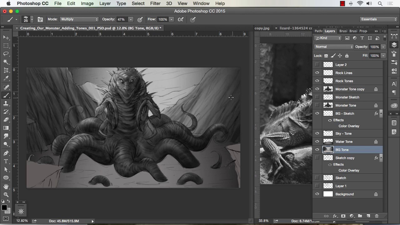
- Overview
- Transcript
3.3 Painting in Light and Shadow to Give Our Monster Depth and Form
In this lesson we will begin to apply shadows to our forms. We will use a combination of the chalk brush and the soft airbrush to give depth to our painting. We will paint with light and dark to further detail our work.
1.Introduction
1.1Introduction01:15
1.2Tools and Resources01:20
2.Understanding the Tools We Will Use to Create Our Monster
2.1Understanding Layers and Brushes18:14
2.2Working With Selections to Control Our Effects11:21
3.Designing Our Monster
3.1Studying and Sketching From Reference to Create Our Creature Design11:32
3.2Blocking in the Overall Shapes of Our Painting15:35
3.3Painting in Light and Shadow to Give Our Monster Depth and Form15:39
3.4Using Liquify to Quickly Modify Parts of Your Illustration14:45
4.Refining the Artwork
4.1Adding in Detail and Textures12:59
4.2Creating Effects With Blending Modes04:19
4.3Adding Finishing Touches With Levels and Color Balance03:20
4.4Saving Elements of Your Painting to Enhance Productivity02:08
5.Conclusion
5.1Conclusion01:12
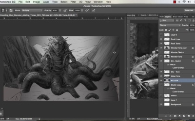
3.3 Painting in Light and Shadow to Give Our Monster Depth and Form
Welcome back to how to create monster art in Adobe Photoshop brought to you by Tuts+. I'm your instructor today Robert Marzullo. We'll, now be covering lesson 3.3, painting in light and shadow to give our monster depth and form. And now the stage of our painting everything separated, so we can just like transparency of our elements and start painting away. I like to start with the chalk brush you can really start with and I just basically block in some light and shadow, or dark to light. In this way, I'm working up value first and then we'll overlay color methods or color of facts later. So this just allows you to only focus on value, so dark to light, highlights, shading. Texture, but we'll even apply some texture effects later. I do painted some of my texture as I go just to give me a better feeling for the painting. A predominantly work at anywhere from 100 to 50% opacity with this brush. After I get enough range of my values, then I'll generally go to 100% opacity. The brush with the transfer set to pen pressure allows you to softly apply overlay effects. Regardless as long as your tablet supports a good level of pressure sensitivity. So, you can generally go up to 100% opacity and paint a little bit quicker by selecting areas of your painting. So, as you see there I just painted everything down pretty far, you can also do that with levels by hitting Ctrl+L. But I like to do as much by hand as possible just to get again a feeling for what I'm painting. So if you notice, I'm painting in little bits of textures in the tentacle. I'm dabbing the brush here and there. I'm trying to make even dark spots into areas of the creature's skin that's all stuff that I can paint back and forth anyways. So to me, it's a little bit better to paint almost a little bit rougher and a bit like I'm almost sketching with paint. But just basically, to get some texture and some some range of value in there. And I also grab the dodge tool and punched up the highlights on the one tentacle. That's another quick method to kind of throw in some quick texture. So you can paint some of those stuff in and I then grab your dodge and burn tool and shade up or shade down certain elements. Cuz with the dodge and burn you can control Media, Highlights, Mid tones and Shadows. So I recommend playing with that as well. I don't recommend over using that tool just use it sparingly because it can get overdone really quickly especially when you're dealing with highlights and dark Shadows. So the beauty of painting it in like this, it sometimes can be time consuming to lay in some of your textures, but I think overall you get a more intimate feel of your design. And if you notice there, I'm just taking a spatter brush, which is just a series of dots, and just kind of lightly dabbing that in there. I've got it set to multiply, so it'll just darken everything it touches and then it just applies a little bit more texture into the the creature there. So, and here I'm using a soft brush to paint in some highlights. I do recommend using a variety of brushes as far as getting in your initial tone work and values and stages because it all gives you something else to add to in your painting. Sometimes, a lot of times your paintings are gonna have some nice accidental texturing to them. And you wanna to get used to looking for that and then pulling from that. That's why you see a lot of still painters that will just grab textures from paintings either paintings are done before or just things they think can click cool. And they'll start to drop them into their work because they know that it creates those happy little accidents that you can see into your work and paint. Here, I'm trying to paint in majority of all my textures by hand, so I'm using a little bit of the smudge brush. I try not to use it too much and the more and more I paint, the less I use it. So that's why I don't wanna recommend that telling you too much about it, you can use it again sparingly to blend some of your stuff. But I think it's better to learn how to blend by simply selecting areas of your value and painting that. So here you see, I grab some of my reference again, pull that over and kind of study it just to gain perspective on even the light and dark range that I should be using my creature here. So I noticed by studying the lizard here, that he's got a lot of cool dark to light transitions. And I would say, that's the way the lighting's done in the picture but it also gives me an idea for how reflective or how specular his skin might be. So you can not only use the reference for the initial line work. It can be used for every other thing, it can be used for color sampling, it can be used for value range. And all I did there was desaturate the photo so I get a nice black and white version, that's under Image Settings in Photoshop. So you can go Image, and desaturate the picture, so that you can see exactly what that color photo would look like in a value range. And all that makes for really great study work, so I recommend doing that. I recommend looking at a painting like that, and painting over and doing your own thing. And then obviously, what we're doing here, where we're making something fantastical. You would just implement all those same studies into making something that you haven't seen before which really is the fun part I would say. So the study work is gaining perspective from these photos and learning how things actually work from dark to light, practice painting them. Practice painting a series of lighting effects and shadow effects and then I see incorporating all that into your own your own work. So again, punching up the highlights with the Dodge tool there, it just gives just enough of a specular look. It's a really quick way to get glossy or specular objects. The only drawback is if you overdo it, you'll get these bleached-out white spots into your work, so you've gotta really do that sparingly like I said before. And just using the Chalk Brush to paint in some of the rock formation, just overlapping strokes. You could see him at about 40% opacity and just kind of brushing that and resizing the brush up and down. Cuz I'm trying to get the overlapping texturing that the brush does. Obviously, a lot quicker method here is just to grab some rocks and drop the texture in and paint over. Again, I don't wanna show you too much of that because I think that, it's better to learn how to paint, with your own brushes and your own techniques. From studying from photos and then later on incorporating textures, to save time that's fine, but you'll find that. You'll be able to save enough your own textures to speed up your own work as well, so it's really up to you if you wanna use that method. It's not necessarily, it doesn't, you don't have to go to that if you don't want, so dark to light. And now, keep in mind, you can flip back and forth from dark to light just by hitting X while you're on brush. B for brush, but then hit X and you'll flip the color selection palette on your bottom left from dark to light. And you can see I toggle on and off my sketch layer just to get, I use the sketch layer at this stage, just as a marker, to show me where I'm at. As I get further and further into the painting, I usually tone the sketch layer down to less and less opacity. Sometimes, I merge it right into the layer like I do with the creature here and then I paint over the line work. So, that's my last stage now, if I want more of a comic book or a cartoon painted look. I'll leave a little bit more in my line work that's one of the reasons why I separated in the beginning stage, cuz I oftentimes like doing a style where it has a little bit more line work. But if you want a more painterly look, paint over your lines blend your lines more, the more you do that the more it will look painted. I mean if you study your photo to the right, you can see there's really no lines in the creature there, the reptile. I switched to a big square brush through here as well, just because I like mixing the brushes up and making sure that I get a good amount of variety in my textures and painting. I see also darken the eyes because I noticed that the reptile to the photo reference had nice dark eyes. And I thought it made him look a little bit more vicious and cold blooded so I figured I would put that in there. You can see I'm almost drawing in back some of my textures especially for the scales. One thing I do wanna mention too is that I spend predominantly most of my time in the areas like faces, even though this is more of a monster face, I do the same thing. I put more time into the face, more details into the face because that's where the viewer is going to identify with your painting and your creatures the most. So I always recommend putting the most detail there. Unless, of course, it's something like the creature's facing away from camera and his head's in the dark or darkness. And you're trying to give some kind of ominous presence there. Then of course, maybe you put a little more detail in the back shoulder where the light's hitting things like that. But he's looking right at camera, so I think the most detail should be in the face. [COUGH] So just punching up a little bit of those highlights and I just keep repeating this process really to where I paint things down and then a painting back up. As far as down being dark and back up being highlights and that's really all I got I mean I've got the reference to the side to go from. But it's just say a process of seeing what sticks out and looking for things that look cool. I can't really explain it much more than that in the sense that you just have to study enough various settings to where you know what to paint in in a certain interval. And it's not always going to be right, but. Hopefully, you get enough of that right where you get a good painting. So like here, I think that I should see some highlights on the tentacle and then I remember okay after a strong highlight our REM light or edge light it's called all those things. There's gonna be a shadow, so then I start painting the shadow off the room light there. And that's simply from studying real life and then seeing how light dark works. I don't always know exactly where to place that but that's just part of the experimentation that you do as an artist. And that's also why I like, if you notice I added a layer over top of my creature now, let me explain that too. You can add to layer, paint over top and it makes for great experimenting. But then, you also have to remember it won't lock transparency like your monster layer. So you'll see, I do that a lot in my paintings, now here I'm adding a selection and checking it with a quick mask to basically isolate that back tentacle. Now, it looks like I don't have the rest of it selected, but I don't need to. I can simply select parts of the monster, invert the selection and I have two things going for me there. I have the selection I created and I have the lot transparency of the monster so I can paint freely. I'm only gonna hit that back tentacle. I can hit then hit Cmd+Shift+I and paint on the other elements with freedom. Watching out for that that line where I segmented right through the creature's bottom two legs there. So, there's lots of options why it's nice to separate your work this way. It makes for getting in there and then adding your details and your shadows a lot easier to accomplish. Cuz a big part of this is you're trying to paint in all these effects but you happen to bleed over and paint over the arm and I go back and paint the arm back which isn't bad. Digital painting is fast regardless but it's a lot faster when you learn to separate your work and approach things and just a productive way really. So again, just painting a variety of texturing in here and trying to get some light source, trying to picture what would happen. What objects might block other objects from the light. Using a little bit of a variety of a soft brush and then here I, again I add that selection a little bit further because and now I want to paint on that front tentacle. So I inverted my selection, but I realized it that, that lasso line went right to the leg and that would create a day artifacts from the edge of the selection. So I added to that and I get in here, just keep adding some details to the tentacle. And a little bit of bounce light on the bottom of it just because I'm thinking about what the water is gonna do to any light that's in the scene and it's gonna refract light. So in turn, you're gonna get a little bit of bounce light on the bottom of the creature's tentacles. Again, just all those things that are more of a memory kind of thing, now here I added another layer, so I wanted to darken up his midsection. So I add that extra layer and I can easily brush that in, and once I get to a level where I'm happy with that, I just hit Cmd+E and merge it down to my initial layer. And I do that a lot more and more as I proceed through the painting cuz there's just certain things that I wanna do. And I wanna toggle on that eye icon, toggle it on and off and see if I like it. If I like it then I merge it down, if I don't then I realize I was heading in the wrong direction. I get rid of the layer. So I use those layers a lot to really support the direction of heading with the painting. And just feel it more a little touch ups, you can see I'm doing that really light at 22% opacity, just trying to build a little bit more texture. And I don't want it to be completely dark right there, I wanna see a little bit of detail even in the shadows. All right, so that'll complete this lesson. Next we'll head over to Lesson 3.4, using liquify to quickly modify parts of your illustration.


