
 Lessons: 13Length: 1.9 hours
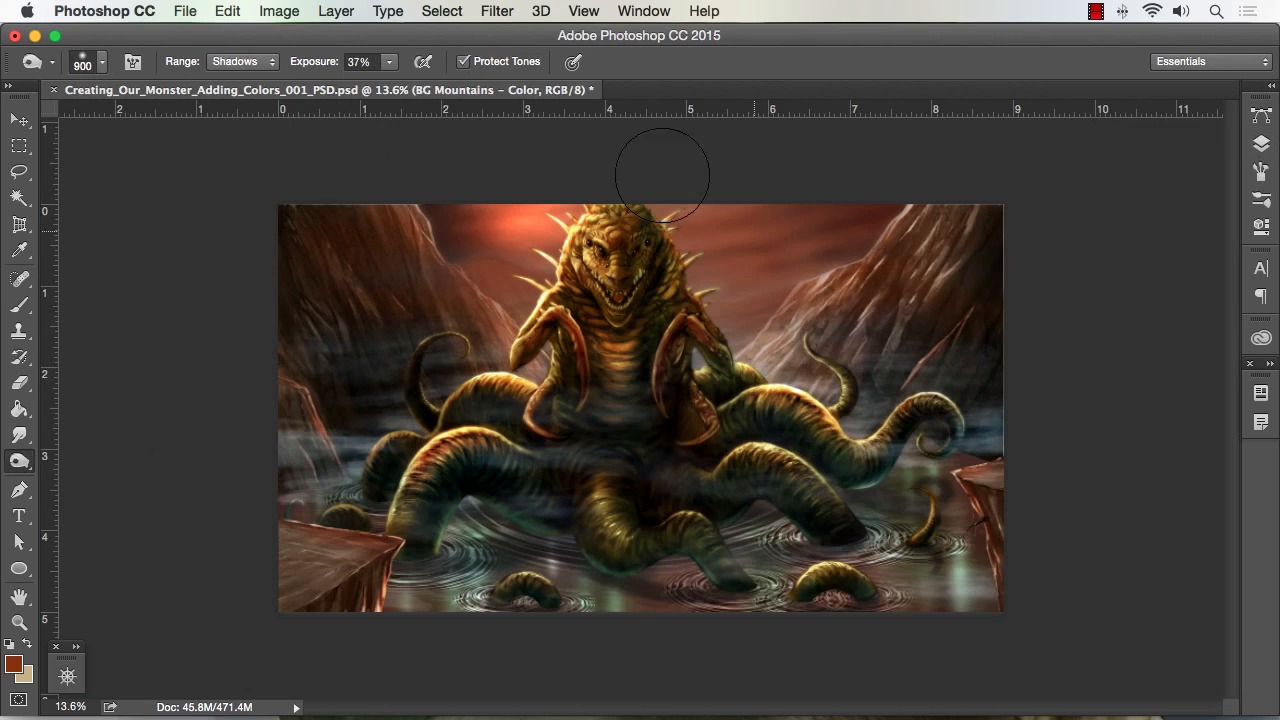
- Overview
- Transcript
4.3 Adding Finishing Touches With Levels and Color Balance
In this lesson we will go over the uses of Levels to add contrast to elements of our painting. We will also cover the uses of color balance to make quick and effective changes to our overall colors. You can create dramatic effects and a variety of moods by simply using these tools.
1.Introduction
1.1Introduction01:15
1.2Tools and Resources01:20
2.Understanding the Tools We Will Use to Create Our Monster
2.1Understanding Layers and Brushes18:14
2.2Working With Selections to Control Our Effects11:21
3.Designing Our Monster
3.1Studying and Sketching From Reference to Create Our Creature Design11:32
3.2Blocking in the Overall Shapes of Our Painting15:35
3.3Painting in Light and Shadow to Give Our Monster Depth and Form15:39
3.4Using Liquify to Quickly Modify Parts of Your Illustration14:45
4.Refining the Artwork
4.1Adding in Detail and Textures12:59
4.2Creating Effects With Blending Modes04:19
4.3Adding Finishing Touches With Levels and Color Balance03:20
4.4Saving Elements of Your Painting to Enhance Productivity02:08
5.Conclusion
5.1Conclusion01:12
4.3 Adding Finishing Touches With Levels and Color Balance
Welcome back to how to create monster in Adobe Photoshop brought to you by Tuts+. I'm your instructor today, Robert Marzullo. We'll now be covering Lesson 4.3 adding finishing touches with levels and color bounds. So we've now got a lot of our colors placed into our painting, but save, perhaps we wanna adjust our colors, but we don't wanna have to go back and then repaint. We can now go into color balance, and adjust the colors of each element better segmented in our painting, and we can adjust the shadows, mid tones, and the highlights of each area. So this affords us a lot of opportunity to further manipulate our work, and it saves a lot of time. So if I want more yellow on my highlights with a touch of blue, I can do that. If I want to darken up the shadows of my creature, I can add more of the darker tones, the blue and the green. So there's a lot of neat effects there. I can go into levels by hitting Command L. And I can adjust the overall opacity and the contrast of the image. So you could see that just with that alone you can really start to change the painting altogether. So it's really great about using color balance is that you can experiment and add colors that otherwise might be a little hesitant to do. If you had to repaint each these elements, you probably second guess yourself. But the fact that you can adjust them really quickly and on the fly, allows for a great kind of productivity to fantasy art. And also the ability to add contrast and highlights. See here I'm using the burn tool to darken up tones in the rock formations. But then I can do that just as easily and adjust color at the same time by using color balance. So I can grab the darker tones and add blue and green. I can add the highlights. And you see just real quick there I was able to punch that up and contrasts and adjust and color all the same time. And I can also grab each one of these elements and play with the hue saturation, a lot of times I work a little bit overly saturated and then I'll tone down the saturation towards the end of the painting. And another tip I wanna give you, when you're doing adjustments like this, since you do have so many options for controlling so many different aspects of your painting. I recommend making adjustments hitting Command Z to go back and check the work. But also taking breaks in coming back and revisiting the work, a lot of times if you take that break and come back you'll see things that you otherwise didn't see by sitting there laboring over it. And here are just kind of pinball around and check the work and add little adjustments. One of the final things that I start to do when I get to the end of the painting is I add layers right over top of everything. And I'll call them final adjustments or added color contrast. And you see I'm painting with overlay mode here, and I'm just painting over top and to me this is a good way to blend the final stages of the painting. And that wraps up this lesson next we'll head over to Lesson 4.4, saving elements of your painting to enhance productivity.


