
 Lessons: 15Length: 1.7 hours
- Overview
- Transcript
4.2 Building a Composition
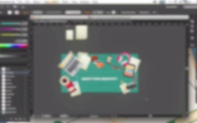
In this lesson we’ll be combining our workspace items into a well-balanced composition with trendy long shadows and text, making a stylish advertisement template.
1.Introduction
1.1Introduction01:40
2.Advertisement Concept Idea
2.1Making a List of Elements03:30
3.Creating a Set of Workspace Elements
3.1Making a Laptop13:40
3.2Drawing a Cup of Coffee06:58
3.3Creating a Sketchbook05:53
3.4Rendering Glasses07:55
3.5Making Headphones06:37
3.6Creating a Smartphone04:59
3.7Creating a Tablet04:10
3.8Drawing a Camera08:32
3.9Designing a Wallet and Credit Cards11:50
3.10Making Stationery08:15
4.Making an Advertisement Template
4.1Creating a Wooden Background06:15
4.2Building a Composition08:26
5.Conclusion
5.1Conclusion02:13
4.2 Building a Composition
Hi guys and welcome back to Creating Flat Workspace Elements for Advertisements course with YuLia Sokolova at tuts+. In this lesson we'll be gathering our workspace items into well balanced composition, with trendy long shadows and text, making a stylish advertisement banner or promotion flier. Let's do it. So here we have all the graded objects on separate layers and the textured background. First of all, we need to resize the items, making them smaller so that they fit the size of the banner. We'll be building a circle composition, placing the objects along the edges of the ad board. And leaving enough space in the middle of the banner so that it can be filled with some text like invitation to the courses or some advertisement information. Let's select the background layer in the Layers panel and drag it down beneath all other layers. We can turn off the Smart Guides in View, Smart Guides. And let's place all the items on the one layer so that we're able to rearrange them easily without dragging the layers one beneath the other. Create a new layer on top of all other layers. Select all objects. Select the layer. Click right mouse button, Arrange, Send to Current Layer. Double click on the layer to change the selection color to make it brighter. And let's start placing the objects onto the ad board. Let's take the laptop, rotate it, and place in the top left corner of the canvas. Copy the sheets of paper so that we have more copies, which will help us to fill the blank spaces. Put a sheet of paper next to the laptop. Let's move it under the laptop by sending it to back. Add another sheet of paper here. And we can move it beneath the laptop if we cut it. Select the laptop and paste it in back. This way we paste the object at its place but beneath the selected object. Continue adding the objects, resizing them, and rotating. Putting them at different angles, like if they were just lying on the table without any order. Just as you put them on your desktop, not distributing, and not aligning them to each other. I'm keeping in mind the photo of my desktop, which I've made at the very beginning, and just putting the objects the same way. You can put them randomly to your liking or use some photo reference as well. I prefer to rotate all the objects in opposite directions but still preserving the circle composition. As if all the objects face to the center of the ad board around around the pivot point. Now let's take the type tool and some text to our image. Create a new layer on top for the text. And let's use some thick bold font like Uni Sans, setting the font size to 36. Type a header or a title. It can be any phrase. Let's write something motivating like Boost Your Creativity. Align it to the center of the output and drag it to our working area. At this step it looks like there is not enough space between the objects. Let's use the scale tool to make the items smaller, setting the scale value to 90%. And move the objects back to their places, adding more air to the composition. Let's add more text to fill the empty space. This may be any simple text, like a message from an advertisement or a lorem ipsum which is commonly used in the designs and templates. Align it to the center and adjust its size. Move the text around, Open the character panel, and increase the spacing between the text lines. Set some thin and simple font to your liking. For example, PT Sans. Make some minor adjustments to make it look better. Let's add one more element in the bottom part of the banner. Make a rectangle with a wide stroke. Add a Read More title. And align it to the center of the rectangle. Make a rectangle be smaller. And set the stroke weight to three points. And finally let's add long shadows to the objects preserving a trendy flat style of our image. Create a rectangle, fill it with black and white linear gradient. And set the blending mode to multiply, making the white side of the gradient transparent. Switch another side to blue color, so that it fits the color scheme of the background. Let's rotate the rectangle, And place it beneath the laptop. Hold Alt Shift and drag to copy the rectangle. And squash it to fit the weight of the coffee cup. Copy the rectangle again, adjusting its size to the size of the notebook. Take at Add Anchor Point tool and add the point in the place where the edge of the rectangle touches the notebook. And use the Delete Anchor Point tool to delete the unneeded point. Place the shape beneath the notebook. Let's continue adding the shadows to the objects using the same simple technique. Making the copies of the rectangles, Adjusting their sizes, Rearranging them, Placing them beneath the items. And now as we finished with the shadows, let's hide all these outside the edges of the ad board, and do clipping mask. Create a rectangle of a size of our ad board. It is 900 by 450 pixels. Add the line into the center of the ad board placing it above all other objects in the layer containing the items. You can leave the text layer on top so that you can change the text easily without editing the clipping mask. Select all the items of the layer. Click right mouse button, and create a clipping mask. And that's it. Our flat workspace advertisement banner is ready. Here are some examples of other banners made in the same style and using the same objects and some additional elements. And some other templates on the screens of the devices. And other colors of the background. Great job, we finished making our composition and created a stylish flat workspace banner for advertisement with original realistic elements. Let's see what you've learned so far during this course.


