
 Lessons: 17Length: 1.5 hours
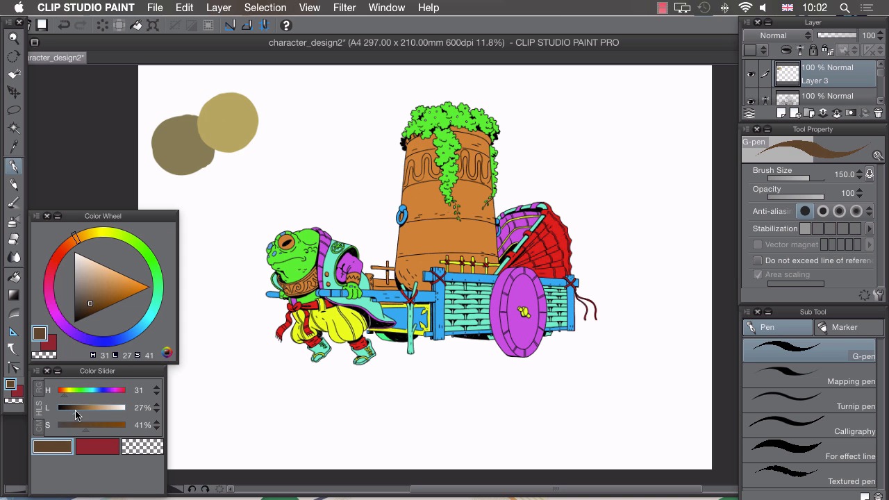
- Overview
- Transcript
4.2 Palette
In this lesson I'll show you how I choose the colours for my illustrations.
1.Introduction
1.1Introduction01:01
2.Sketching Our Idea
2.1Reference03:53
2.2Blocking In09:22
2.3Working Out the Perspective11:46
2.4Background09:57
2.5Character09:50
3.Inking
3.1Pen Setup05:44
3.2Inking Over Our Drawing09:18
4.Colour
4.1Flatting04:54
4.2Palette05:10
4.3Colouring03:17
4.4Shading04:41
4.5Line Colour03:28
5.Finishing Touches
5.1Colour Tweaks02:44
5.2Texture02:29
5.3Exporting02:24
6.Conclusion
6.1Conclusion00:41
4.2 Palette
Hi, welcome back. In this lesson, I'll show you how I go about choosing my colors. For this illustration I might want to use a limited palette of around five or six colors. Because I'll be using so few, it's important I choose the right colors for the image. To help me do that, I can open the color wheel. By clicking on Window and choosing the color wheel. And what this does is help me make more informed decisions about my colors cuz I can see the relationship to one another on this wheel here. For this image I think I'm gonna go for quite a warm palette. So with that in mind, I think the first color to choose would be a green, because we're gonna have greens in this toad skin here, and we've put quite a lot of green in this plant here, so I think that's quite a good starting point. So with the warm aspect in mind, I'm gonna choose on my color wheel around about here. So, I've actually stayed away from this obvious green here, and I've pushed it a lot more almost into this orange section. And from there I can use my color slider to be very precise about choosing my exact shade because, as I said, we're going to need to be very careful about choosing these colors. So I wanna get quiet a muted looking off green like this and once we have a color that we think will work as our green we can go to our pencil and just make a big splotch of that color onto our canvas just to see what it looks like. And I'm quite happy with that. I think I am gonna use this as a basis because if you look at it on this color wheel it looks as if we've chosen something a bit orange, but on our canvas it looks like an off-green. I think I might stay in this range here, and try and find a yellow for my image so if I just use this more saturated range here, so If I drag it up to something a bit brighter on my slider and a bit more saturated like that. That looks, again, it's a little bit dull, but I think it'll work well with this green here. So, we're still working with these warm colors. A that will be our sort of yellow, that will contrast to our green there. I also need a darker version of these so I'm gonna try and find a brown I can use for this push cart. So find move more towards this brown section, more towards red in our pica like that and then go quite a bit darker and a little less saturated around there. And I think this will work quite well as a dark point for these two colors. The next thing I want to do is actually find something that contrasts with these. So we've got some warm things here. And I'm gonna choose a complementary color and that will be a blue. So if I drag to this other side, you can see there are complementary colors almost on the opposite side of our color wheel. So if I go to around here on our color wheel, I can then choose a lighter color and, again, go little bit desaturated because all the colors I'm choosing are slightly desaturated here. And this will be a dark blue, which sort of our cooler version of this green here. I'm also gonna choose a lighter version, as I did here. So if I go a little more towards blue, And quite a lot brighter And a little bit more saturated. I then have a light version like this. And I think that's all the colors that I'm actually gonna use in this image. So, I can use different mixtures of these colors to get different effects, and give us a limited palette drawing here. Once we have some colors that we like, I'm gonna close my color wheel, and I'm gonna make a new color set here. So, if I choose the color set window, you can see we have a few different color sets to choose from. What we want to do is choose this spanner here and select, Add New Settings. And we can call this, Palette, like that. Click, OK. We now have an empty palette to add out colors to, so all we can do is choose our eyedropper, choose our colors, and then say add color. Move to the next square, eyedropper, add the color, and do that for all of these colors. Until we have all our selected colors in this swatch here. Ready to start coloring. In the next lesson, I'll show you how to use our flats and then selected palette to start coloring our image.


